Mastering Character Creation: Bring Your (Brand) Story to Life!

Sandra_Staufer_Lightning_Fibre

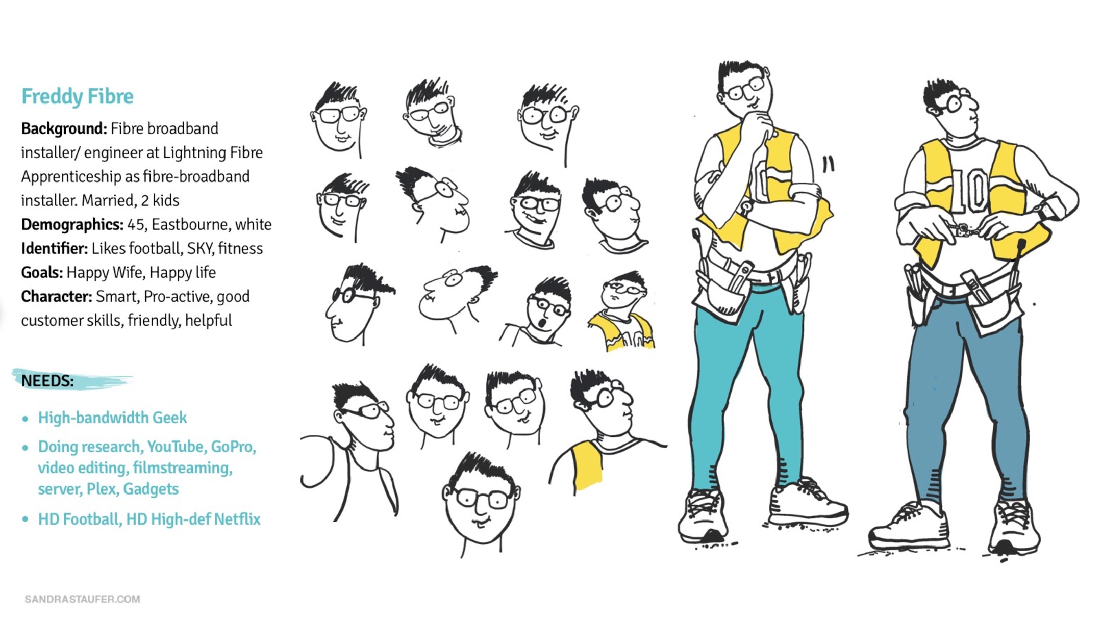
Freddy Fibre and Barbara Broadband

Creating a compelling character is one of the most rewarding parts of storytelling. Whether you’re crafting heroes for a novel, a game, or you create a protagonist in a screenplay, memorable characters are the heart of any story.

Creating a character for a brand is a strategic decision aimed at making the brand more relatable, memorable and engaging. It helps with:

  • Emotional Connection
  • Differentiation
  • Storytelling
  • Memorability
  • Consistency and Recognition
  • Targeting Specific Audiences
Sandra_Staufer_Doodling for icons_01 Copy 3


1. The Basics

Every character needs a foundation. Answer these core questions:

  • Name: What’s their full name?
  • Age: How old are they?
  • Appearance: How do they look? Include unique features that set them apart.
  • Occupation/Role: What do they do and how does it define them?


2. The Backstory

A rich backstory gives characters depth and informs their actions. Consider:

  • Origins: Where were they born? What’s their family like?
  • Key Events: What experiences shaped them?
  • Relationships: Who matters most to them? How do these bonds shape their decisions?


3. Define Their Motivation and Goals

Every character needs a driving force. Ask yourself:

  • What do they want? (Goal)
  • Why do they want it? (Motivation)
  • What’s standing in their way? (Conflict) Characters with clear motivations feel more authentic and relatable.
Sandra_Staufer_Characters

4. Give Them Flaws and Strengths

Perfect characters are boring. Balance their abilities with weaknesses:

  • Strengths:What are they good at?
  • Flaws:What holds them back?
  • Internal Conflict: How do their strengths and flaws clash?


5. Craft Their Personality

Use tools like the Big Five Personality Traits to explore their temperament. Think about:

  • How do they react under pressure?
  • What are their quirks, mannerisms, and habits?
  • How do they speak?


6. Visualise Them in the World

Place your character in different settings. How do they interact with their environment?

  • Do they feel out of place or right at home?
  • How do they engage with other characters?
  • What’s their relationship to the story’s theme?


and now... Iterate and Refine

Characters grow as your story evolves. Keep refining them all the time.

Final Tip: Let Them Surprise You!

The best characters often take on a life of their own. Don’t be afraid to follow where they lead, even if it deviates from your original plan. The unexpected twists will make your story even richer! What kind of character are you creating today?

An example:

With the help of Lightning Fibre, I have created Freddy Fibre and Barbara Broadband. We also created this character for an advert.  You can read more about character creation here.

Sandra_Staufer_Characters
Sandra_Staufer_Doodling for icons_01
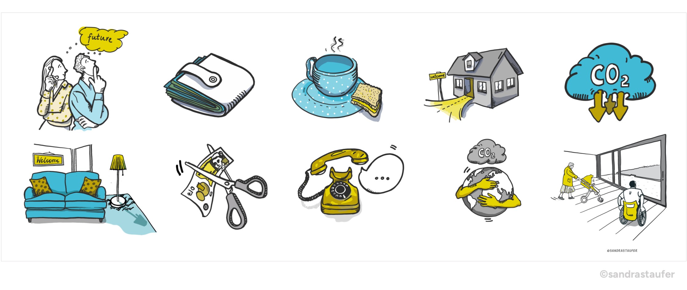
Icons are visual shortcuts; they convey information quickly and clearly. So they need to be precise and clear and convey a message in seconds. Understanding the purpose and the message of the icons is critical, but at the start, it's also good to sketch freely and have fun!

I often get asked to create icons for websites, branding, brochures, newsletters and workshops. An example would be producing icons for a workshop and a card game for managers to help them recognise required management competencies and find their unique management styles.

Doodling VS final product

Creating an icon involves both design skills and technical steps. Determining the purpose and defining the style for consistency is important, but don't underestimate the creativity involved, as there are many cliché icons out there from stock libraries etc. And we need to do stuff differently.

In the initial mood board phase, I recommend experimenting, sketching, doodling and drawing freely - like a child - and without constraints to avoid cliches.

Telling a story appeals to the audience; an intriguing scene can catch the audience’s attention. So get going: time to have fun and play and not to think of the outcome - yet! Connect with your inner child and experiment.

However odd these first ideas are, there is no right or wrong. Make sure you keep those initial sketches as they may aid the progression of the ideas later.

Sandra_Staufer_Doodling for icons_02

What are icons?

Icons are visual shortcuts; they convey information quickly and clearly. So they need to be precise and clear and convey a message in seconds.

Understanding the purpose and the message of the icons is critical, but at the start, it's also good to sketch freely. We can hone in on the purpose and their intention later - and simplify the visual. This allows you to brainstorm without limitations, laying the groundwork for a polished icon.

‘Icons should be simple and recognisable in various sizes. Avoid excessive details that may get lost when scaled down.’

We need to aim for a design that is clean, with a strong, identifiable shape. But again, in this initial sketch phase, that is not the focus; just doodle away and let your creativity flow.

At the end of this phase, we may have a favourite, and that’s good, but be sure to test it with your audience. Do they grasp the message quickly? Fresh eyes can often spot issues you might have missed, and constructive criticism can help refine your designs.

Sandra_Staufer_Doodling for icons_03

Doodling for designers to encourage divergent thinking

We don't doodle enough, as designers. I think that it is due to years of training to solve a problem within our field of work.

Doodling ideas freely serves other purposes too:

It focuses our creativity and allows us to have fun and be innovative. It is a powerful tool for thinking, learning, and creating.

Doodling is a form of visual thinking, where abstract thoughts and ideas are expressed through imagery rather than words. This can help clarify complex concepts, making them easier to understand for ourselves and others.

The random, free-flowing nature of doodles disrupts rigid thinking patterns and encourages divergent thinking. It’s a great way to get unstuck and find fresh perspectives.

The more bizarre and absurd our ideas, the better the outcome, as scaling back is always possible.

Sandra_Staufer_Doodling for icons_04

An example:

30 ICONS FOR 30 LEADER CORE COMPETENCIES

Recently I designed 30 icons for a client to help managers identify the competencies they need as leaders - and to understand who they need to be to inspire as managers. This was part of an app created online under the title 'Thrive to Perform' & Perform to Thrive'.

Thrive to Perform is an innovative, evidence-based leadership development and well-being programme rooted in positive physiology principles. It is designed to empower emerging, confirmed and senior leaders with the skills and mindset needed for personal and professional success.

The mood board phase brought us from animals and shapes to tidy, technical, intelligent icons that communicate to the audience. The initial doodles helped the client and me focus on what we needed to communicate and how.

This was one of my first sketches, Fifi the fish trying to solve a problem. This direction was evidently not used in the end product, but it made me think outside the box.

Sandra_Staufer_Doodling for icons_01

This is the progression board to establish 30 Icons. You can find out more about the work my client is undertaking here: www.positiveperformances.org.

Sandra_Staufer_Doodling for icons_04 Copy 2
Welcomepack_00

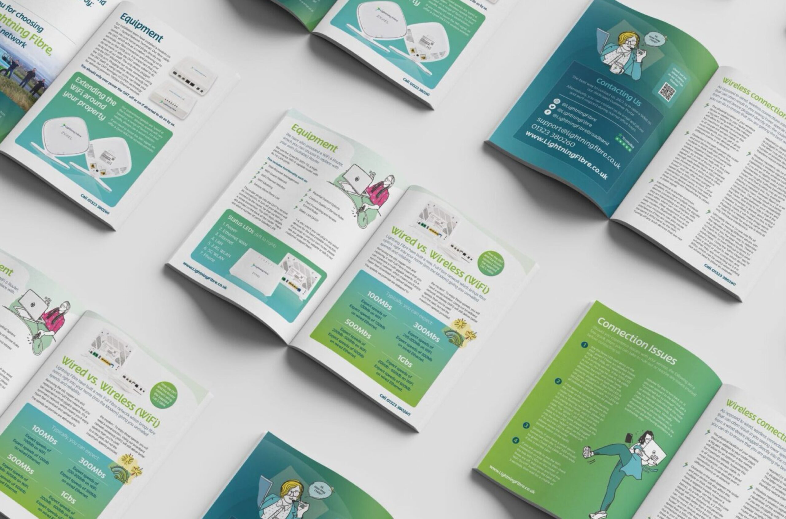
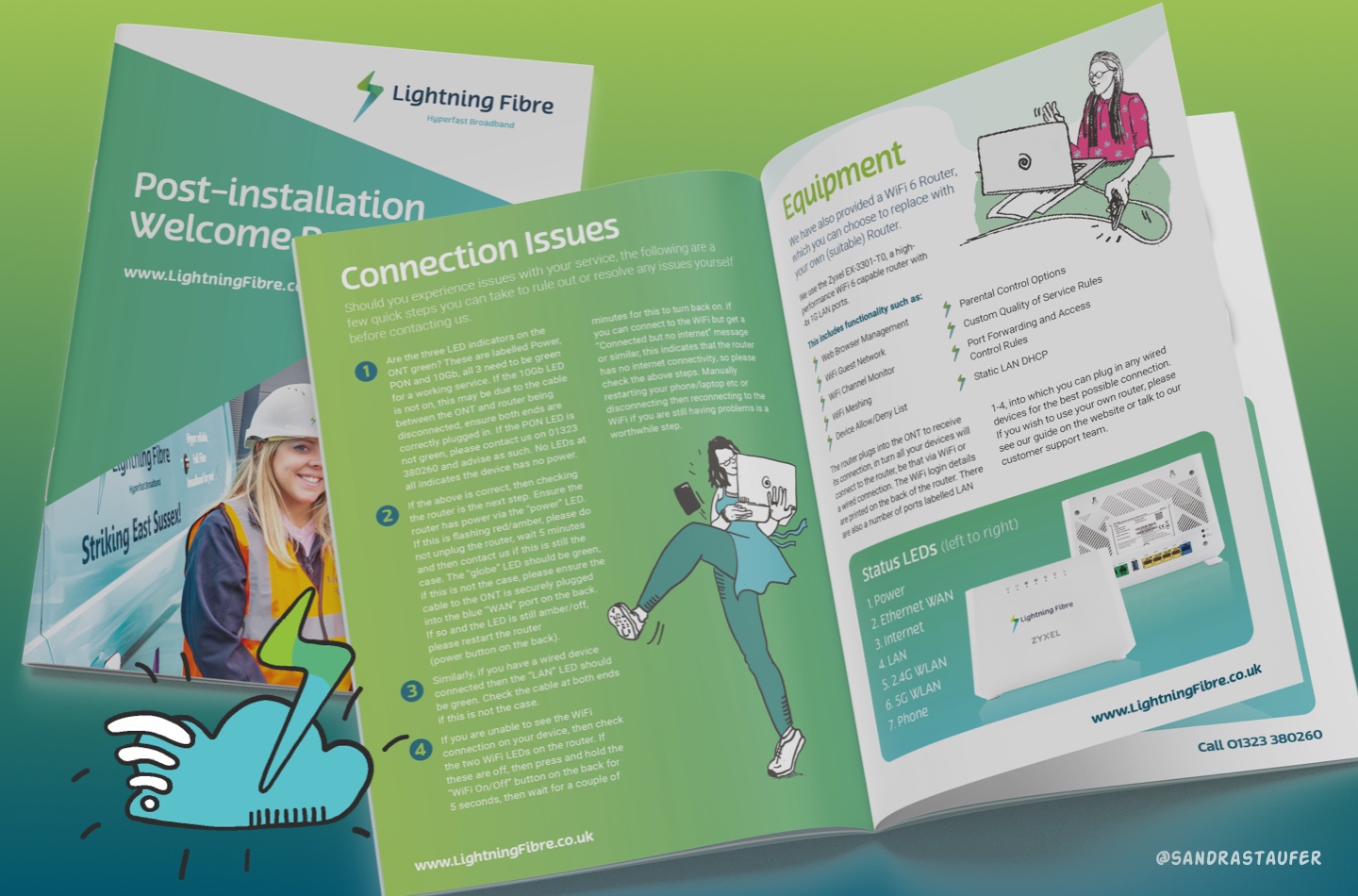
Set a positive customer experience in a personalised Welcome Pack

A good Welcome Pack can significantly enhance the customer experience, especially when they receive it upon installation of a product or service. To create an effective Welcome Pack, consider the following components:


1. Personalised Welcome Letter

  • Warm Introduction: Start with a personalised note that thanks the customer for choosing your product or service. This sets a positive tone.
  • Contact Information: Include details of how they can reach customer support or their account manager.
  • Next Steps: Provide a brief overview of what the customer can expect in the coming days or weeks.

2. User Guide or Quick Start Guide

  • Clear Instructions: A well-designed guide that helps the customer get started with the product or service quickly.
  • Visual Aids: Use images, diagrams, or videos (QR codes can be used to link to online content) to help with the setup.
  • Troubleshooting Tips: Address common issues upfront to reduce customer frustration.
Welcomepack_03

3. Branded Merchandise

  • Practical Items: Include useful items like pens, notepads, USB drives, or tote bags. These keep your brand top-of-mind. But do think of the environment, and produce merchandise that people actually need.
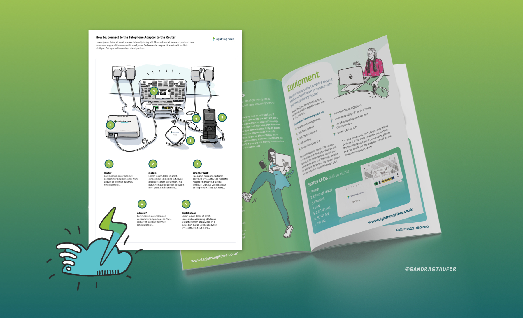
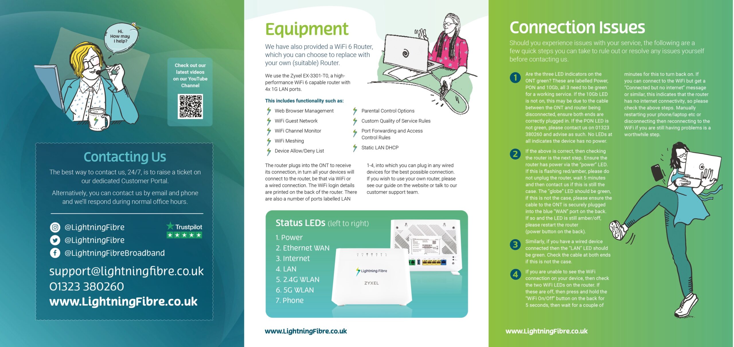
  • Personalised hand-drawn user-guide: A personal instruction guide to help the customer understand how to install the product is welcomed. This can be done effectively with hand-drawn illustrations.
  • Quality Matters: The merchandise should reflect your brand’s quality. Cheap or flimsy items can backfire.

4. Discounts or Vouchers

  • Future Savings: Offer a discount on their next purchase or a referral code they can share with friends.
  • Exclusive Offers: Consider including a time-limited offer to create a sense of urgency and encourage further engagement.

5. Customer Success Materials

  • Case Studies or Testimonials: Include success stories from other customers to build confidence in your product.
  • Tips and Tricks: Provide advanced tips to help them get more out of the product or service.
  • Upcoming Events: Mention any webinars, workshops, or events that they might find beneficial.

6. Product Samples or Add-Ons

  • Surprise Gifts: If applicable, include a sample of a complementary product or a small add-on.
  • Trial Offers: A free trial for an additional feature or service can encourage exploration of other offerings.
Welcomepack_04

7. Feedback Request

  • Survey or Feedback Form: Include a simple, easy-to-complete feedback form or link to an online survey. This shows that you value their opinion.
  • Incentivise Feedback: Offer a small reward for completing the survey, such as a discount or entry into a prize draw.

8. Digital Resources

  • App or Online Portal Guide: If your product includes digital components, provide instructions on how to access and use these.
  • Social Media and Community Links: Encourage customers to join your online communities or follow your social media channels.

9. Packaging

  • Branded and Eco-Friendly: The packaging itself should be an extension of your brand and ideally eco-friendly. This should look personal and friendly.
  • Aesthetic Appeal: The unboxing experience should be pleasant and memorable, making the customer feel valued.

10. Next Steps Reminder

  • Follow-Up: Mention any follow-up actions the customer should take, such as scheduling a training session or setting up an online account.
  • Reassurance: Reinforce that support is available whenever they need it.

Additional Considerations:

  • Customisation: Tailor the pack based on the customer’s specific purchase or subscription tier, if possible.
  • Simplicity: While it's great to include many items, ensure the pack isn't overwhelming. Balance is key.


Creating a well-thought-out Welcome Pack shows your customers that you care about their experience from the very beginning, setting the stage for a positive long-term relationship.
Welcomepack_01
Metaphors Sandra Staufer

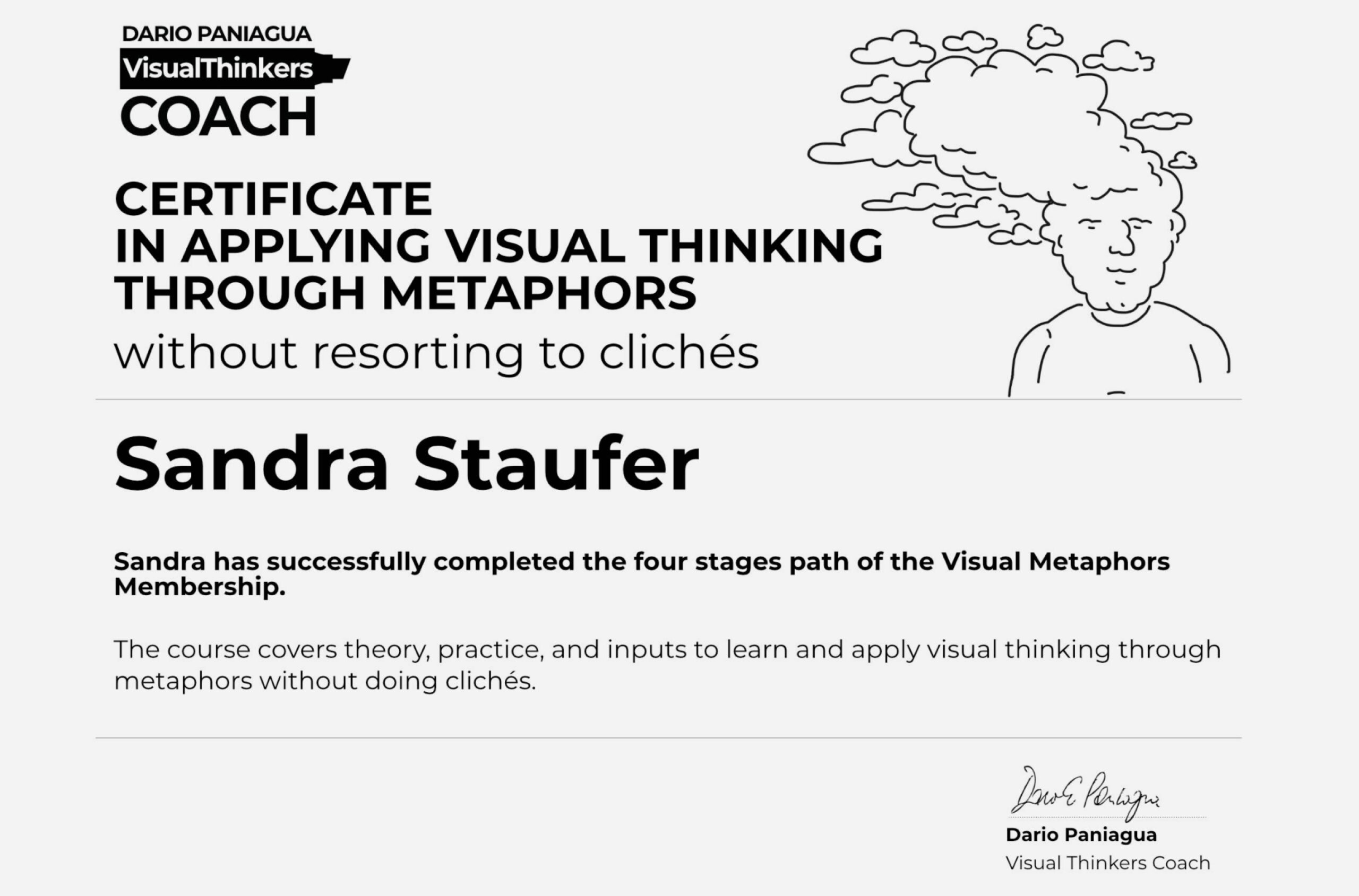
I’m happy to share that I’ve obtained a new certification: "Visual Thinking through metaphors without resorting to clichés" from Dario Paniagua!

Visual metaphors create miniature narratives that deeply resonate with the audience. They go beyond merely describing situations, instead, they analyse and dynamically transform them.

Looking back

In the past, I may have touched on skills, by attempting to create metaphors, and visuals that work hard, possibly coming across as a little absurd to draw attention. But sometimes I just drew icons - ok as part of a user interface but not to communicate a story.

Nice icons...

1705434313293

A nice pretty story but nothing unexpected...

1705434325125

New approach

Experimentation is valuable, and learning from past experiences is essential for refining a communication style. The task at hand involves incorporating this approach into my workflow: To not think clichés to try to be clever with my images and steer clear of clichés and to infuse creativity into my visuals. Upon reviewing some of my past work, I recognise the potential for enhancement, and I am enthusiastic about the prospect.

Before initiating any project, I now engage in thorough, thought-provoking contemplation, pondering whether I can employ metaphors instead of opting for the straightforward and apparent: "Could I do this with a metaphor rather than just drawing the obvious"? Let me think....

1705434334779

Visual metaphors that help drive attention and tickle a smile...

1705434284834

Going forward

Going forward, let me tell the stories cleverly, with intelligence - to grab attention and to convey a message, to help create memorable images that tickle the audience, invite a smirk or make us think.

The course has been transformative.

1705435569606

The course

The course outlined clear strategic tools which help in this process. So that we don't fall into the habit of simply producing icons, because we can.

We learnt of so many illustrators who do this so skillfully, https://www.joeyguidone.com/, as an example, to just name one. These magicians are becoming real heroes to aspire to. The charme in employing illustrations lies in our ability to craft a narrative through the use of visual metaphors.

The personal engagement I received on its course is admirable. I felt supported in my progress. There is a community you can be part of, encouriging you to ask questions and submit homework.

This course will suit illustrators, graphic recorders and even artists. It is a worthwhile investment, especially now that AI is at our heels - important to find ways to create visuals without resorting to clichés.

I have started a journey that will take me years to perfect.

Here is the link if you are interested: LEARN VISUAL THINKING THROUGH METAPHORS * avoiding clichés - https://www.dariopaniagua.com/.

2024-01-26_17-28-47
TogetherCo_Sandrastaufer

Corporate presentations with the aim to tickle emotions

A personalised flyer or a PDF Brochure, which is bespoke, specific to your organisation AND tells your story will stay in people's minds.

When I attend a networking event and I dish out my little personalised postcards with some illustrations on them, I often get comments like "Oh that's nice", or "Oh, I will keep this as a bookmark". Why is that? Because my personalised business cards are hand-drawn and personal and they look colourful.

A nice design will create interest, but bespoke illustrations will make a real impact!

First impressions are really important when you meet a potential audience.

It will help your audience feel valued and respected. They will remember your organisation.

TogetherCo_Sandrastaufer_03

An example

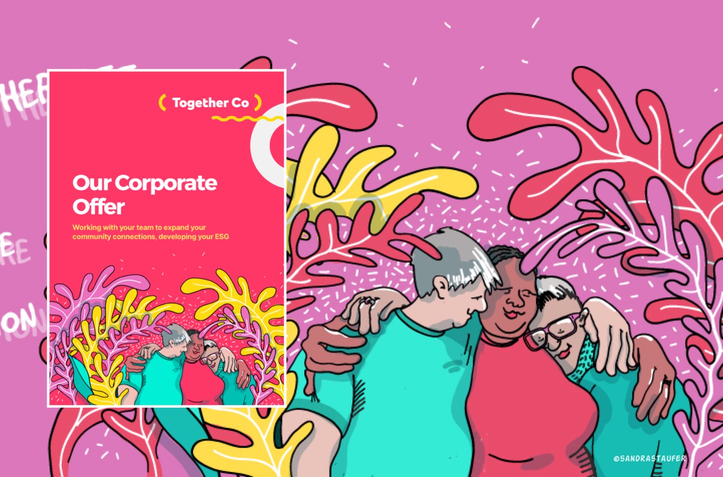
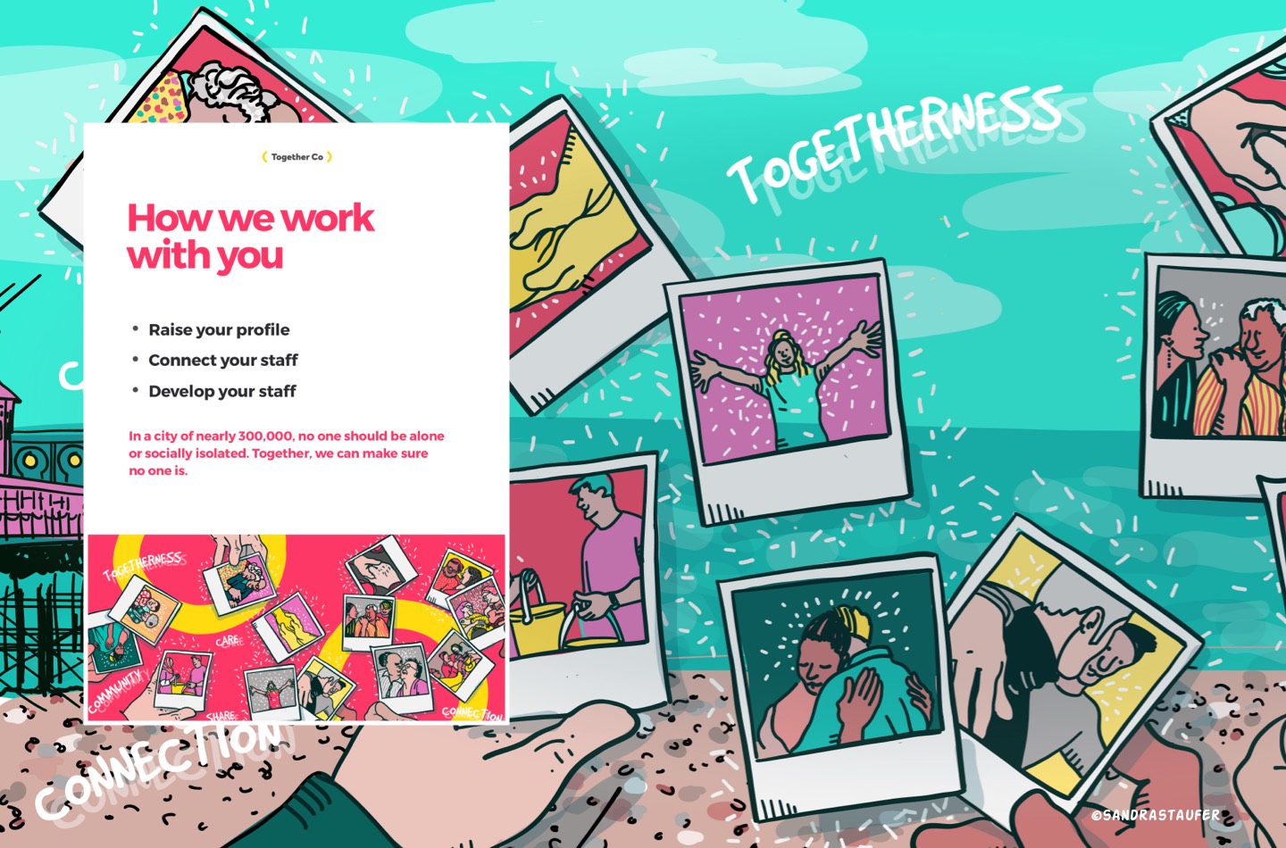
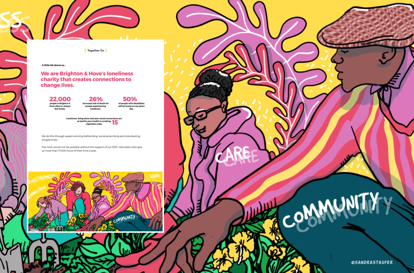
Recently I was asked by Together Co., a Loneliness Charity if I could help them improve their presentation materials. The organisation is dedicated to connecting volunteers with individuals in need of companionship and support. By becoming a volunteer, you can help combat loneliness and isolation while fostering meaningful relationships.

One of the first areas they needed my support was to make their corporate partnership deck into a document that they could send to companies who are interested in working with them; they would then use some of the key messages and design on their website too. This is quite a bold step, and I was very pleased to accept the project. We get innodated with marketing materials and having something that looks slightly different could be very effective.

The illustration needed to be emotive and engage with the audience, warm the heart. I used the corporate colours from their branding guidelines as well as some of their visual asset.

TogetherCo_Sandrastaufer_02

The outcome

The outcome is a PDF presentation that shows personality. It reflects 'care' and invites the audience to read it. The amount of content is balanced with bespoke illustrations and is very digestible.

The documents are set up so we have control over the design and can amend and create a new PDF within a day.

AI make come for us. I wonder if it will be able to capture an organisation's brand, they story, their objectives whilst creating an emotive illustration that warms the heart. We will see.

About TogetherCo

"Are you tired of feeling isolated during the pandemic? Do you miss the social connections you used to have? Look no further than TogetherCo! Our community platform connects you with like-minded individuals for virtual chats, games, and activities. Say goodbye to loneliness and hello to new friendships. Join Togetherco today!"

"Looking for a way to make a positive impact on your community? Consider joining Together Co, where we believe that small actions can make a big difference. Our team is dedicated to helping people connect with others and build meaningful relationships. By volunteering with us, you can help combat loneliness and isolation while making new friends and having fun. Join us in making the world a brighter place, one small step at a time."

Brighton Chamber of Commerce

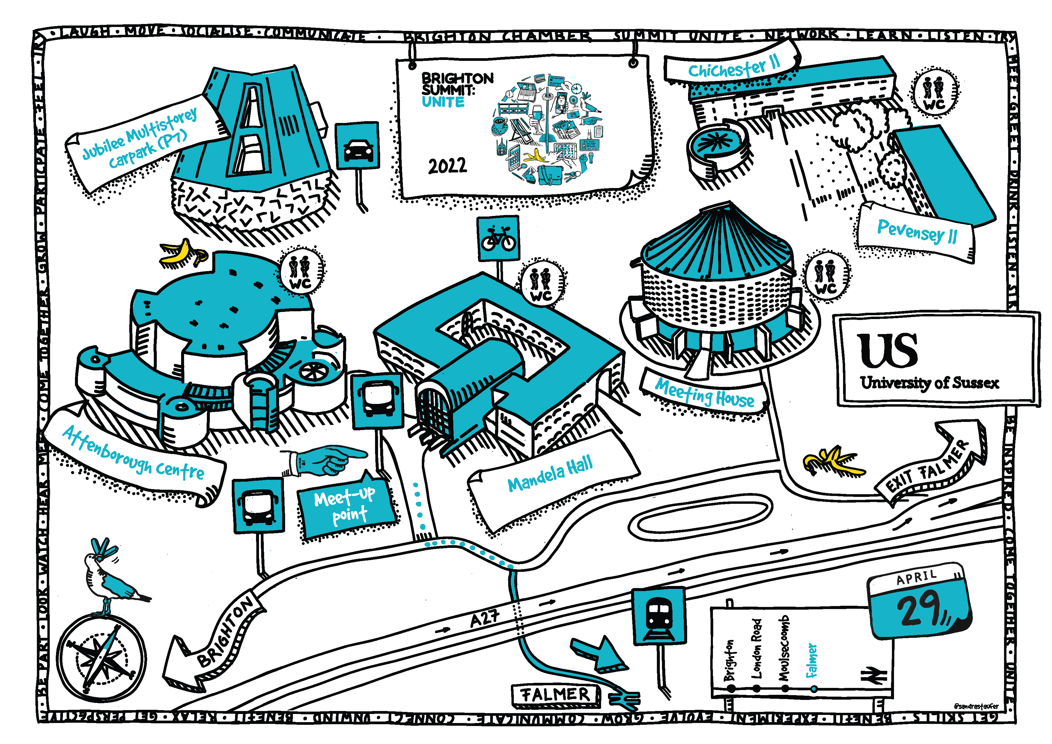
A hand-drawn map can add a personal touch to an event - and reflect your branding.

Maps have long been the purview of the field of illustration, from imaginative maps illustrating fantastical journeys, to informative maps that guide tourists through their destinations.

A map can be filled with characteristics of a place and details to represent an area. They can access elements of storytelling.

This may look like a challenge but it is such a nice project to undertake as you can pull out certain key areas, portrays the overall 'feel of the place and adds a sense of humour to really tell a story about your event. This can create a real mood.

It is a free license to make a map less boring, more informative and assure it fits in with your organisation's visual comms.

A hand-drawn map may not be completely accurate in terms of distances and locations, but with an exciting composition, it can create a quick impact and highlight the atmosphere of the location or of your event.

Large type, hand-written titles and fun icons are a big trend right now.

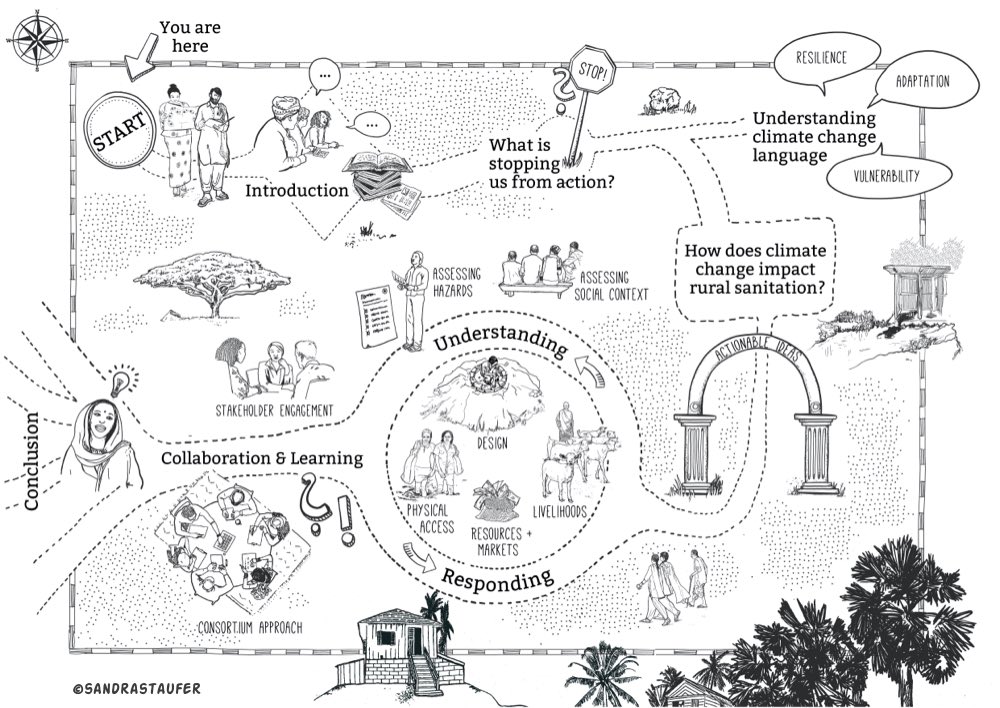
A personalised map can explain a complex process too..

A visual map is an effective tool to illustrate a process or thinking path. It can be a step-by-step guide through a complex process using visual assets.

SHL5_Rural Sanitation & Climate Change_Book_Map_VN08_DELIVERED-01
02_IDS_01_Map_VN13_DELIVERED-01

Custom-made maps, be that a process map or a location map,  show that you are thinking of the user-experience. 

Taking the time to commission a hand-drawn map for your website or brochure shows the audience that you care about details. It is just so personal, aesthetically pleasing and fun.

A good brief is essential to ascertain what you want to highlight and which key areas, points of interest or buildings are taking centre stage. Outlining the process in sketches is critical before starting an intricate process map. Providing your branding guidelines with the brief is key so that your new map fits in well on all of your marketing materials.

Looking back at some old (art)work helps you take your next steps in developing your own style.

Brighton Illustrator
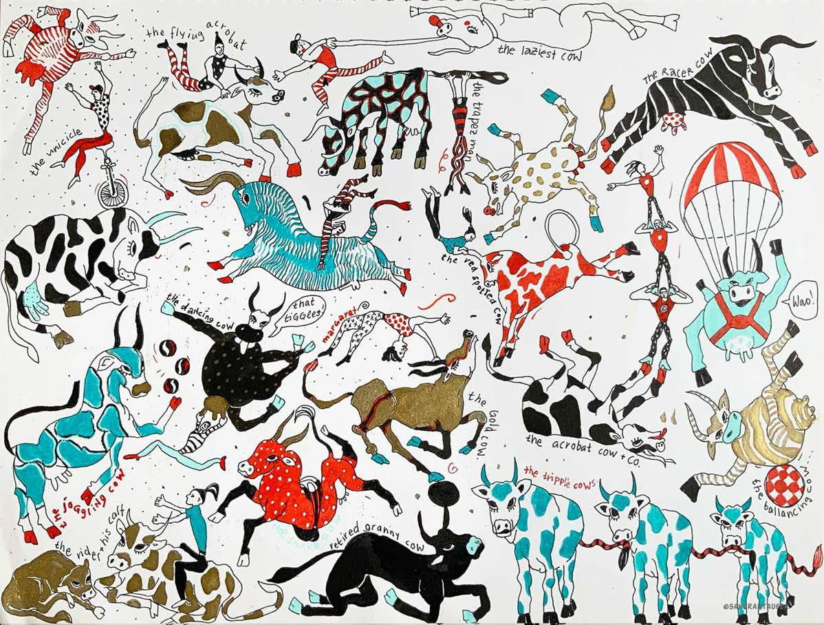
©sandrastaufer 'The Cows" 1994

It's nice to see drawings you did when you were younger because you can see how uninhibited the work was, how you experimented with different styles and media.

Last week helped my mentee put together a portfolio. She is trying to get a place on a prop-making course and I helped her evaluate what her best work is - and how she can develop further some of the work she already has. I helped her identify her style and a path forward to show her brand identity as an artist. (here a link to some tips)

This encouraged me to look back into my old portfolio, some of it dating back decades. Choosing just 10 pieces for her portfolio is hard, but how would that feel for my own, if I had to do this exercise?

I distinctly remembered some artwork, others I completely forgot about, like this one - 'the cows'. Of course, this activity can cause apprehension; when I first looked at some of my old artwork I wasn't impressed. But it helped me see my growth. It's so nice to see drawings you did when you were younger because you can see how uninhibited the work was, how you experimented with different styles and methods. I love seeing my hand-drawn stuff and comparing it to my digital work. On one hand, it is nice to see how far I have come in terms of finding my style but some of it is also surprising, seeing how your current style actually developed very early on.

As a serious illustrator you have to continually look back at work short-term and in a large retrospective view too to review the journey you have made. I am quite good at throwing out old sketches or work that wasn't personal to me. At this point, I am very happy that I had not abandoned all of my old artwork, tossed it out, or completely destroyed it because now, I have a trail back to that time to see where my style developed from and why. It's a little bit like my own art history. You are a critic too and you constantly are analysing what has gone wrong and right with a body of work and what to do about it.

Of course, I often ask myself why my style has developed the way it has, and that is why this retrospective is so revealing. I feel I almost couldn't help but go down the route my hand took me. I may have had heroes and influencers that pulled me in a direction, but I feel looking back now, there were early signs of my style developing the way it has.

Your work gets judged by others on a daily basis, being your own judge feels just as important, because it helps you move forward and make decisions about your direction. You also realise that the path you took to your style is not coincidental, but there is the reason behind it.

It's critical to stay innovative, of course, and just doing the same thing isn't right (and boring too), but I do think keeping to a style you have developed over the years that identifies as you and is comfortable, is really important. I will also take on the challenge I mentioned to my mentee and rework some of the artwork I did 30 years ago. Why not?

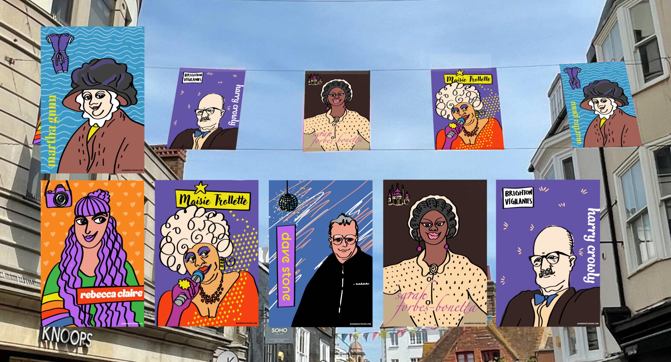
Businesses from across the board are now recognising the true power of illustration to establish engaging products and services and to deliver their message in a universally appealing way.

Illustrations help organisations to build a strong brand image, one that connects subliminally with target audience, and businesses from across the board are now recognising the true power of illustration to establish engaging products and services, and to deliver their message in a universally appealing way.

Design blogger Gabby Araujo puts it poetically when she describes how a visual element ‘can blend a metaphor of your product benefits within real-world scenarios’.

I’d take this one step further though by claiming that well-thought-out, bespoke illustrations can make tricky or sensitive subjects accessible and truly personalise the customer experience.

Some good examples

Cloud-based payroll company Gusto, for example, has a doodle-rich platform that helps users to onboard, pay, insure, and support their team, in a way that is both approachable and fun; targeted illustrations enable customers to construct a mental image of themselves actually using the product. Communications platform Intercom uses illustrations on advertisements and blog posts to provide users with an idea of what its products do before they engage by clicking on a link.

Both firms employ playful, bespoke illustration styles - in contrast to stock image styles- to successfully build an inviting and ultimately memorable brand experience.

Illustrations bring a human touch that can connect us viscerally with a product or service.

This is why so many organisations - not just tech giants - are choosing to use visual elements to personalise what they offer, to help them build successful brands with unique personalities.

YouTube now populates its landing pages with doodles as well as copy, ensuring its onboarding process remains distinct among other video-sharing platforms.

Embracing the storytelling ability of illustrations, means that marketing automation platforms Mailchimp uses abstract digital illustration styles to put across its brand image. “When pictures and graphic design are not enough, illustration can work magic not only by filling a visual gap, but also connecting words and intent at the same time,” says Franz Lang, one of the artists who illustrated Mailchimp's recent rebrand

Digital illustrations personalise what organisations have to offer: they inspire users to take action and make their experience remarkable. In an increasingly digitised world, they remind us that businesses are run by people - real humans, like us, with real thoughts and feelings.

If you're interested in learning more, call me and we can have a chat.

The e-cargo bikes may have changed but the branding remains the same for FareShare Sussex zero-energy Brighton food distribution project

The UK's wholesale food industry is warning this week that it will no longer be able to protect consumers from price rises but about by soaring transportation costs and and problems attracting new workers. It is reassuring to know then that grassroots organisation FareShare Sussex is working ever harder to ensure that food that might ordinarily go to waste is being redirected to people who really need it.

Creating a memorable identity

Clean, green brand identity for FareShare Sussex's zero-emission e-cargo bike

Shows the organisation's relevance and sustainability credentials

Talks directly to the target audience and the wider community

Illustration for Fareshare Sussex by Sandra Staufer
Illustration for FareShare Sussex's e-bike by @sandrastaufer.

Interestingly though, this effective, successful and award-winning food charity is not one to sit on it laurels. In July 2020, FareShare Sussex embarked on a three-year project, funded by circular economy charity WRAP, to use environmentally friendly transport solutions to increase its ability to redistribute surplus food. In the main, this project is proving a great success: introduction of an electric van, for example, has saved £1,8000 on annual transport costs and 4,800kg of direct carbon dioxide emissions. The introduction of a pioneering temperature-controlled e-cargo bike, on the other hand, wasn't quite as successful.

Whether or not Einstein actually uttered the words 'failure is success in progress' is open to debate, but whoever did so had a point, as we never really know how well something works until we actually try it out. And if something doesn't quite cut the mustard first time around, chances are that a reflectively modified, better-thought-out version will be both more efficient and better suited to its desired function than any prototype.

And so this has proved to be the case with FareShare Sussex's zero-emission refrigerated e-cargo bike, which proved unsuitable - too heavy and under-powered, for Brighton's hilly city landscape. Since June 2020, however, FareShare Sussex has been piloting two new lighter-weight and more powerful electric vehicles, with great success.

One aspect of the FareShare Sussex project which proved spot-on first time around, however, is its playful green and white branding. Last year, I collaborated with local graphic designer Richard Excell, of Excell Design together with Hove-based advertising products supplier TJ's Branding Solutions to produce the e-bike's temperature controlled unit's exterior wrap, with its clean-lined graphics and fresh, original illustrations of 'dancing' fruit and vegetables.

As a committed eco-enthusiast and self-builder, I was thrilled to learn that my design would be part of this innovative community project. I have very strong views on both food waste and food poverty and immediately recognised the importance of the work FareShare Sussex does. Some 3.6 million tonnes of good food is wasted by the UK food industry every year, while millions of people are struggling to afford to eat.

FareShare Sussex addresses both these issues by redistributing food industry surplus - food which would otherwise be wasted - to the people who need it most. It provides food to charities and groups that deliver additional services such as advice and guidance, health support, counselling and befriending, and using food as a vehicle for good above and beyond alleviating hunger.

From the outset, FareShare Sussex wanted its new bike to look the part, with its vehicle branding reflecting its function as well as advertising its superlative environmental credentials. As well as showing people what FareShare Sussex does, and how it does it, the bespoke illustrations used in the e-cargo bike branding have helped to create a memorable identity and invite wider involvement in the work of FareShare Sussex. They have helped to instill trust and to build on the organisations' accessibility, community relevance and sustainability credentials.

It seems apt somehow that a four-wheeled zero-emission e-cargo vehicle is now part of a virtuous circle that's actively helping break the cycle of food poverty across the county.


If you're interesting in learning more about FareShare Sussex, contact development manager Kelly Dibbert here faresharesussex.org.uk

Want to make an impact with a super-sensitive - or deadly dull - message? Here’s how and why it pays to be quick on the draw….

When it comes to developing marketing materials for sensitive subjects such as personal hygiene, sex or potentially embarrassing health problems, it’s all too common for creatives to find themselves staring out of the window, not knowing where to focus their gaze, never mind where to start.

It’s these tricky topics, together with dull or ‘dry’ factual content, that require the most ingenuity in terms of creative input. Sadly though, there’s no marketing-with-sensitivity handbook out there explaining how we should handle potentially awkward or yawn-inducing marketing matter. There are, however, approaches we can adopt and adapt in order to maximise audience reach, without compromising a topic’s gravity, causing extreme embarrassment, or sending someone to sleep.

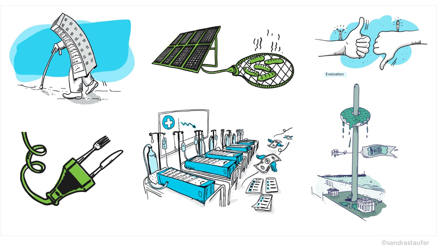
Illustrations for a sensitive subject - where a photo won't do!

With a carefully crafted illustration, a sensitive topic can be presented creatively and with dignity.

Delivering the message with ingenuity

... and brevity.

For blog
Illustration for Sanitation Learning Hub by @sandrastaufer.

Good illustrations can persuade, inform and influence subliminally; showing rather than explaining, enhancing a marketing message by genuinely engaging audience emotions.

Delivery is everything when it comes to both super-sensitive and super-boring topics. How we say something is almost as important as what we say. And as we might not know exactly who will be looking at our content, we cannot predict the potential fallout from the narrative we deliver. We can, however, communicate our message in a way that maintains audience dignity.

And while long-form written content is certainly valuable in some areas of marketing, the antithesis is true for both highly sensitive and deadly dull topics, where brevity is always the best approach. We need to cut out any potentially patronising waffle and get straight to the point.

Content must never accuse or overwhelm, but rather show our audience what we can do to help them, by delivering facts in a comforting way. This is where well-considered and well-drawn illustrations can do the hard work, enabling us to take ownership of our message while at the same time creating immediate audience impact.

The most important thing we must do though when delivering information is to tell the truth, and this is where good illustration really comes into its own. Sensitive bespoke graphics can help organisations appear friendly and trustworthy, while at the same time communicating a marketing message in a more visceral, organic way than even the best-chosen words or photographs.

In the same way that picture books hold the attention of young children, helping them to move the narrative forward without adult assistance, good illustrations and animation can persuade, inform and influence subliminally; showing rather than explaining, enhancing a marketing message by genuinely engaging audience emotions.