Clean, green brand identity for FareShare Sussex's zero-emission e-cargo bike
What goes around… New e-cargo bike for FareShare Sussex
The e-cargo bikes may have changed but the branding remains the same for FareShare Sussex zero-energy Brighton food distribution project
The UK's wholesale food industry is warning this week that it will no longer be able to protect consumers from price rises but about by soaring transportation costs and and problems attracting new workers. It is reassuring to know then that grassroots organisation FareShare Sussex is working ever harder to ensure that food that might ordinarily go to waste is being redirected to people who really need it.
Creating a memorable identity
Shows the organisation's relevance and sustainability credentials
Talks directly to the target audience and the wider community
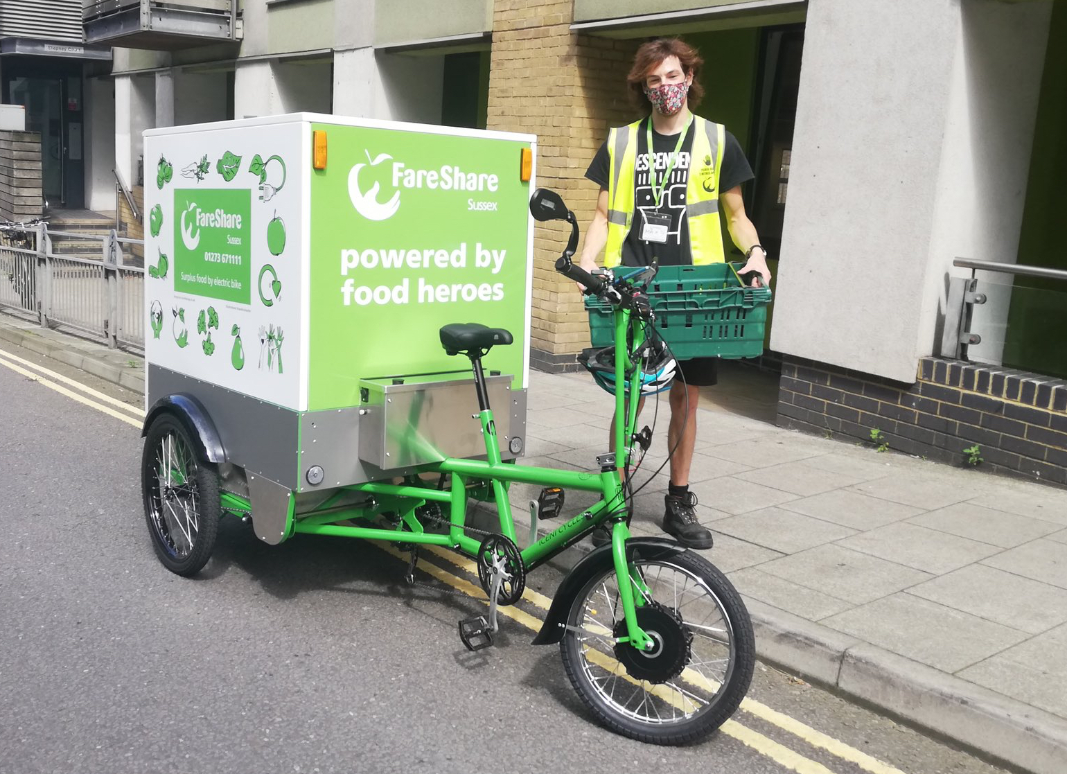
Illustration for FareShare Sussex's e-bike by @sandrastaufer.
Interestingly though, this effective, successful and award-winning food charity is not one to sit on it laurels. In July 2020, FareShare Sussex embarked on a three-year project, funded by circular economy charity WRAP, to use environmentally friendly transport solutions to increase its ability to redistribute surplus food. In the main, this project is proving a great success: introduction of an electric van, for example, has saved £1,8000 on annual transport costs and 4,800kg of direct carbon dioxide emissions. The introduction of a pioneering temperature-controlled e-cargo bike, on the other hand, wasn't quite as successful.
Whether or not Einstein actually uttered the words 'failure is success in progress' is open to debate, but whoever did so had a point, as we never really know how well something works until we actually try it out. And if something doesn't quite cut the mustard first time around, chances are that a reflectively modified, better-thought-out version will be both more efficient and better suited to its desired function than any prototype.
And so this has proved to be the case with FareShare Sussex's zero-emission refrigerated e-cargo bike, which proved unsuitable - too heavy and under-powered, for Brighton's hilly city landscape. Since June 2020, however, FareShare Sussex has been piloting two new lighter-weight and more powerful electric vehicles, with great success.
One aspect of the FareShare Sussex project which proved spot-on first time around, however, is its playful green and white branding. Last year, I collaborated with local graphic designer Richard Excell, of Excell Design together with Hove-based advertising products supplier TJ's Branding Solutions to produce the e-bike's temperature controlled unit's exterior wrap, with its clean-lined graphics and fresh, original illustrations of 'dancing' fruit and vegetables.
As a committed eco-enthusiast and self-builder, I was thrilled to learn that my design would be part of this innovative community project. I have very strong views on both food waste and food poverty and immediately recognised the importance of the work FareShare Sussex does. Some 3.6 million tonnes of good food is wasted by the UK food industry every year, while millions of people are struggling to afford to eat.
FareShare Sussex addresses both these issues by redistributing food industry surplus - food which would otherwise be wasted - to the people who need it most. It provides food to charities and groups that deliver additional services such as advice and guidance, health support, counselling and befriending, and using food as a vehicle for good above and beyond alleviating hunger.
From the outset, FareShare Sussex wanted its new bike to look the part, with its vehicle branding reflecting its function as well as advertising its superlative environmental credentials. As well as showing people what FareShare Sussex does, and how it does it, the bespoke illustrations used in the e-cargo bike branding have helped to create a memorable identity and invite wider involvement in the work of FareShare Sussex. They have helped to instill trust and to build on the organisations' accessibility, community relevance and sustainability credentials.
It seems apt somehow that a four-wheeled zero-emission e-cargo vehicle is now part of a virtuous circle that's actively helping break the cycle of food poverty across the county.
If you're interesting in learning more about FareShare Sussex, contact development manager Kelly Dibbert here faresharesussex.org.uk
Want to make an impact with a super-sensitive - or deadly dull - message? Here’s how and why it pays to be quick on the draw….
When it comes to developing marketing materials for sensitive subjects such as personal hygiene, sex or potentially embarrassing health problems, it’s all too common for creatives to find themselves staring out of the window, not knowing where to focus their gaze, never mind where to start.
It’s these tricky topics, together with dull or ‘dry’ factual content, that require the most ingenuity in terms of creative input. Sadly though, there’s no marketing-with-sensitivity handbook out there explaining how we should handle potentially awkward or yawn-inducing marketing matter. There are, however, approaches we can adopt and adapt in order to maximise audience reach, without compromising a topic’s gravity, causing extreme embarrassment, or sending someone to sleep.
Illustrations for a sensitive subject - where a photo won't do!
With a carefully crafted illustration, a sensitive topic can be presented creatively and with dignity.
Delivering the message with ingenuity
... and brevity.
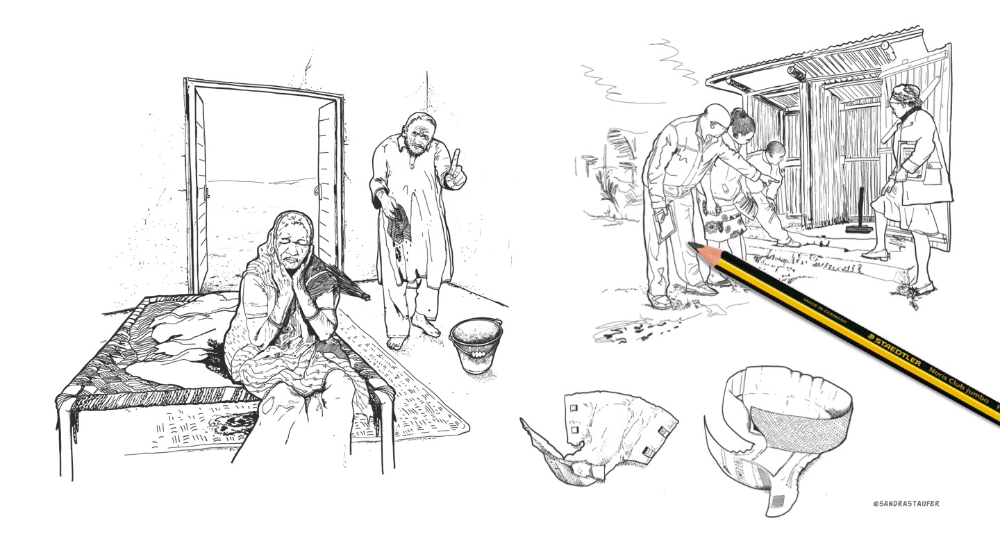
Illustration for Sanitation Learning Hub by @sandrastaufer.
Good illustrations can persuade, inform and influence subliminally; showing rather than explaining, enhancing a marketing message by genuinely engaging audience emotions.
Delivery is everything when it comes to both super-sensitive and super-boring topics. How we say something is almost as important as what we say. And as we might not know exactly who will be looking at our content, we cannot predict the potential fallout from the narrative we deliver. We can, however, communicate our message in a way that maintains audience dignity.
And while long-form written content is certainly valuable in some areas of marketing, the antithesis is true for both highly sensitive and deadly dull topics, where brevity is always the best approach. We need to cut out any potentially patronising waffle and get straight to the point.
Content must never accuse or overwhelm, but rather show our audience what we can do to help them, by delivering facts in a comforting way. This is where well-considered and well-drawn illustrations can do the hard work, enabling us to take ownership of our message while at the same time creating immediate audience impact.
The most important thing we must do though when delivering information is to tell the truth, and this is where good illustration really comes into its own. Sensitive bespoke graphics can help organisations appear friendly and trustworthy, while at the same time communicating a marketing message in a more visceral, organic way than even the best-chosen words or photographs.
In the same way that picture books hold the attention of young children, helping them to move the narrative forward without adult assistance, good illustrations and animation can persuade, inform and influence subliminally; showing rather than explaining, enhancing a marketing message by genuinely engaging audience emotions.
Creating a personalised, impactful hero image for your website can really help the online presence and engagement - and hence help with conversion. It also talks to the audience directly.
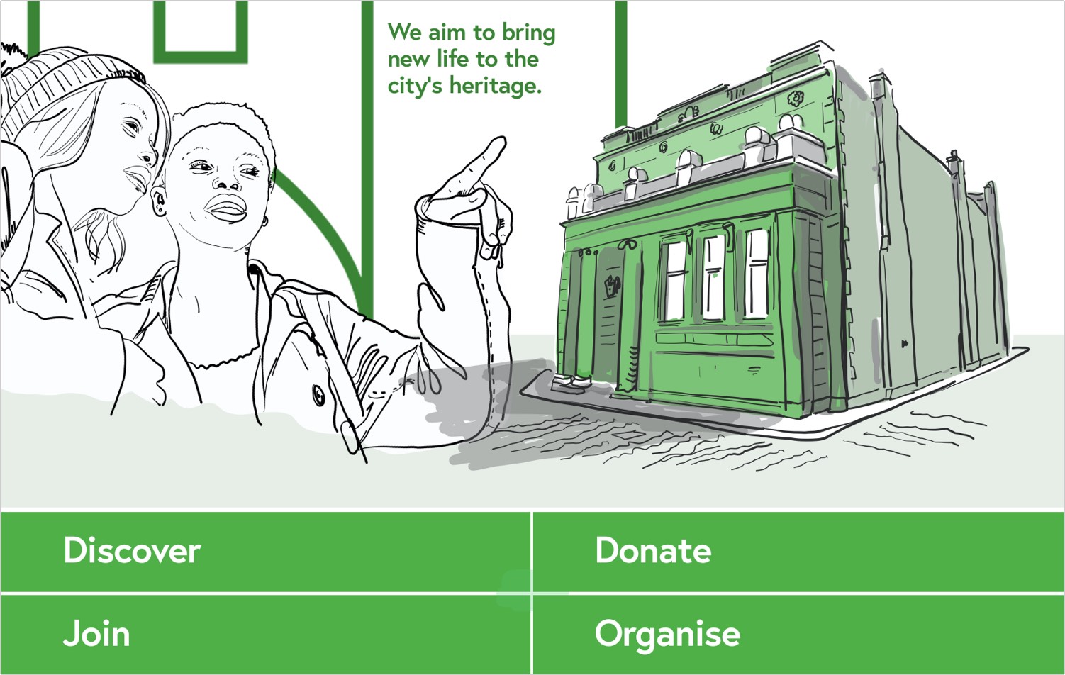
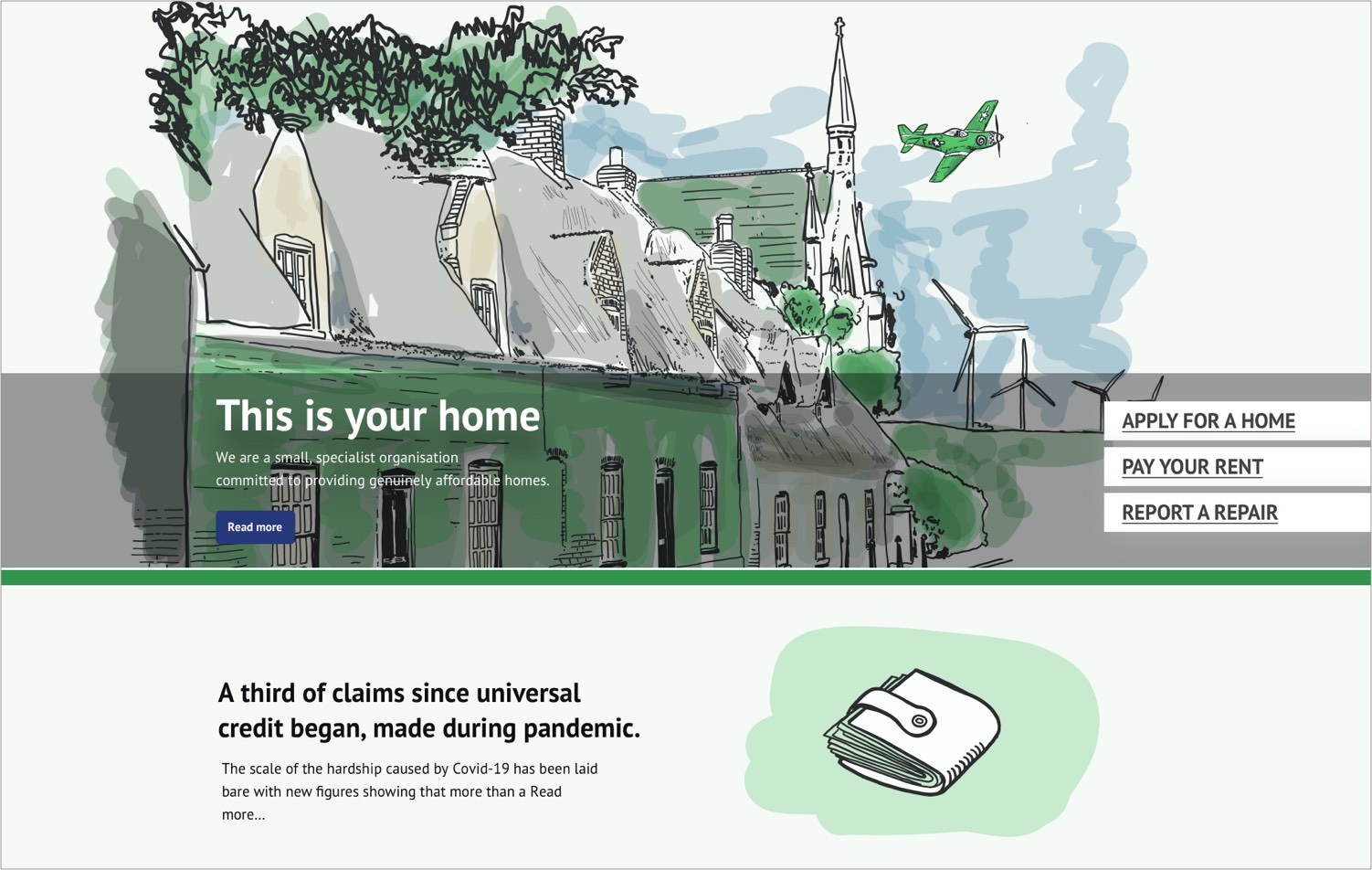
Your website is your most powerful marketing tool. And one of the first thing website visitors see is your hero image. It is a specific type of website banner, quite large and often impactful and even animated. It grabs the audience's attention and reflects your brand messages.
A good hero image offers a glimpse of what your business offers. It is at the top of your homepage and takes valuable real estate on your website. A powerful, warm and impactful hero image brings your homepage to life.
An impactful hero image can boost your conversion rates and impress your users.
The way your website is designed directly influences how a user feels about the site's brand. A meaningful, distinctive hero image, that has been aligned to your branding, can help to establish trust among new visitors and even convert them into customers.
It takes 50 milliseconds for users to form an opinion about a website. That’s why you need to make sure that your site is delightful. Using a hero image is a good way to ensure users can identify with your brand values and a positive online experience.
An example
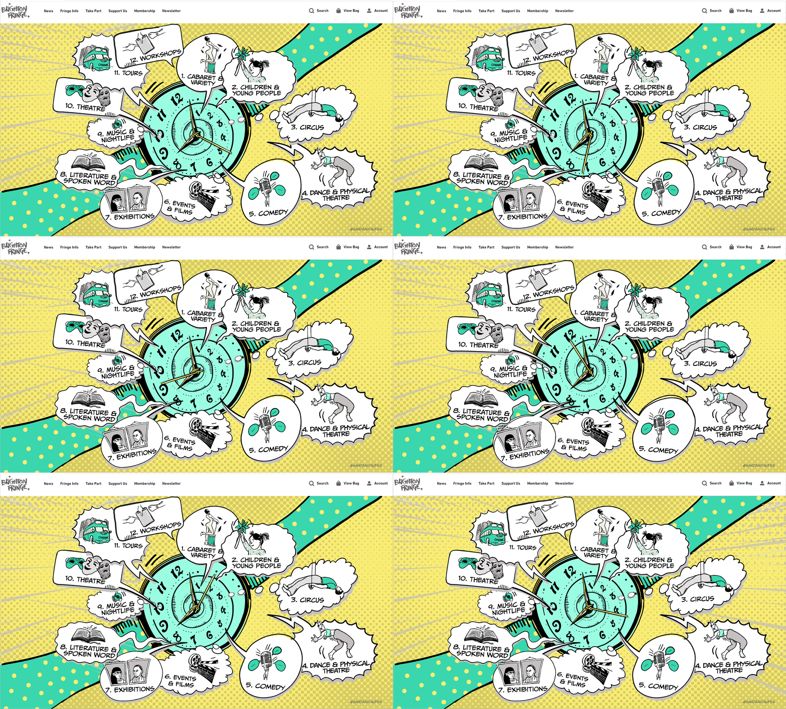
A hero graphic full of hope to provide core branding for the 2021 Brighton Fringe marketing campaign
Background
After 2020’s cancellation of the Brighton Festival and Fringe because of Covid-19, the world-famous Brighton Fringe Festival needed an engaging hero image to communicate that the festival is still as active and the organisation as creative as ever.
The requirements
Stepping away from its usual brochure-led branding, Brighton Fringe was on the hunt for an artist, to produce an engaging hero panel for digital platforms for its 2021 event. The hero image will be the 'shop window' for the organisation.
Outcome
Using a consistent brand identity for each year is critical for a good marketing campaign to help sell tickets. The audience will remember an impactful graphic and identity if with the organisation. It excites and engages.
Key benefits of a successful hero graphic
- Builds a strong digital brand
- Entertains, excites and engages people from all backgrounds and age group
- Reflects well, sits comfortably with, and boosts main event branding
- Improves an event’s online presence and raises awareness of its artistic range
- Provides a successful shop window for an invent, boosting ticket sales
The 'About us' page is one of the most visited pages on a website. Your customers want to know whom they are dealing with, what your story is. So it has to be a good one!
Don't miss the opportunity to show off your company to your visitors. Use this precious piece of website real estate to establish credibility and build trust.
The 'About us' page helps evaluate things like the size of your company, mission and vision, core values of the company, how your business came to be where it is today, but most and for all who runs the company. How you come across on that page is important for your brand. This page should be communicating more than just about your services, it should tell YOUR story and introduce your staff members, their titles and contact details. People love stories, and they are usually paying for the story rather than the product, so your 'About us' page should revolve around your story. Then make it easy for the user and offer 'good call to actions'.
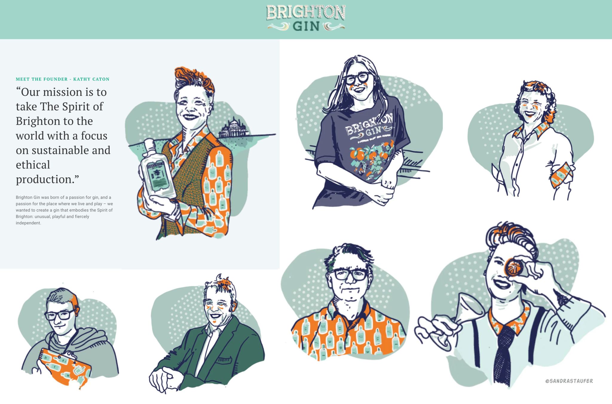
The About us / team page is a good place to introduce yourself and to show off a bit of personality.
Potential customers want to see behind the curtain and whom they’re dealing with, so it’s important to include pictures - or illustrations! But don’t just slap some old low res staff pictures on there that have no visual language and are poor quality. The pictures you choose are meant to build trust. Invest a little time on planning this page and make it special. You could use team photos too on this page or individual photos as this adds credibility.
But how can you make this a little different?
A personalised avatar is the best way to show some individuality and creativity. This will stick in people's minds and hearts.
You could even switch between photos an illustration occasionally but make sure you use a reputable photographer like @LaurenPsyk to get these done professionally. And don't mix and match!
Creating the right avatar to represent a person's brand may be quite a challenge, as it is so personal and long-lasting. But an 'About us' page with a difference will definitely help you stand out.
Below you can find some examples of styles for your avatars:
Bespoke illustrations are a powerful tool for audience engagement.
Your stock photos are crying.✨
Why? Because hand-drawn illustrations are out here stealing the spotlight. 🎨💥
They’re quirky and authentic.
Whether it’s posts, stories, or ads, illustrations make your content pop, feel human, and -bonus - get shared way more.
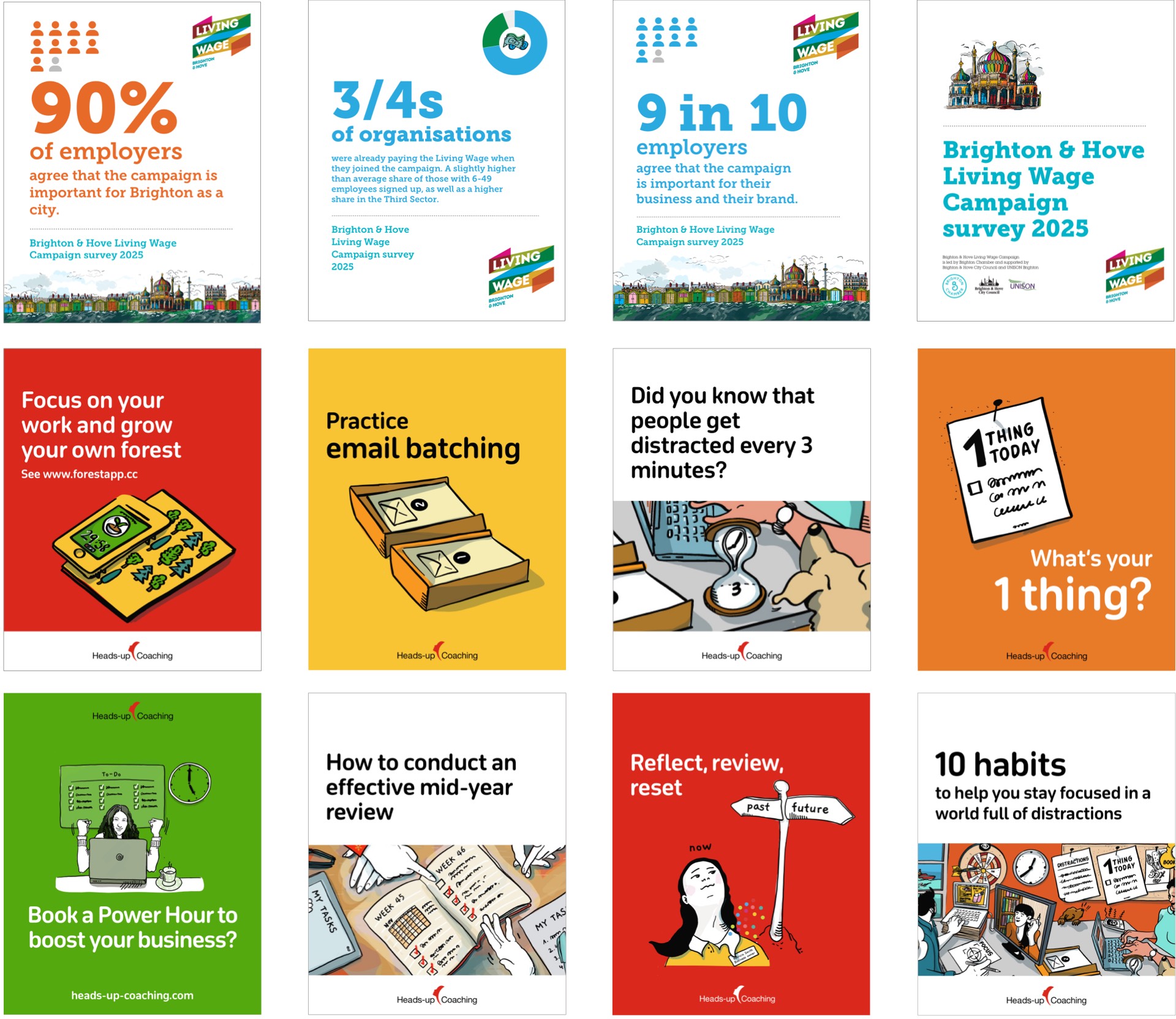
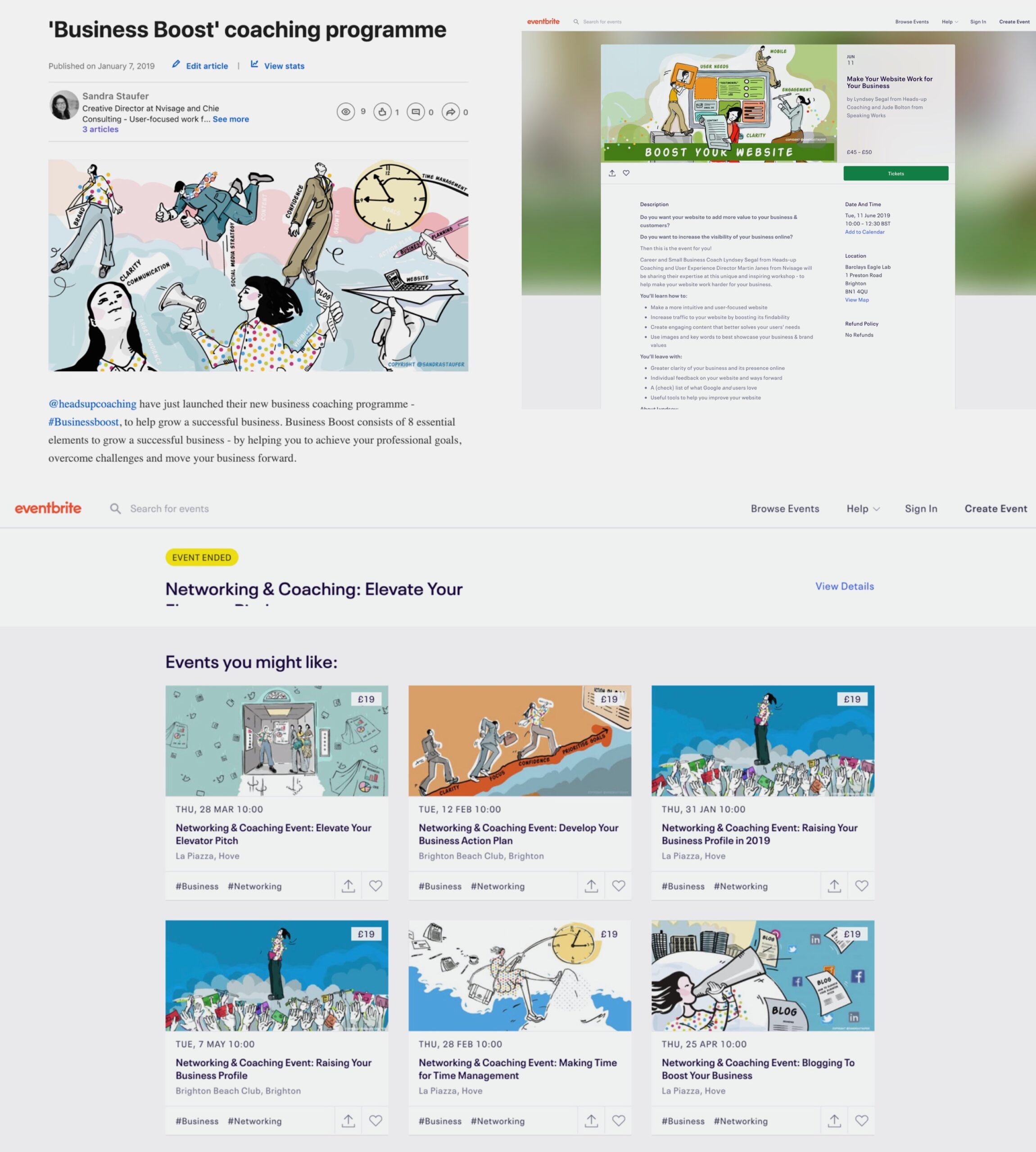
“Sandra is incredibly professional and possesses an extensive range of design skills, knowledge and expertise. I highly recommend her.”
Sandra has produced a wide range of bespoke illustrations for a series of events, workshops, blog posts and my website for my business coaching business. These have helped me to create a unique brand identity and stand out from my competitors.
Sandra is able to take a brief and swiftly create illustrations that bring a variety of business topics to life, communicating their messages clearly and distinctively.
Lyndsey Segal, Heads-up Coaching
Hand-drawn illustrations make social media content more dynamic, fun, and shareable.
- Stand out from generic stock images
- Add a human, relatable touch
- Build a distinctive visual identity
- Spark engagement - likes, shares, comments
- Convey emotions and stories creatively with hand-drawn elements
Examples: Social media graphics with a difference
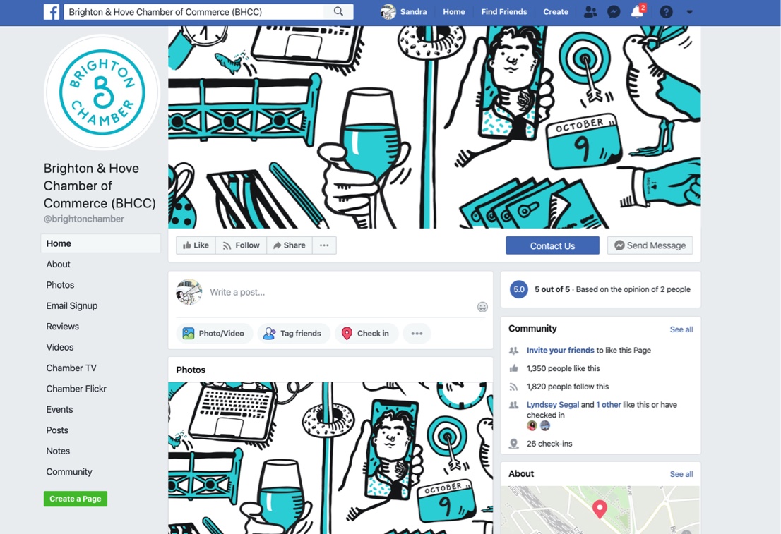
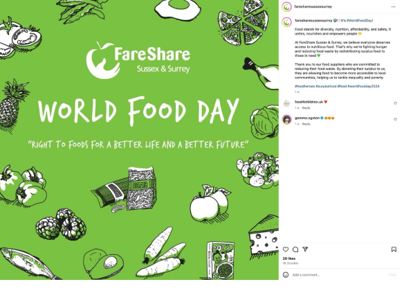
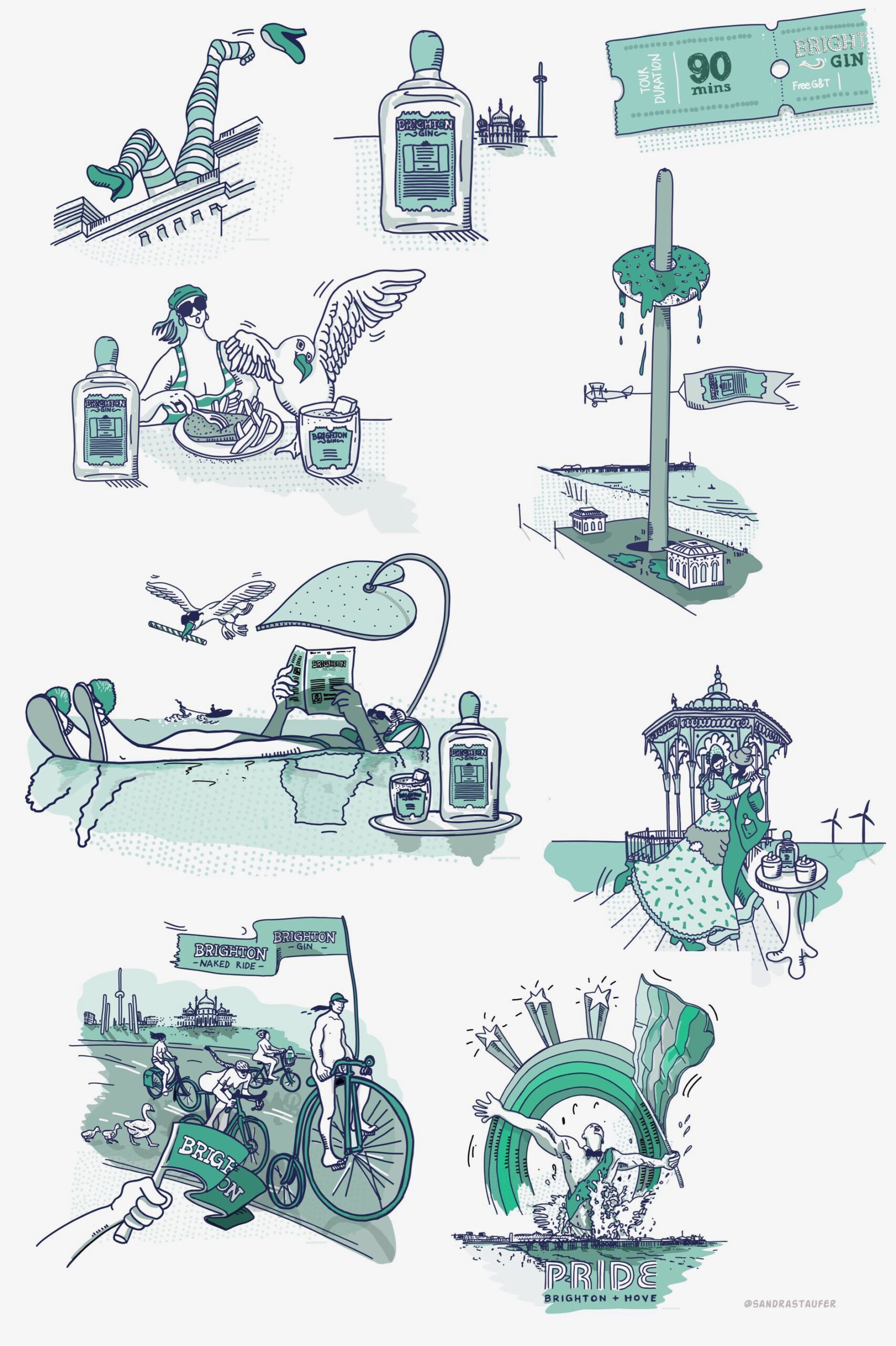
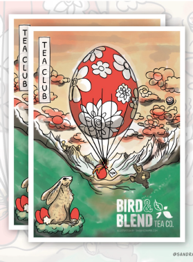
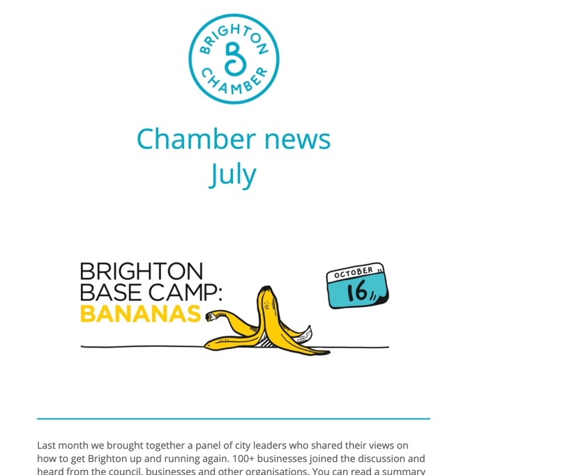
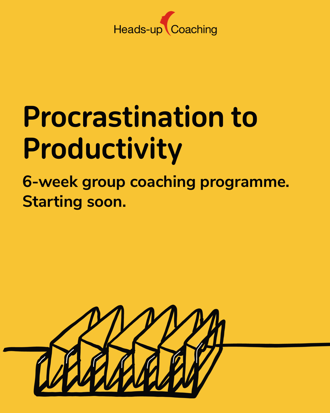
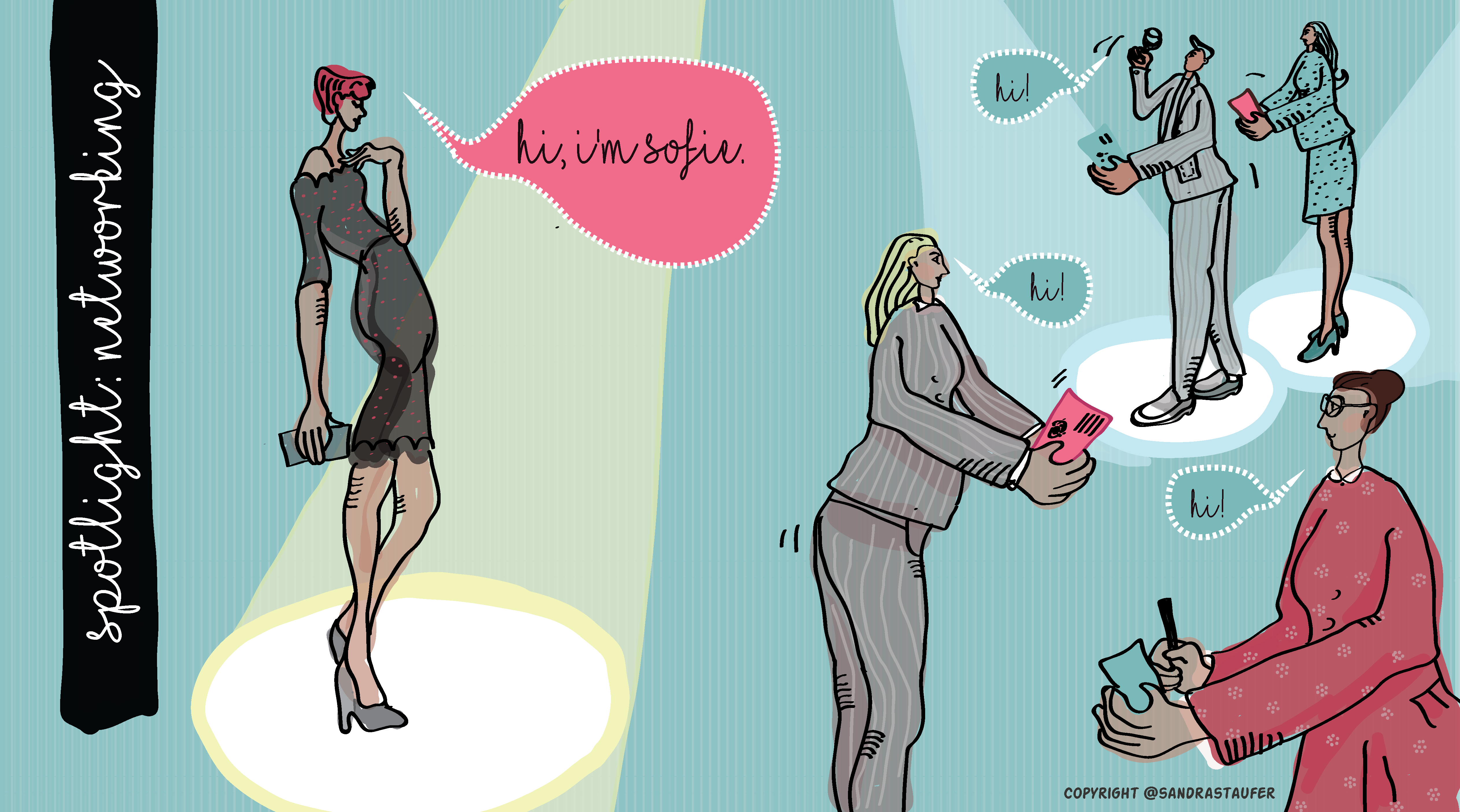
Ready to ditch the boring? Let's go.
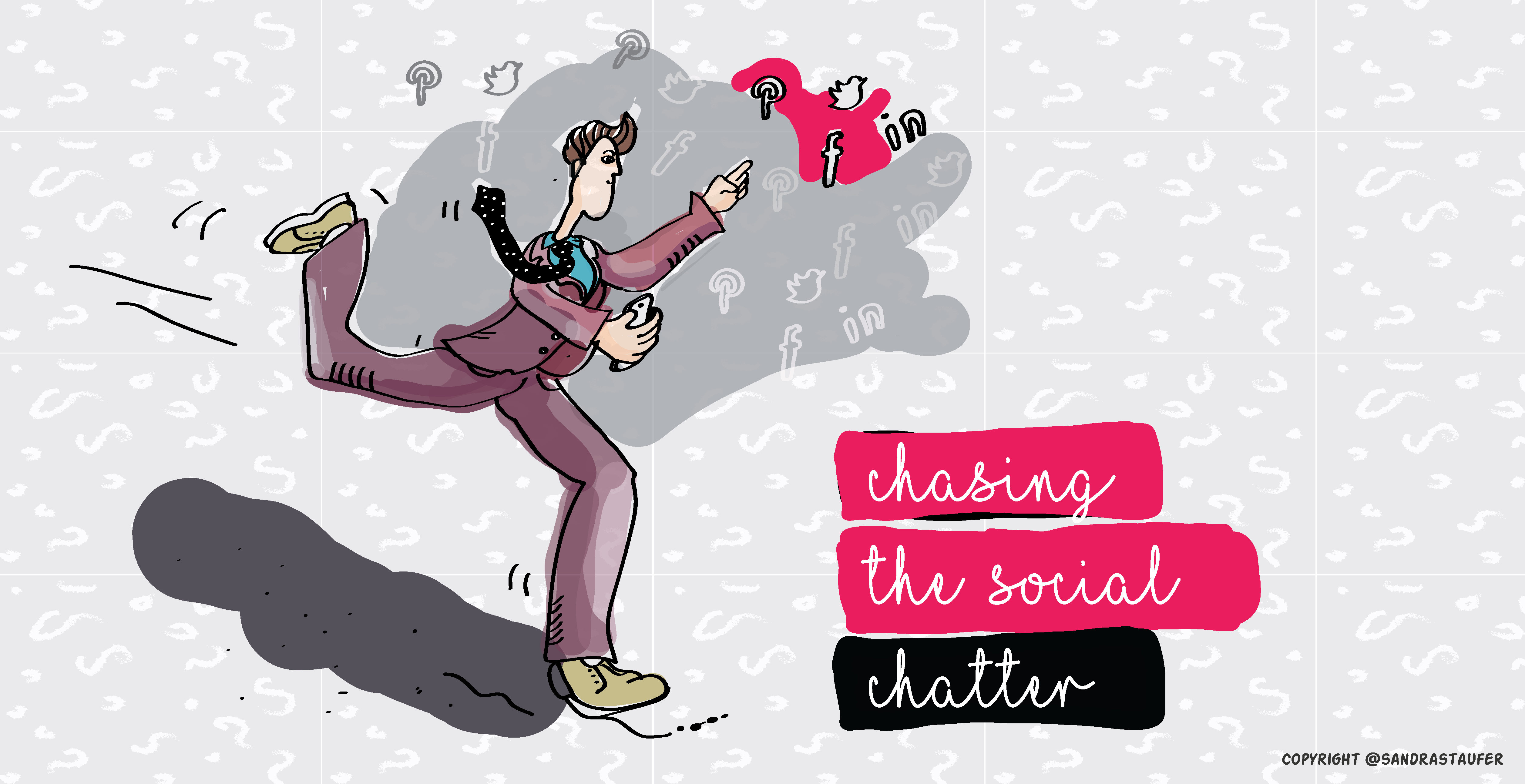
Just one of the exciting web and mobile UX trends: personal, hand-drawn illustrations created with care
New UX Trends show:
- Seamless, one-page sites
- Purposeful animation and motion design
- Animated empty pages, error pages, and confirmation pages
- Voice interaction, Voice UI/Screenless UIs
- Good UX copy
- Awesome typography
and
- Hand-drawn, More Personal, Race-neutral Illustrations
Telling a more personal story
More and more custom brand illustrations are chosen over stock imagery as people are a little tired of them. Using illustrations in digital design offers more versatility as they are adapted to the content and reflect the story more adequately. They are also scalable.
This UX design trend is also gravitating toward illustrations that are inclusive, i.e., race-neutral, and representative of people of all ages.
Personal, hand-drawn illustrations can represent a certain brand aesthetic and can represent a brand better, even become part of the brand assets. It’s about appearing less digital and more approachable.
So how can manage companies and organisation the illustration commission process?
Commissioning illustration is a skill. Finding the right illustrator for the task is half the battle: read and understand the article yourself and find the right look and feel of illustration style to suit tone. Then pick out particular visual cues and stories, and make them part of the brief.
There are many Illustration Associations and portals out there, where you can find portfolios, searching via tags and keywords.
Here some examples:
- https://theaoi.com/folios/
- https://brightonillustrators.co.uk/
- https://www.illustratoren-schweiz.ch/en/
to name only 3. Here is a useful Guide to commissioning
TIPS:
Choose the right style that fits and is expandable/ adaptable
Of course, it is essential to choose the right style, a style which conveys your brand correctly and a style which is expandable and can grow in the future.
You may already have a look and feel in mind, but it's worth compiling a mood board of different potential illustrators and styles before making an approach. Test some of their previous work in situ in your design if you can.
Illustration agencies can be helpful in bridging the gap and suggesting options.
Setting a detailed brief to manage expectations is key
A very tight brief is the best way to deliver the concept you need for the job. A totally blank sheet of paper can be a curse as well as a blessing for the illustrator.
Be clear
make sure your expectations are detailed, show examples and communicate do's and don'ts. Do that from outset, as illustration is a time-consuming activity, so creating storyboards, sketches etc are very important before letting the illustrator dive into details. Use references and stock illustrations to communicate the direction.
Be precise
If you want to establish a character for a brand asset, make sure that the tone of voice, the mission and vision, the personas etc are discussed in your brief. Make sure there this is clear and tell the illustrator to ask questions prior to commencing the work. Ask the illustrator to sketch and have a brainstorming session first rather than giving you finished artwork. Details can wait for phase 2.
Less is more
The illustration process can make everyone get carried away as it is narrative, but just like the graphic design, less is more. Keep the stories simple, make sure that the illustrations communicate effectively and ask the illustrator to simplify. But have fun with exploring the characters.
Value the work
Remember that drawing is a skill that takes time to develop, treat a piece of illustration as an artwork as it takes time, care and affection to produce.
Give positive and constructive feedback in the process as this will keep the illustrator on your side. This is especially important if you want to work with the style long-term, help the illustrator grow with the brand.
These are exciting times: Digital meets hand-drawn.
A picture paints 1000 words....
Many people find slides tedious.
You can grab their attention by using thought-provoking images.
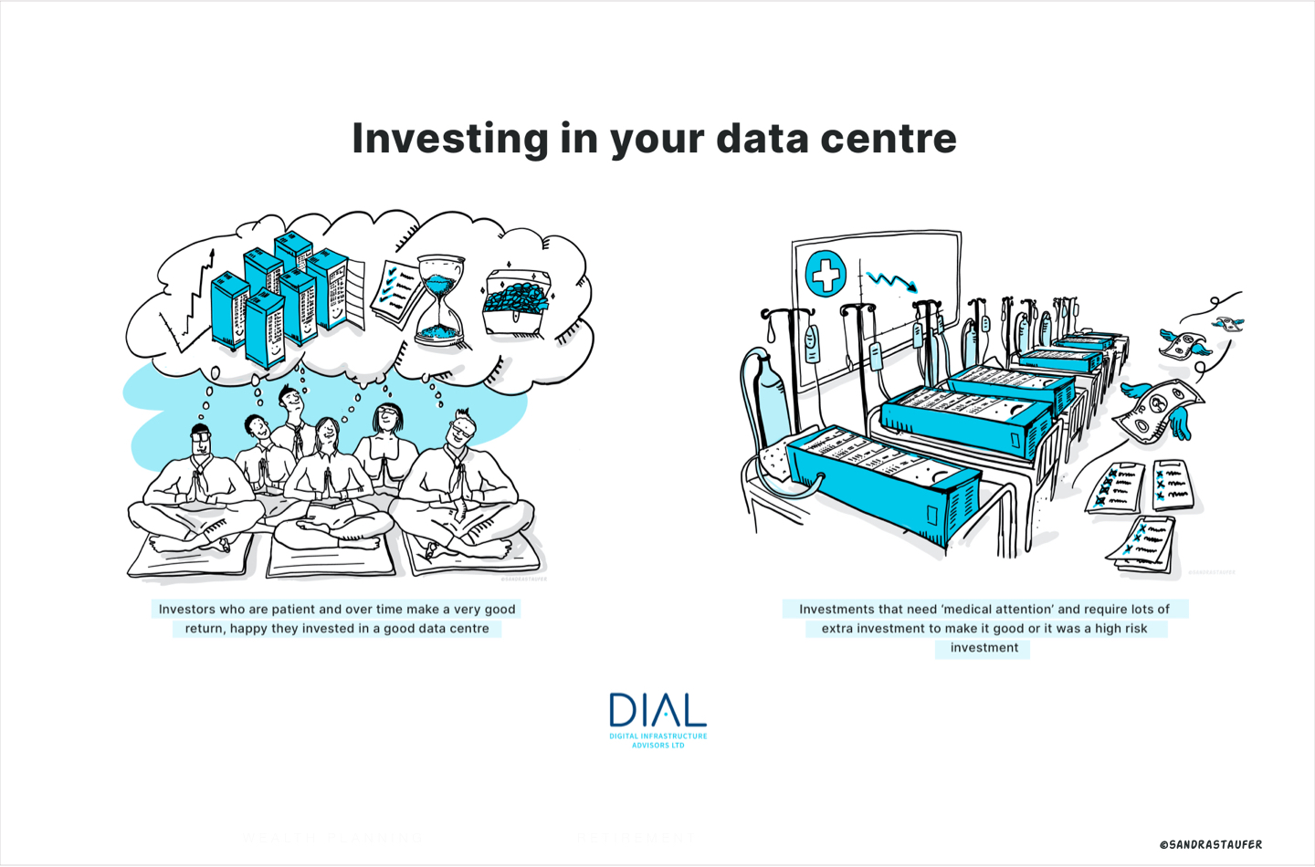
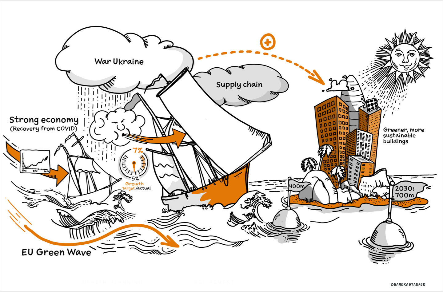
A few nice, friendly illustrations can help an organisation stand out from the competition and have a more profound influence on the audience, especially in a high-pressured environment or in a tender process.
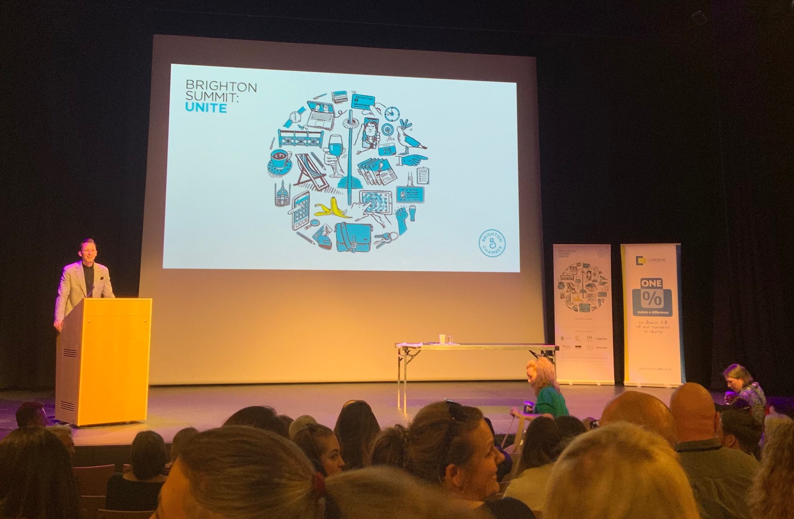
Illustrations can enhance a workshop or a presentation and grab the audience’s attention. They add power to the messages you are trying to convey and help focus on effective client communication.
They can complement what the speaker is talking about to create an understandable and simple connection between content and speaker. It also shows your audience that you made an effort.
Personalise your tender proposals and stand away from your competition
For a tender design especially, it's critical that you stand out above the competition and clearly show the potential customer that you care and that your proposal is unique. Reading a document with creative, humorous assets would create a better experience and will certainly help the reader remember your proposal.
Presentations and tenders are often required with a quick turnaround. So is a personal illustration style the right way forward? Well, that depends on the style of illustrations, of course. A life-sketched 'hand-drawn' approach, for example, is quick, effective and spontaneous. Let us not forget to add a pinch of humour or sarcasm if allowed, as this will definitely add a 3rd dimension to a presentation.
Make your event stand out
Standing out from others isn't always easy; especially when the user hasn't much time, such as here, on this events portal www.eventbrite.co.uk/; a nice personal illustration makes your event stand out.
Let's have some fun
My illustrations style is very suitable for quick turn-round PowerPoint presentation projects, a tender proposal or a blog. I am are happy to fulfil one-off projects or commit to a monthly subscription e.g. for a monthly blog.
Stock imagery VS bespoke illustrations
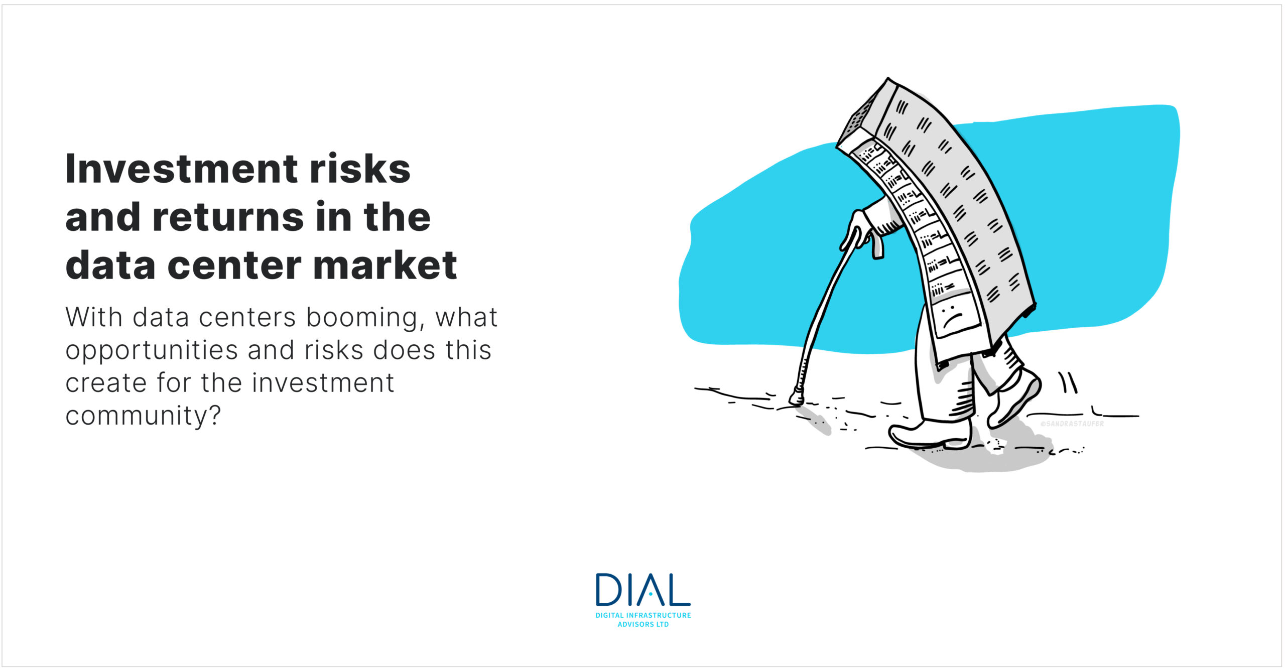
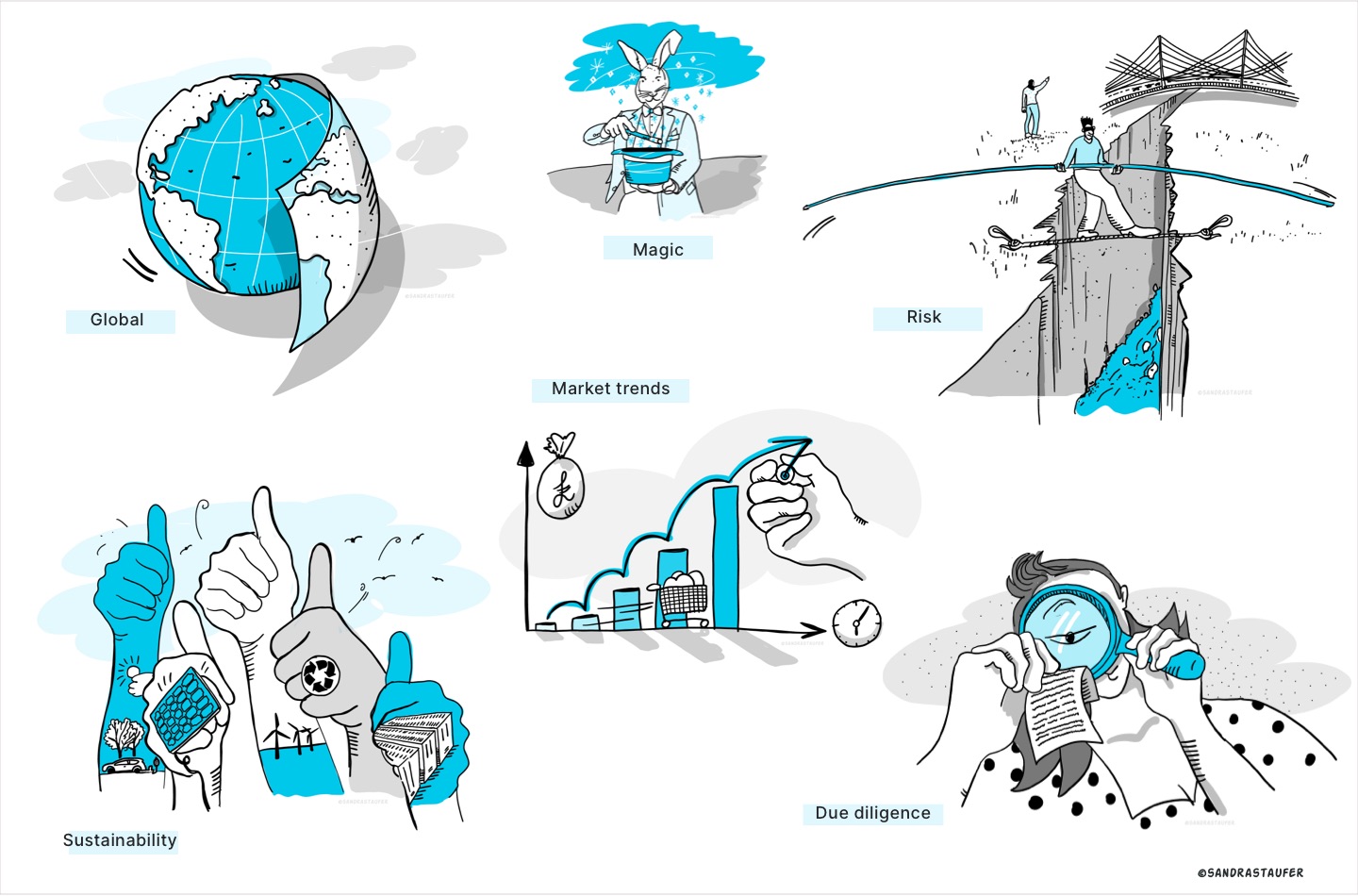
The web is full of stock images and marketing departments are often tasked with trawling through stock libraries to find appropriate visual assets and icons for presentations and blogs. This can quite easily be inefficient and time-consuming. Furthermore, the outcome can be a mixture of unconnected visuals which do not represent your brand's organisation cohesively.
Choosing an illustrator to produce a library of assets that can be reused for your PowerPoint presentations and blogs is a compelling way of communicating a coherent brand message. It will certainly take away the pain of finding assets yourself. Each illustration should be designed to enhance and clarify your message.
The important thing is to maintain a consistent visual illustration style that represents your organisation well. Illustrations will be an exact match to your story and can equally become part of the organisation's design system (perceptual patterns).
A picture paints a thousand words. Illustrations are like the glue that helps hold the attention of the audience or the reader. By doing so, they will unconsciously gain a better understanding of your topic. A large part of our brain is devoted to visual processing. Because of our impressive ability to take in and process optical elements, we’re able to understand an idea much quicker if it was conveyed using visuals. Especially when the user hasn't much time, such as here, on this events portal www.eventbrite.co.uk/; a nice personal illustration makes your event stand out.
Personalise your tender proposals and stand away from your competition
For a tender design especially, it's critical that you stand out above the competition and clearly show the potential customer that you care and that your proposal is unique. Reading a document with creative, humorous assets would create a better experience and will certainly help the reader remember your proposal.
Presentations and tenders are often required with a quick turnaround. So is a personal illustration style the right way forward? Well, that depends on the style of illustrations, of course. A life-sketched 'hand-drawn' approach, for example, is quick, effective and spontaneous. Let us not forget to add a pinch of humour or sarcasm if allowed, as this will definitely add a 3rd dimension to a presentation.
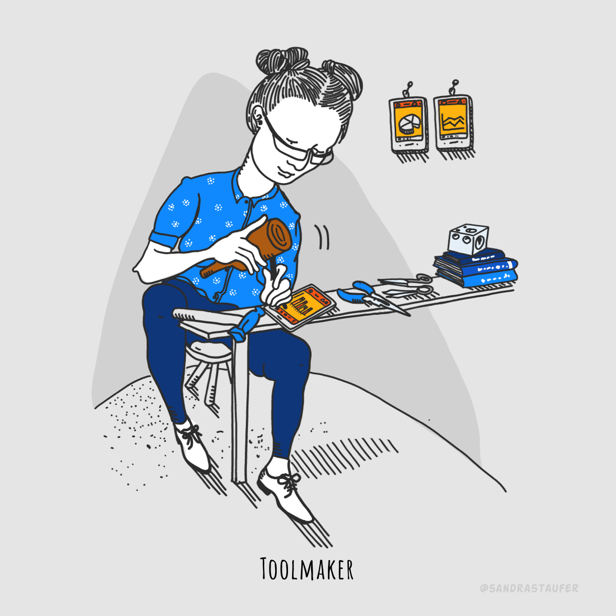
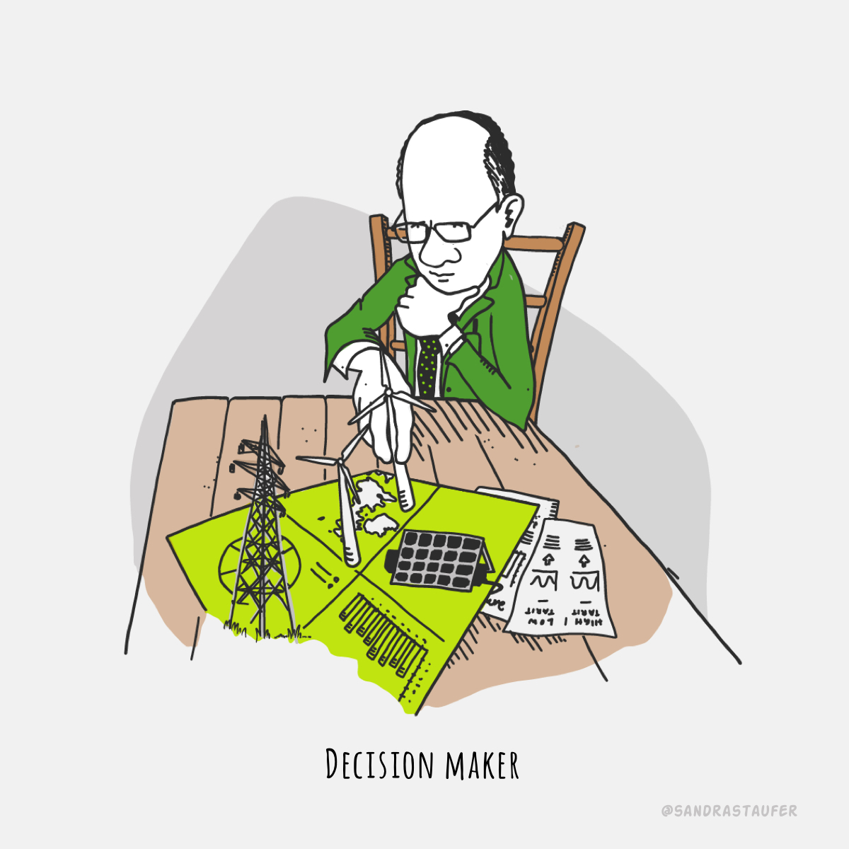
Illustrations help your presentations and blogs be more effective, personable and memorable.
Let me help you with a presentation that's a little different; a presentation that keeps your audience engaged.
Related Content you might be interested in:
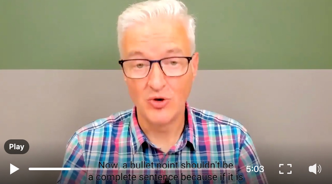
'666 rule of bullet points'
by Steve Bustin, Public Speaking Coach
"The penultimate video in this current Preparing for a Presentation series is about bullet points in your slides (if you're going to use slides, that is!). If you really can't avoid using them, I share my top tips for best practice."
'10 Presentation Aids To Enhance Your Presentation'
You’re putting together a presentation and you’ve considered using presentation aids but don’t know where to begin?
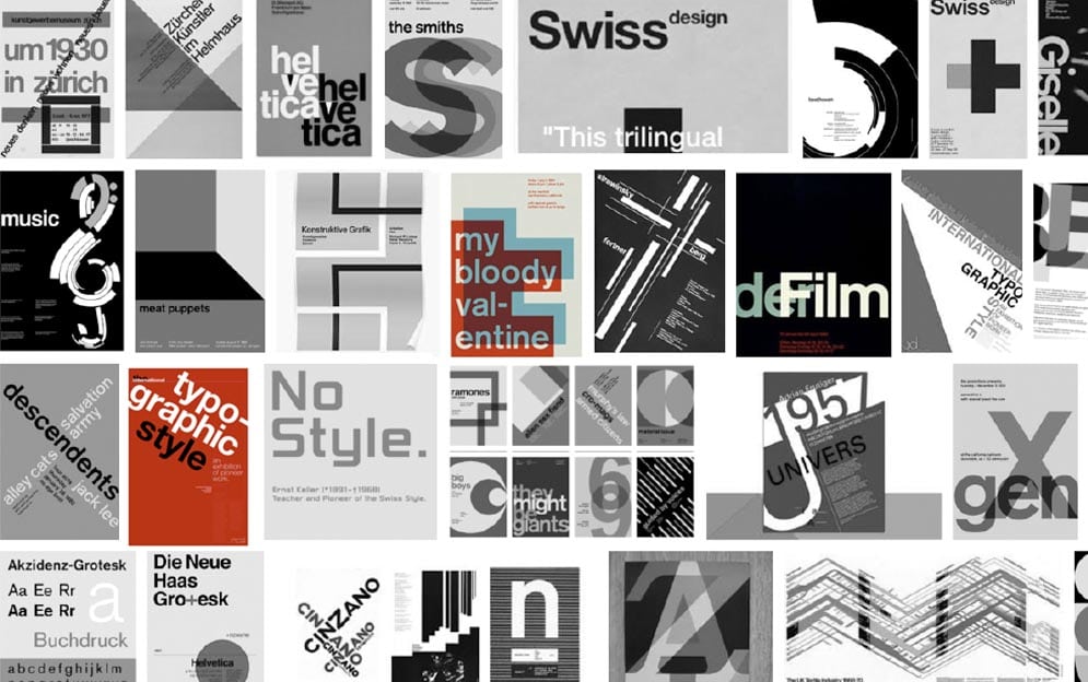
Current trends in comparison with the 'Swiss International style'
Just recently I thought to revisit the great and good typographers of the 'Swiss Style'. As trends focus on reducing the number of tasks - but executing them as flawlessly and frictionlessly as possible - it’s never been more important to get the foundations right.
Those guys really knew what they were doing with the simple ascetic! Swiss graphic design enjoys a worldwide reputation for legibility, cleanliness quality, strong concept, formality, objectivity and precision.
Often referred to as the 'International Typographic Style or the International Style', the style of design that originated in Switzerland in the 1940s and 50s was the basis of much of the development of graphic design during the mid 20th century. Led by designers Josef Müller-Brockmann at the Zurich School of Arts and Krafts and Armin Hofmann at the Basel School of Design, the style favoured simplicity, legibility and objectivity.
Emil Ruder played a key role in the development of graphic design in the 1940s and 50s. His style has been emulated by many designers, and his use of grids in design has influenced the development of web design on many levels.
So why did I feel this reconnection was necessary to advance my design work? As Maslow’s Pyramid identified, creativity and purpose are at the top of the hierarchy of needs. In daily design works, designing for clients, creativity and purpose can sometimes take lesser of a place over profitability and business success, speed of throughput etc. I needed a bit of creative injection and remind myself why these fantastic typographyers and graphic designers in the 'Swiss style' period found it necessary to simplify, to create art with typography and graphic design, to create works that achieved longevity.
As a web designer, I often feel squeezed and made to use UI patterns and templates to save time, and this can be frustrating; a good creative long concept phase is invaluable, where I can get my creative juices to flow, where I can ask the client for the real purpose of a redesign (Good video: Why Some Designers Are More Valuable Than Others,). Often there simply isn't the budget, or the client doesn't see the added value which is a shame (Good video: How to Respond To Price Buyers or Low Budget Clients - Roleplay).
‘Mobile first’ has shown the desires of users to do their thing and get out. The app like attributes of laser focus on the key task free from distractions. This has pushed a focus on being concise and clear and making sure that clarity is consistent across platforms and channels. The hyper-competitive market dictates the simplifying of the interface to serve up the best user experience.
Hence it is critical that individual design elements have been crafted with precision and utter simplicity to be able to carry the messages and journeys without distraction. I welcome the trends where we simplify fonts, use much more white space and allow the design to breathe which then best communicates the message. I love it.
The great 'Swiss Style' designers created visual communication which in their simplicity achieved attention and unchallenged presence. The design principles of the international style are still relevant in today's web design, and I am happy to recognise that most of the trends for graphic design in 2018 reflect these principles:
- clear organisation of the elements on a grid
- hierarchy to achieve a good composition
- figure ground (the visual separation of design’s parts, the relationship between dominant and less dominant design assets, or between foreground and background, negative space / positive space etc.
- symmetrically or asymmetrically balance to establish harmony and to create a more dynamic composition
- contrast to create visual tension, colour type weight, or scale, tonal values etc
- scale
- proportions
- cropping
- pattern
Philip VanDusen (Verhall Brand design) analysis of graphic design trends for 2018 showed a very close parallel to the 'Swiss International Style' design and typography masters - and how relevant graphic design still is. I clearly see that the trends are taking forward the international style designs principle, whilst reflecting on the Swiss Style masters. Even if some of these trends do not necessarily reflect simplicity, they are based on good organisation and contrast, good hierarchy, symmetry & asymmetry as well as considered proportions.
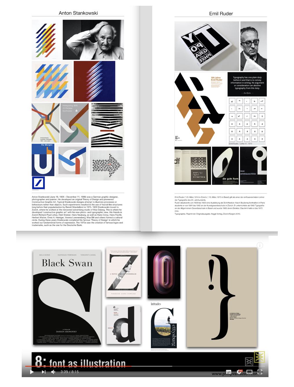
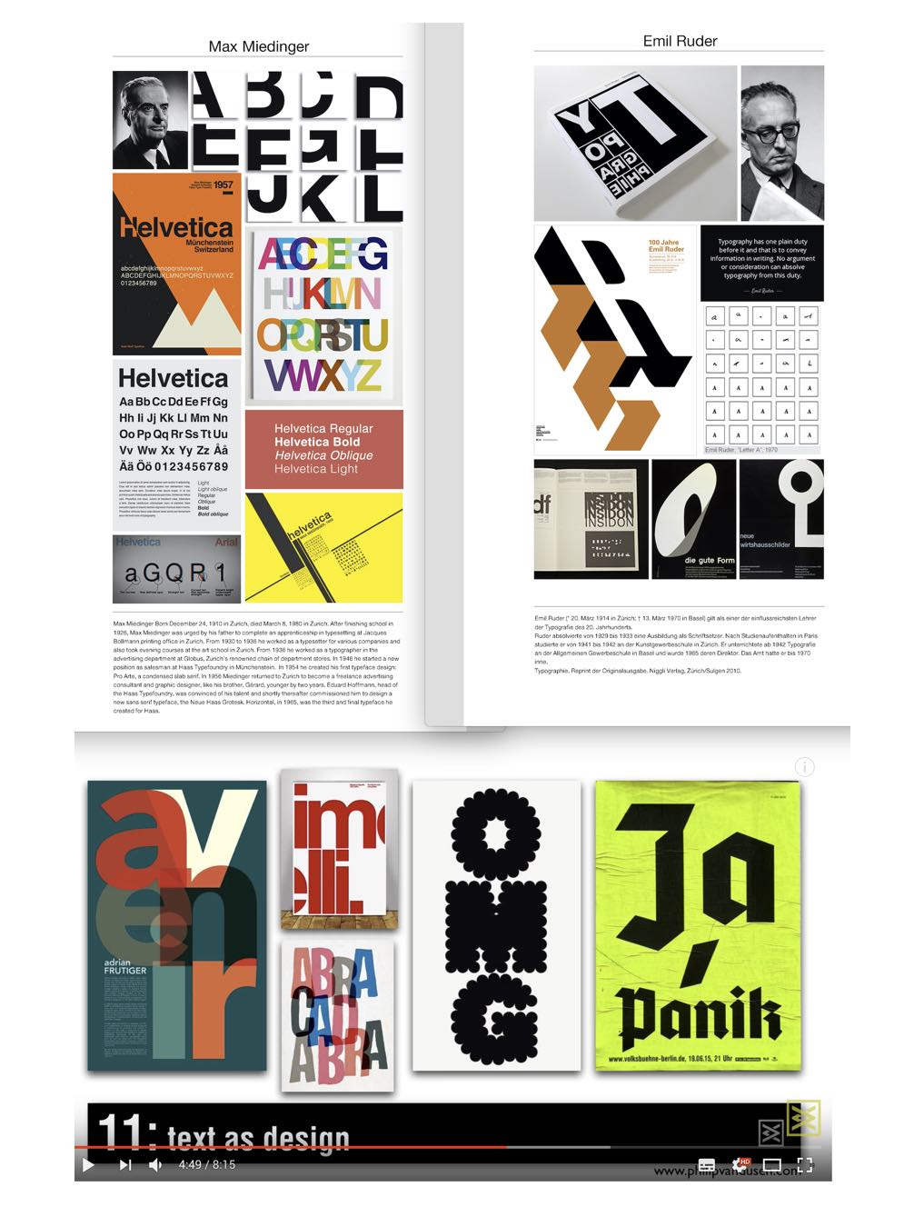
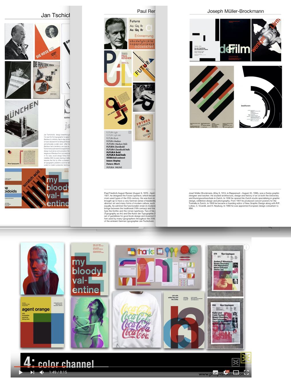
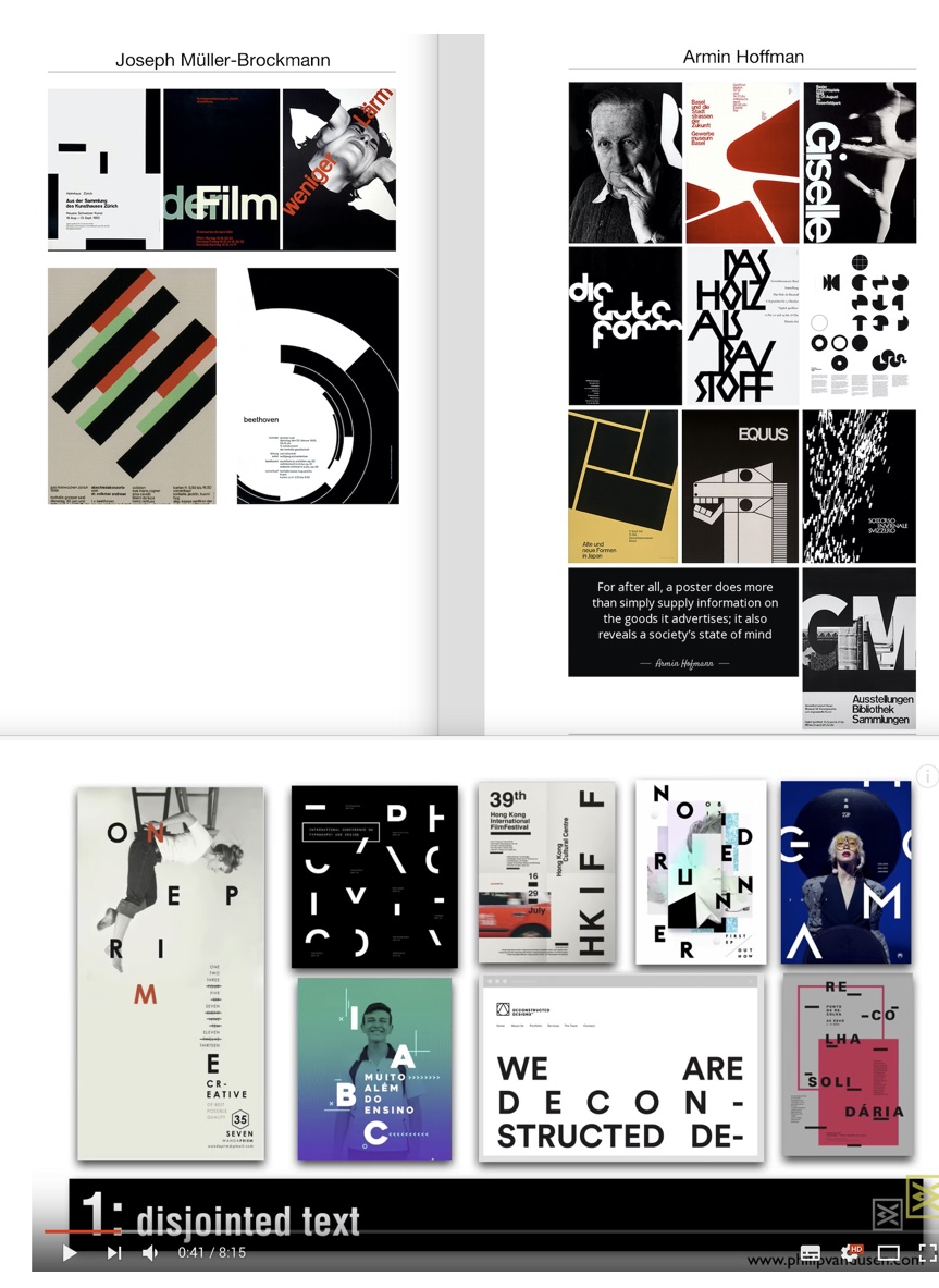
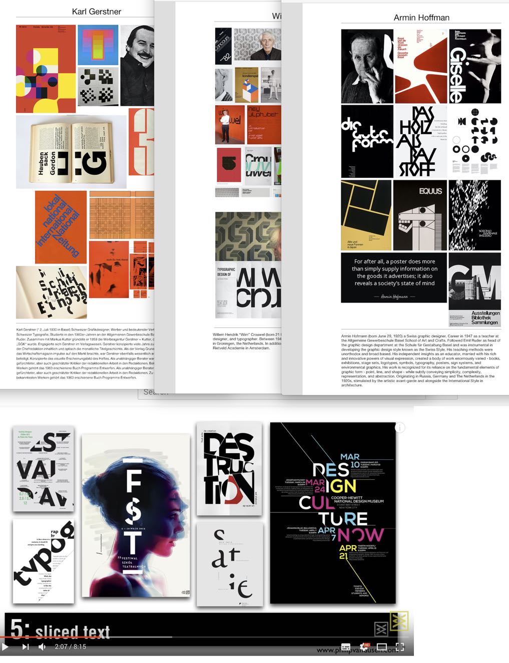
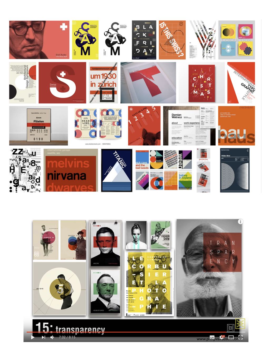
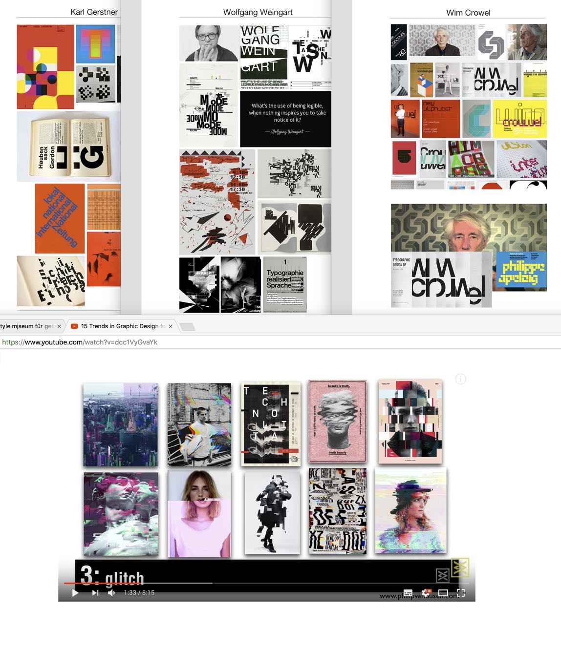
I hope you liked this little comparison exercise, and as we know other trends for 2018 suggested bigger and bolder creative typography in general, use of fonts in different compositions, double exposure effect of images, vivid colours, (examples Youtube mark, spotify logo) for dimension, geometric shapes and patterns.
Conclusion
After years of visual opulence, the ‘Swiss International Style’ and its simplicity is again in demand, especially for infographics and typography used in the digital and printed media. What I really like though is in the trend of making our designs more concise, simple and usable, we are looking back at designers from simpler times for inspiration. Ironically it is they who are bringing sense, meaning and most of all impact, to these incredibly complex and challenging times.
So now more than ever graphic design is utterly relevant and essential and we can truly learn so much from these masters of their craft.
___
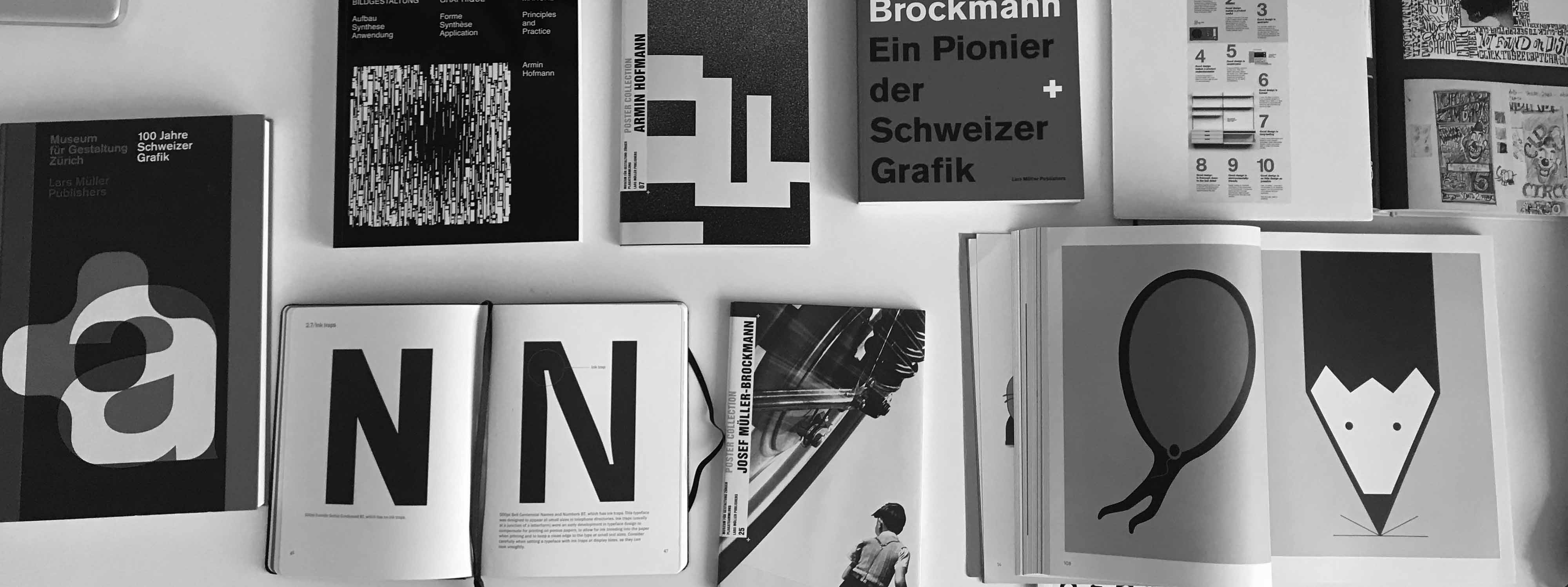
Books I am currently reading:
- Graphic Design Manual: Principles and Practice by Armin Hofmann
- Josef Müller-Brockmann: Pioneer of Swiss Graphic Design
- Poster Collections: Armin Hoffman
- 100 Jahre Schweizer Grafik
- Type Matters by Jim Williams
___
Timeline:
___
Resources:
- Design is History / Swiss Design
- Famous graphic designers / Emil Ruder
- Design principles & the international style
- 15 Trends in Graphic Design for 2018
- Graphic Design Trends of 2018 | Are They Important?
- 5 HUGE Graphic Design Trends in 2018
“When you have once touched quality, you’ll never forget it.”
Armin Hofmann

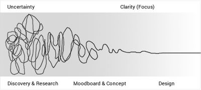
Getting a web design project off the ground is exciting for designers as well as for clients. Navigating through that process can be intimidating too, as there needs to be much discussion about scope definition, budget, timeline, legacy content, usability, sitemap, etc. Most importantly, it is critical to establish what the client actually defines as a 'project success'; the client may not be able to articulate it, but together you must have a discussion about what this means to all members of the team. In this blog, we are examining a web design project path, not looking at the commercial or schedule restrictions, but suggesting a linear approach from discovery to design 'sign off'.
Getting to know the project team
Set aside some time to get to know the team members on the project, your client, any other stakeholder and any third party contributors; learn their strength and weaknesses, as good communications between the stakeholders is key to the success of a project. Learn the expectations of each team member and make sure you understand the expectations for the project.
Ask questions, don't hold back
From outset ask the client if they submitted all the information they keep, such as user-testing survey results, insights etc. The client may not think this information relevant to a web design project, but it is. Gather all the project assets such as brand guidelines, logos, visual communications documents and discuss any legacy problems with the online branding, taxonomy and a good amount of web content etc.
Ask the client the following questions:
- What are the main business goals and priorities for the website?
- What is the value is of the redesign? at this point in time?
- What are the user needs?
- What are the brand needs?
- What about existing user research?
- Has any user-testing on the current website been undertaken?
- How will the success of the project be measured?
- Is the online marketing sorted?
- And what other marketing materials and campaigns are there supporting the new website?
Request some examples of likes and dislikes and ask them to qualify these examples. Discuss the design of a new logo now, if that is required as this may change the timeline.
Needs VS Wants
Most clients think that their website should be a tool for all people. Needs will make a website successful, Wants are all things that can be done with the website, the latter will lose focus. It's so important to focus on needs and to establish early on the MVP, the idea being to provide the end user with something that offers just enough to satisfy their main desires, and nothing more. You can also read more on How to Build an App MVP here.
Research, and read the brief
Take time to research the client. Undertake a Discovery in focus groups on site, so you know what and whom you are dealing with. Get to know the competition and their approaches. Look at trends and standards. Read the brief, twice, three times. Don't read into it. Ask the client to explain the brief. Sit with your project team and create a list of priorities to answer the brief, establish the milestones within the design process. If there isn't a brief, help the client write a brief, it is the only way forward.
Here some questions to help establish the design brief:
- How do you want people to feel when they come to your site?
- Look and feel: Evolution or revolution?
- Message objectives/hierarchies?
- Colours, logos, branding, fonts etc
- Dos and donts?
- Magic wand / wish list?
__
The Discovery
Understanding the audience and the 'jobs-to-be-done' - don't make assumptions
Get to grips with all the question relating to the user/ audience, and don't make assumptions. To design well from outset use JTBD to focus on the job that people are wanting to do, rather than the attributes around that person. Learn about the user motivation, the situation they are in and their pain, anxieties which may make them struggle to interact with the website and complete a call to action. (Example: When I am sitting at my desk, searching for a new sofa - (Situation), I want to see the images clearly together with the prices - motivation, so that I may compare and purchase the product with that knowledge - outcome). A wireframe tool such as Axure may help for this exercise.
“People don't want a quarter-inch drill, they want a quarter-inch hole.”
Theodore Levitt
Content first - tell the story
Content drives the traffic and engagement, and this intern drives the user to act. It is important to have a vision of what the website could/should look like, however, it is more important to think how the design can enable the content, to make it accessible and appealing to the user, so that she/he can interact. Voice and one are critical, a good story allows better reading, and the story is important in the description of the vision, description of services or products, and conveying the feel of the brand. The words are the tool that shapes the design, as different words on a call to action, for example, create a different experience.
Set some design standards and respect web standards too
Discuss with your project team the web standard that now has been established, talk to them about good design standards and why it is important to establish these from outset, as they help with the outcome. Identify the 'sign off authority'. And do not allow 'design by committee'; make sure that everyone in the team knows this is a recipe for disaster. Focus on the end product (everyone wants to have their most important bit on the homepage), and assure that this is managed well, help with the internal politics, always bearing in mind what you actually want to user to achieve or do.
Keep it simple - mobile-first approach to help with difficult designs decisions
If you keep the navigation simple for mobile for an optimised user experience, this will translate well into the desktop design. Help the user to navigate intuitively. A good prototype tool such as Invision helps establish the user-journey and test with the client how the user interacts on all platforms. It helps answer many questions at outset and helps you think about the engagement with the content.
Be creative and coherent
Even though designers don't like it when clients say 'just be creative', as this gives no insight into what they actually envision, it is important to think outside the box, to experiment and to be creative. The project assets may set the direction clearly but this is a good time to also undertake a 'wild card' design to make the project team think. This allows to test the brand messages and align the online presence. If possible allow a bit of time for this creative process within the timeline, as especially if you are establishing a long-term partnership with this client, the outcome of this research could be used at a later stage for inspiration, and it is a valuable investment.
Coherence is important as it asks for reasoning for every design detail. It means talking to the user in a similar tone across the User Interface. It means following the key brand elements but being creative around those.
All members of the project team need to understand why design needs to work well...
... and that the design needs to be agile enough to allow for content changes. Pretty pictures are nice, but the content editor needs to have the right tools to create engaging content blocks. Discuss with the editor what content component they require, and this may drive a big part of the design process. Maybe even show the client early how the content management system works, as this will give them an insight into your design decisions.
Reviewing the design
Reactions to initial mood board and designs will always be emotive, everyone has an opinion about design. Make sure that even early the design is critiqued against the brief, and that your client remains within that framework, as it is easy to go off on a tangent, looking at hundreds of other websites they may also like. Remind the team of the objectives and focus on what the website needs to achieve, the designer can then find good design solutions. An interactive prototype may give the impression of how the website will feel like, recently we have found though that people focus too much on the detail of that user-journey. We suggest that this phase is critical, but at the beginning where we are trying to establish a look and feel, and for the client to commit to that, it may be easier to keep it simple and show flat design with certain components such as a mobile menu or a highlight box indicating the functionality within the look and feel. This can then be signed off by all stakeholders, and the project team can then embark on the details of the user-journey in context of the next design phase. Because design is all about detail.
Test early to help with conversion
It is easy to get excited about a first direction and to continue with it too far, without testing it with users. A prototype tool and Chalkmark testing period is great and gives good insight on task-oriented success rates by getting quick feedback on design decisions and any assumptions made. In the project, schedule plan allows time for this, as after the build it is too late to incorporate essential findings.
A design doesn't need to be complicated - the case for white space
We don't need to create something beautiful to be effective, but a good design makes it easier to use and appreciate it. Combining pretty with useful is the aim. Keeping a design simple requires skills as the right design decisions need to be made on what is really necessary and what is clutter. In interaction design, white space or 'negative space', refers to the empty space between and around elements of a design or page layout. It is often overlooked and neglected. Designers believe in using white space for elegance and ensuring a quality user experience. Unfortunately, not all clients appreciate the need to allow for this white space. The trends, however, are changing, and we welcome this trend as white space is a powerful design tool which can focus content.

Interpreting the design feedback
Again it is important to outline the objectives of a design review, and in most cases that is to find the long-lasting overall design direction for the organisation. 'I don't like it' must be the most useless sentence in the history of design. It may reflect the observer's opinions, but learn more about what’s not working for a client and that will give you more steer for the next design stage. It is a fine balance between imposing a design opinion, listening to the client, and adhering to design standards. Reminding the project team of the project objectives may avoid a discussion about design details. It is the project manager's skill to lead this discussion carefully and making sure that each project team member contributes feedback relating to their expertise. This is of course never easy. Best to offer designs in batches, and building up the blocks, so for example, design a mobile homepage with navigation first and then test how this translates into desktop and other platforms and adjust the design process accordingly.
Make sure the design is signed off
Achieving a design sign off can be a drawn-out process, but it is important, as it aligns the project team with the objectives of the project, and acknowledges that all questions have been asked and answered. Of course, that is the theory, in practice, many more questions will come when the design is coming to build when content is entered, but it feels like a good milestone for the team. And of course, it gives the designer the affirmation that the client is happy with the design and that in case there are any changes all parties are aware of the implications.
Conclusion
In theory, this process can be linear, but usually, it is not, because people's opinions and personalities affect the project flow. Each project brings different challenges; one of the biggest challenges for us is to focus on that objective (on the hole to be drilled) and to try to convince the client that it is worth taking the time for a good discovery and enough time for the design phase, as the outcome will reflect that investment.
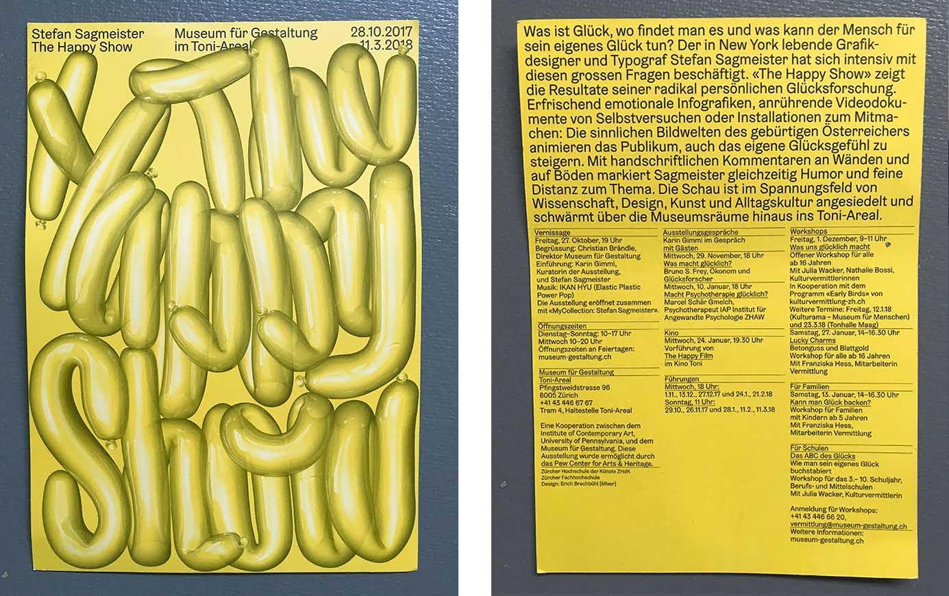
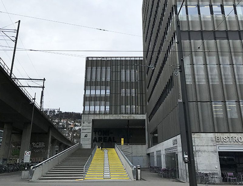
Stefan Sagmeister - The Happy Show - Museum für Gestaltung im Toni-Areal - and a ‘Fasnachtschüechli’
- "What is happiness, where can one find it and what can man woman do for his/her own happiness? The New York-based graphic designer and typographer Stefan Sagmeister has been working intensively on these big questions. 'The Happy Show' shows the results of his radically personal happiness research. Refreshingly emotional infographics, moving video documents of self-experiments or installations to join in: the sensuous imagery of the native Austrian animates the audience to increase their own happiness. With handwritten comments on walls and on floors, Sagmeister simultaneously marks humour and subtle distance to the subject…’ 1)
So I went along and took advantage of the ‘power of time-off’. In the long run, we all want to find happiness, don’t we? At this point, I was quite sure that I had quite a good steak in the happiness pie, and I took this as a chance to test my assumptions.
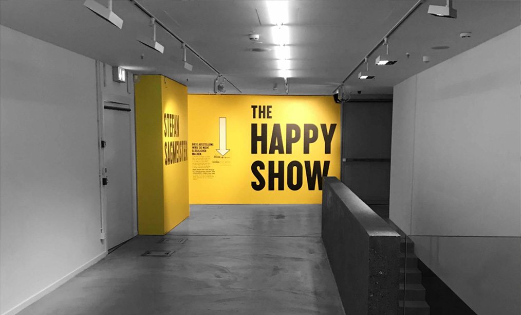
I always enjoy a visit to the ‘Museum für Gestaltung’ and the Toni Areal, as I myself once attended the ‘Vorkurs’ (Foundation) in Zurich, and I have extremely fond memories of drawing alphabets, studying typography, experimenting with form and challenging my skills. So if in this case, I was to find a new approach to how I perceive design, then that would suffice for the day. But a challenge is always good and I am merely grateful that someone asks questions, especially about 'happiness', to challenge my belief systems.
I liked the brochure accompanying the exhibition which is now sitting in my office: "1.2 This exhibition will not make you happier." (This managed my expectations), "2.1 Now is better", "2.11 Happiness breakdown" etc. Then a list of self-help tips which are useful to keep for the future.
"2.5 Happiness and time off - Learning, working, retiring“. Sagmeister: ...Ich ahnte, dass ich mit dem Medium Design mehr als nur Werbung und Promotion machen könnte. “ (Approx. translation: “I sensed that with the medium of design I could do more than just advertising and promotion.”)
This is where I am currently at in my life as a designer: The sensing that more can be done with design than selling products. That, in fact, more must be done. What that ‘other’ was, I still had to define.
So I engaged and participated in some of the exhibition’s surveys and let myself be immersed in some of the questions Stefan Sagmeister asked in this ‘happiness research’. Some insights were challenging, such as the observation, that we learn for 15 years, work for 10 and then spend 15 years in retirement until we die; and therefore it may be a good idea to shorten the retirement period by 5 years and use this time as sabbaticals during our working lives.
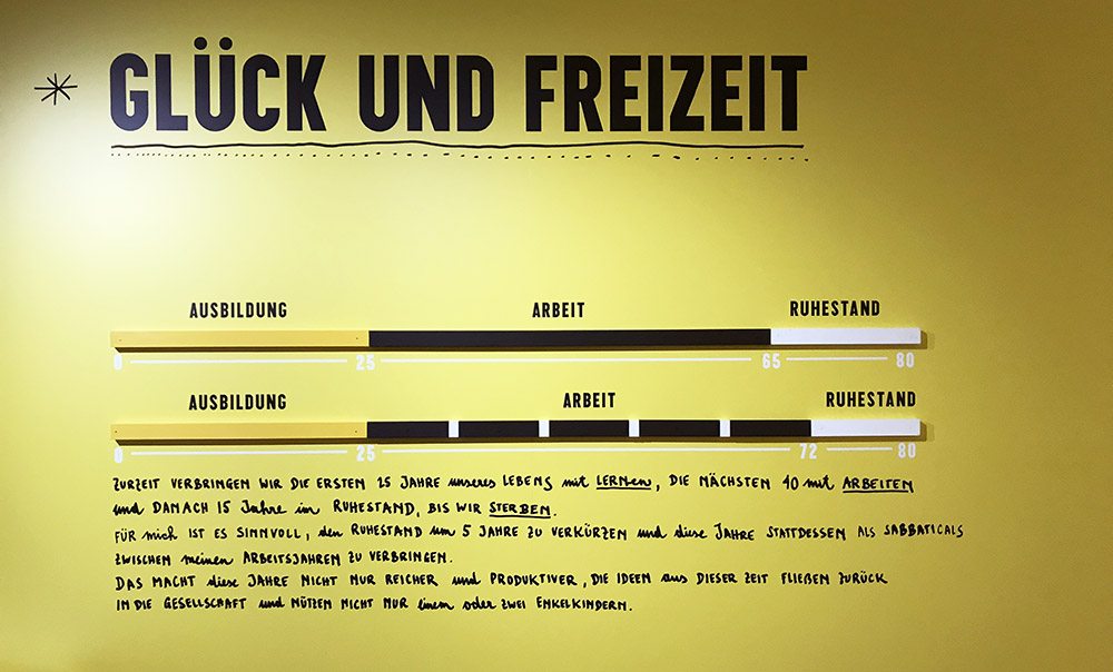
It reminded me of the times I spoke to my teenagers about finding a hobby and how they could and should make that to their profession, as this would/ or could be a path to happiness, or a path to a happier work life.
In the sabbaticals, Stefan Sagmeister has been taking time off to explore projects with content that don't have to earn money. This seemed a great idea, and to experience what he discovered filled me with excitement. I appreciated the invitation to be active and interact with the exhibition. ‘"Find a reflection of yourself and tell it what you really think." I liked the question, if there may be any tools to achieve happiness and how we could train the brain to draw from achieved happiness at a later stage like a source of power. But it only touched me on the surface. Some of his tips were useful and I carried them away with enthusiasm to implement.
Personally, I feel that timeout could be taken in much smaller junks, letting everyday life leap into the creative process. As a working mother, I experience that taking time off to pick up the kids from school offered perspective on what I had been working on; coming back to it gives me the valued distance to make better judgement calls, and I often feel empowered to make more concise decisions. Was I fortunate enough to have a close transition between work life and ‘time out’? Or is my design work compromised because of the interspersing interruptions of family life?
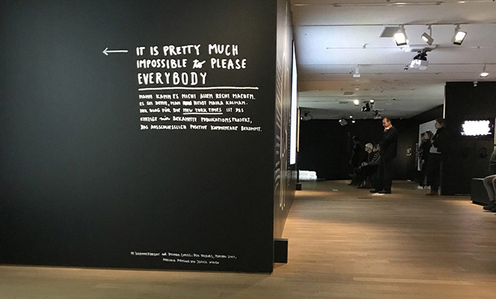
"This exhibition will not make you happier", the small print says at the entrance. "I mention this here to manage your expectations" – because to lower expectations is a good strategy on the path to find happiness.”
Analysing the exhibition closer, I feel it was more of a journey of self-discovery for Stefan Sagmeister and I applaud him for putting the exhibition together to illustrate a collection of findings. The exhibition certainly made me think about what I consider ‘happiness’ and realised that this required context: happiness in a ‘design’ context/happiness in a personal life context. I learnt that my design work could be a great source of happiness if time was allowed to produce content which did not necessarily pay my bills. So here my January resolution: To produce design work that is ‘other’, to produce stuff that makes people smile. And I am grateful for that inspiration.
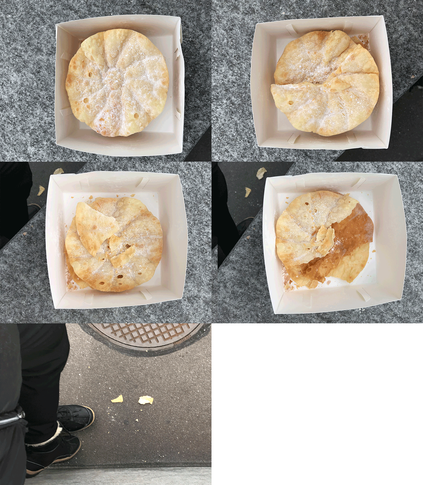
Once outside, I suddenly remember that earlier in the day I had purchased a timely ‘Fasnachtschuecheli’. As as a ‘Swiss abroad’, I realised that this little pack filled with nostalgia and loaded with childhood memories was my real happiness for this moment in time. And so I embarked on creating a little installation myself, by eating a little piece of happiness on a tram stop outside a design museum. If only it were that simple.
References:
- Veranstaltungen www.kulturzueri.ch
- blog.wohlgeraten.de Blog: Museum für Gestaltung in Zürich – „Happy Show“ für Design-Fans.
- www.badische-zeitung.de/ausstellungen: Sagmeisters "The Happy Show": Eine Geschichte des Glücks

