Creating an engaging PowerPoint presentation or workshop
A picture paints 1000 words....
Many people find slides tedious.
You can grab their attention by using thought-provoking images.

A few nice, friendly illustrations can help an organisation stand out from the competition and have a more profound influence on the audience, especially in a high-pressured environment or in a tender process.

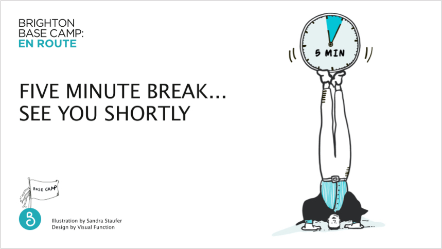
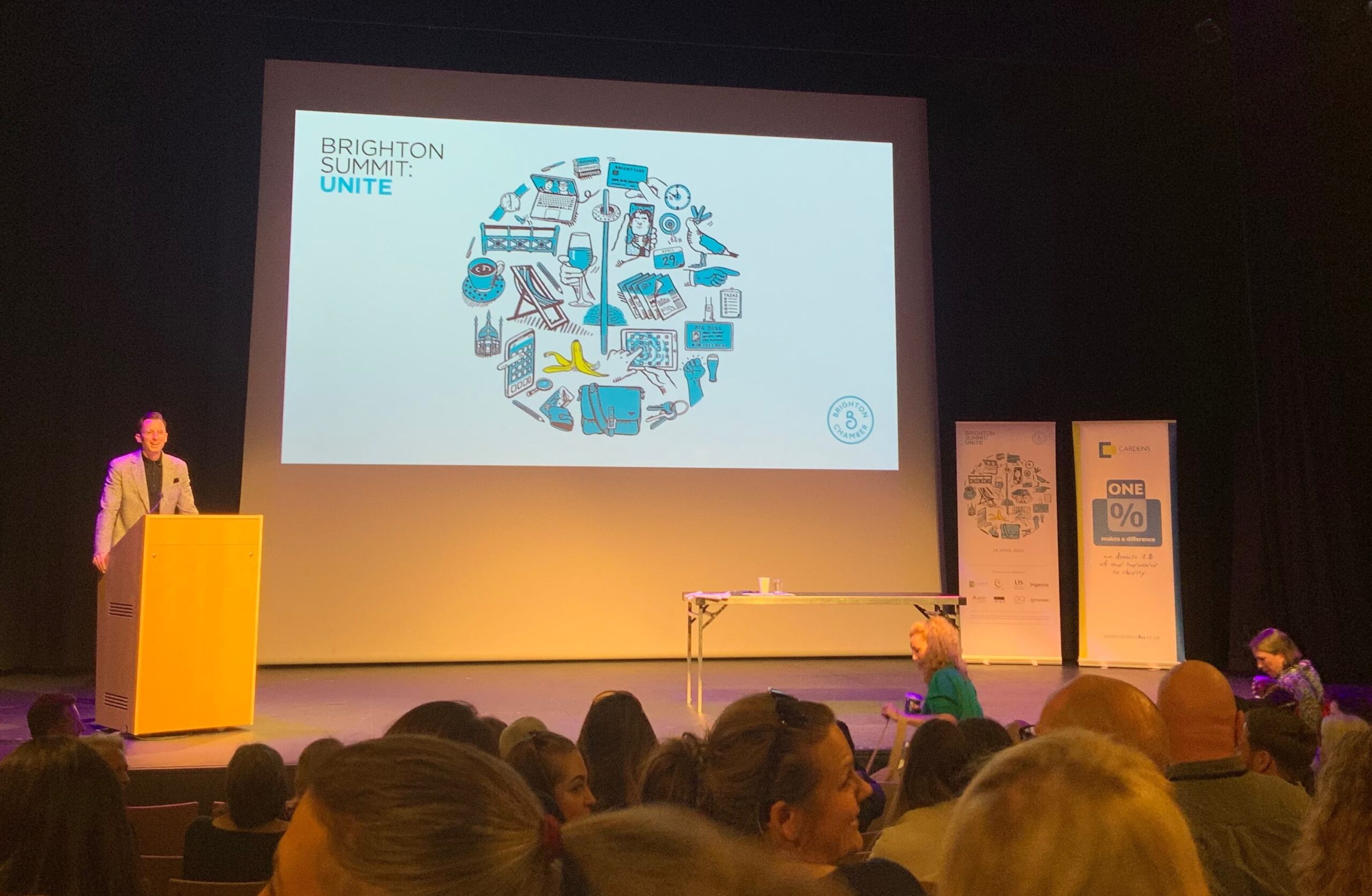
Illustrations can enhance a workshop or a presentation and grab the audience’s attention. They add power to the messages you are trying to convey and help focus on effective client communication.
They can complement what the speaker is talking about to create an understandable and simple connection between content and speaker. It also shows your audience that you made an effort.
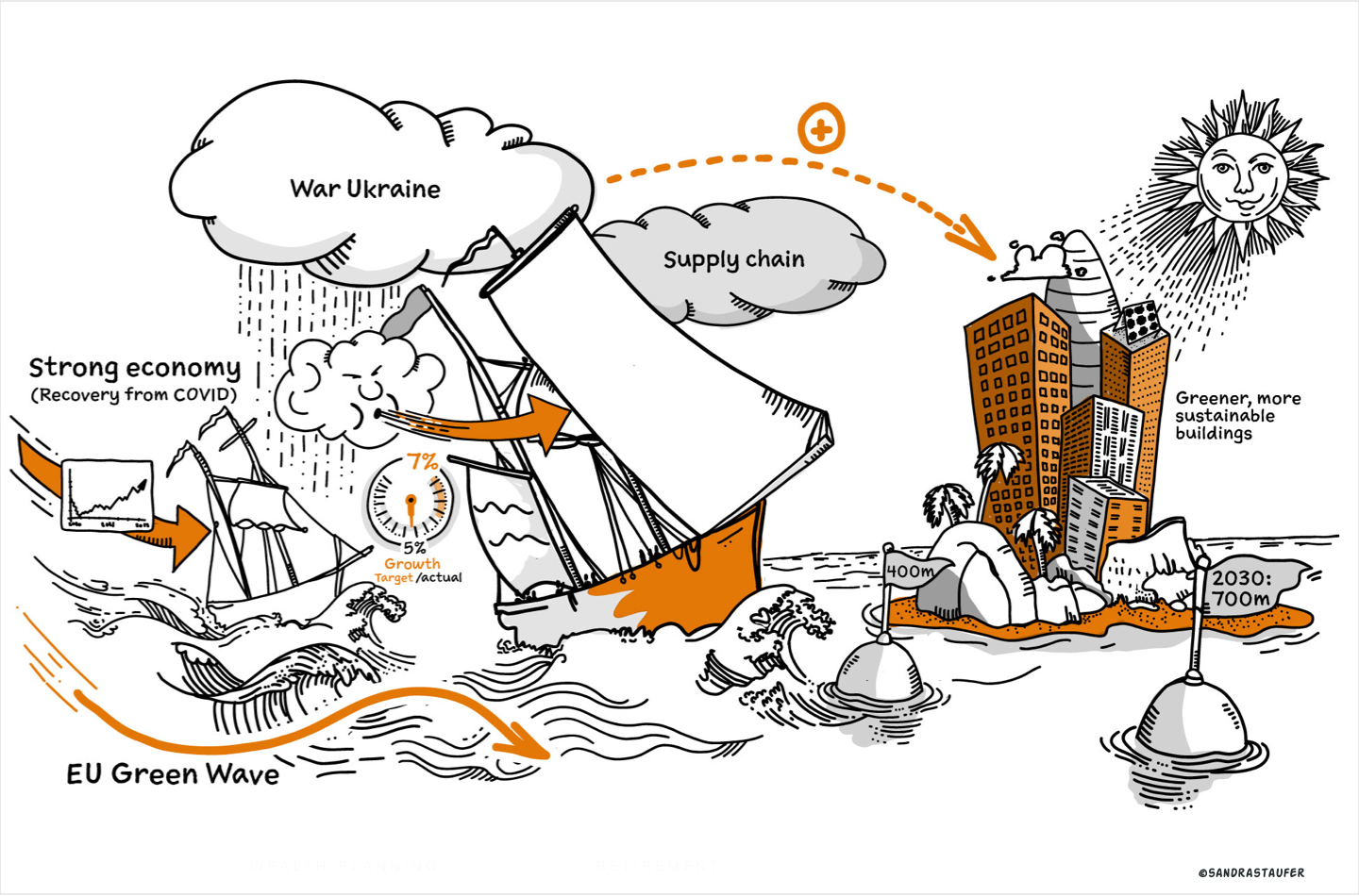
Personalise your tender proposals and stand away from your competition
For a tender design especially, it's critical that you stand out above the competition and clearly show the potential customer that you care and that your proposal is unique. Reading a document with creative, humorous assets would create a better experience and will certainly help the reader remember your proposal.
Presentations and tenders are often required with a quick turnaround. So is a personal illustration style the right way forward? Well, that depends on the style of illustrations, of course. A life-sketched 'hand-drawn' approach, for example, is quick, effective and spontaneous. Let us not forget to add a pinch of humour or sarcasm if allowed, as this will definitely add a 3rd dimension to a presentation.
Make your event stand out
Standing out from others isn't always easy; especially when the user hasn't much time, such as here, on this events portal www.eventbrite.co.uk/; a nice personal illustration makes your event stand out.
Let's have some fun
My illustrations style is very suitable for quick turn-round PowerPoint presentation projects, a tender proposal or a blog. I am are happy to fulfil one-off projects or commit to a monthly subscription e.g. for a monthly blog.

Stock imagery VS bespoke illustrations
The web is full of stock images and marketing departments are often tasked with trawling through stock libraries to find appropriate visual assets and icons for presentations and blogs. This can quite easily be inefficient and time-consuming. Furthermore, the outcome can be a mixture of unconnected visuals which do not represent your brand's organisation cohesively.
Choosing an illustrator to produce a library of assets that can be reused for your PowerPoint presentations and blogs is a compelling way of communicating a coherent brand message. It will certainly take away the pain of finding assets yourself. Each illustration should be designed to enhance and clarify your message.
The important thing is to maintain a consistent visual illustration style that represents your organisation well. Illustrations will be an exact match to your story and can equally become part of the organisation's design system (perceptual patterns).
A picture paints a thousand words. Illustrations are like the glue that helps hold the attention of the audience or the reader. By doing so, they will unconsciously gain a better understanding of your topic. A large part of our brain is devoted to visual processing. Because of our impressive ability to take in and process optical elements, we’re able to understand an idea much quicker if it was conveyed using visuals. Especially when the user hasn't much time, such as here, on this events portal www.eventbrite.co.uk/; a nice personal illustration makes your event stand out.
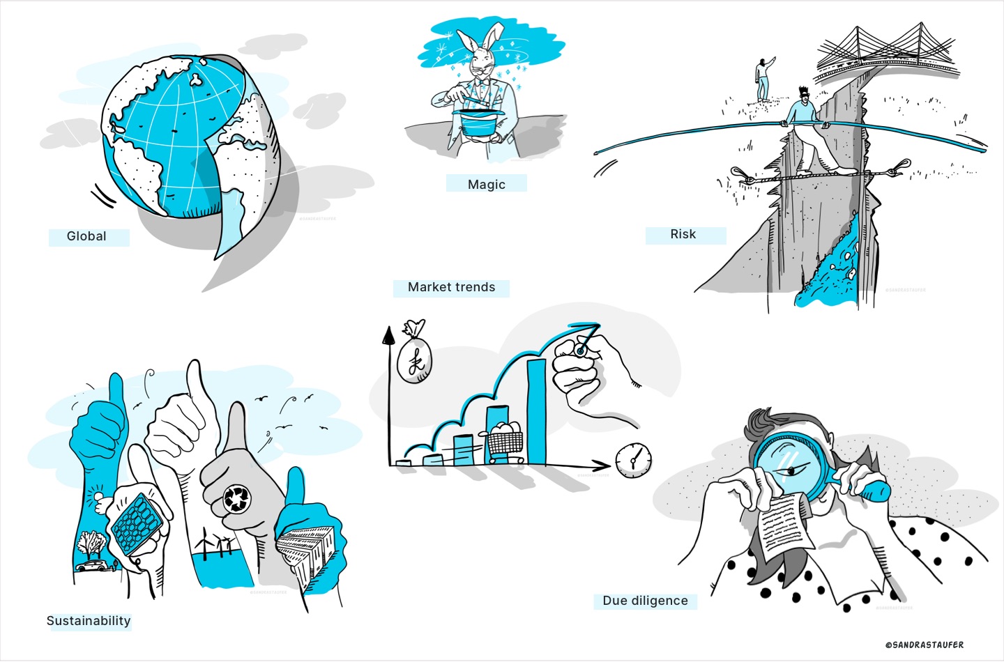
Personalise your tender proposals and stand away from your competition
For a tender design especially, it's critical that you stand out above the competition and clearly show the potential customer that you care and that your proposal is unique. Reading a document with creative, humorous assets would create a better experience and will certainly help the reader remember your proposal.
Presentations and tenders are often required with a quick turnaround. So is a personal illustration style the right way forward? Well, that depends on the style of illustrations, of course. A life-sketched 'hand-drawn' approach, for example, is quick, effective and spontaneous. Let us not forget to add a pinch of humour or sarcasm if allowed, as this will definitely add a 3rd dimension to a presentation.
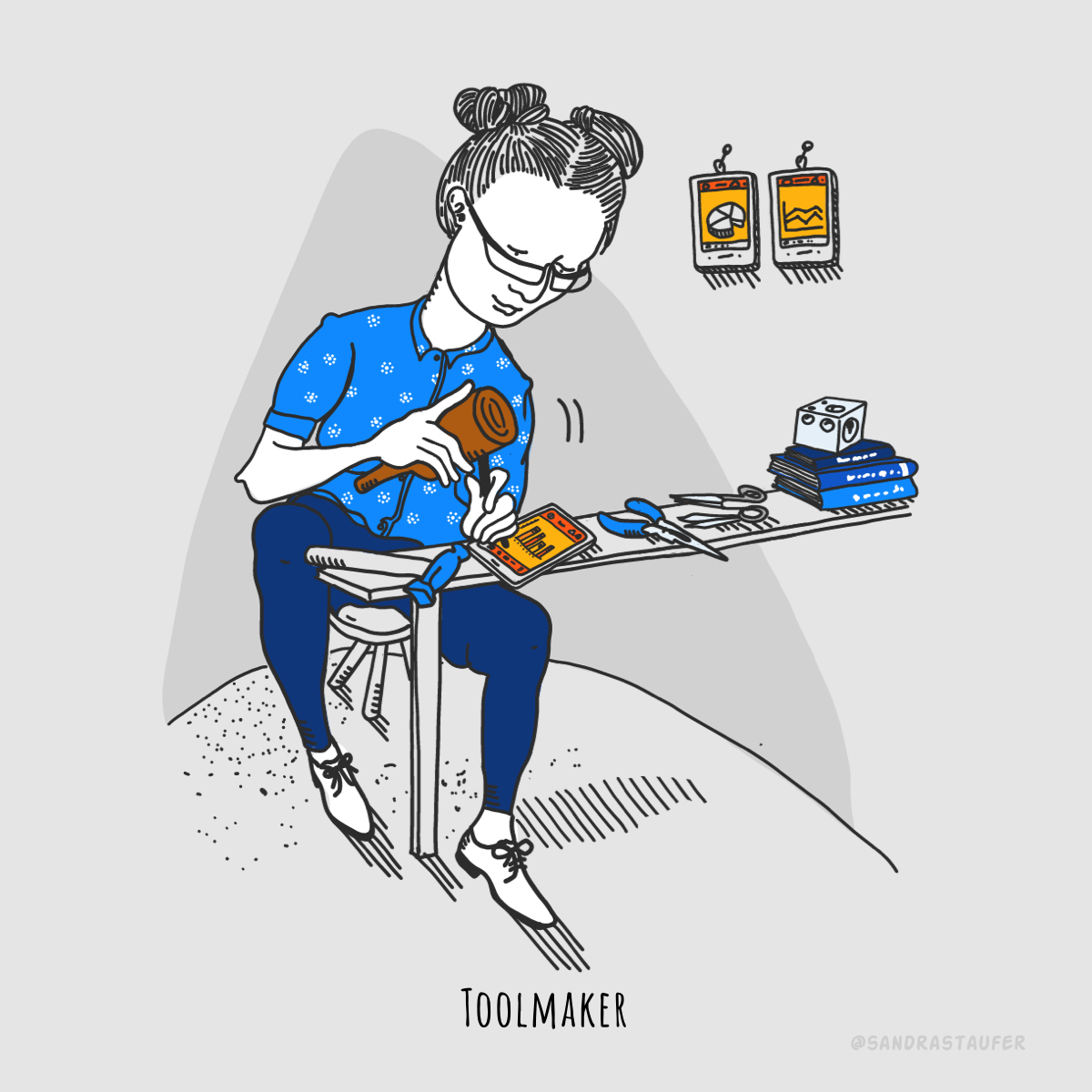
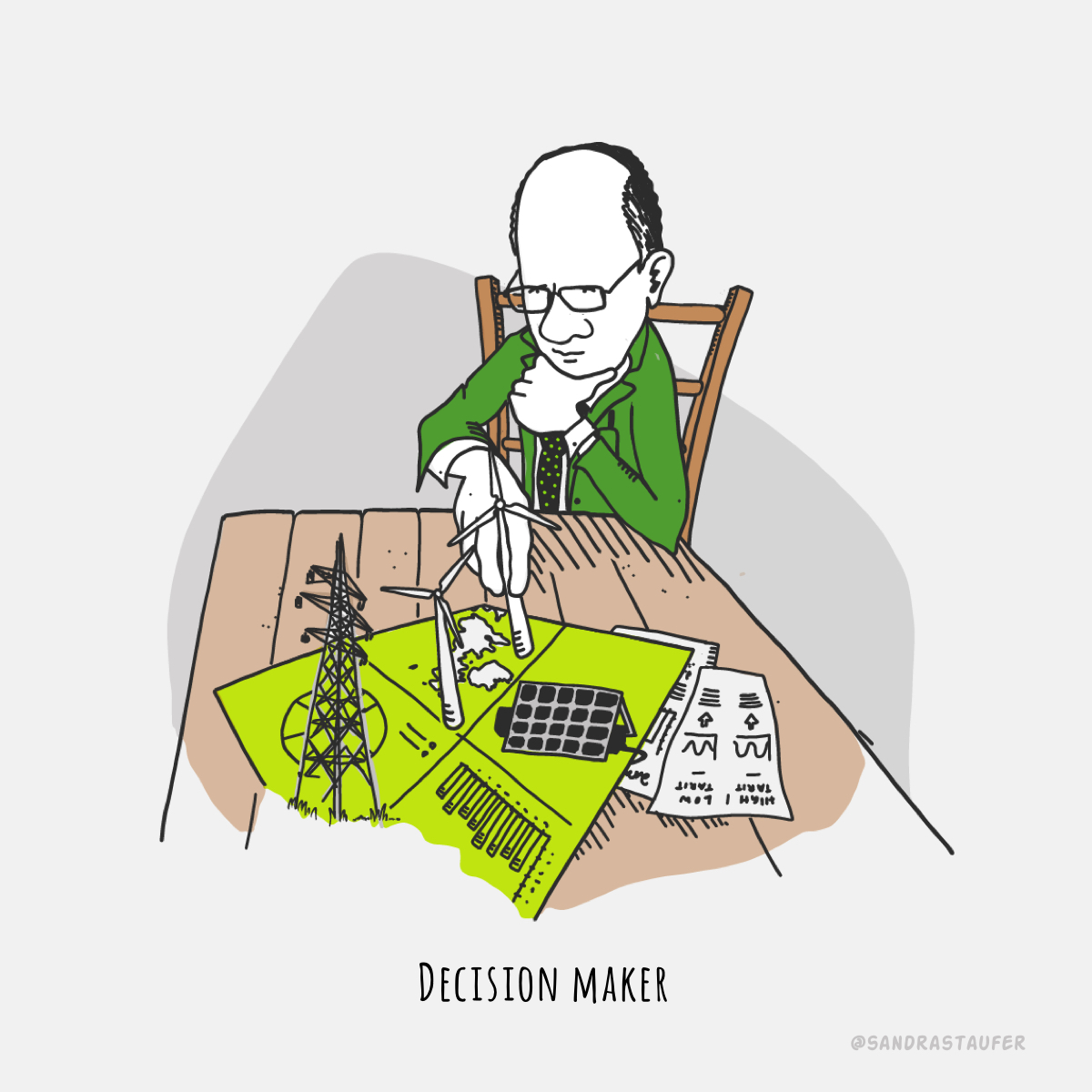
Illustrations help your presentations and blogs be more effective, personable and memorable.
Let me help you with a presentation that's a little different; a presentation that keeps your audience engaged.
Related Content you might be interested in:
'666 rule of bullet points'
by Steve Bustin, Public Speaking Coach
"The penultimate video in this current Preparing for a Presentation series is about bullet points in your slides (if you're going to use slides, that is!). If you really can't avoid using them, I share my top tips for best practice."
'10 Presentation Aids To Enhance Your Presentation'
You’re putting together a presentation and you’ve considered using presentation aids but don’t know where to begin?

