Case study: Illustrations for Brighton Gin’s comms materials
Illustrations for Brighton Gin's comms pieces
Checky illustrations for a renowned Gin distillery in Brighton
Background
Brighton Gin was born of a passion for gin, and a passion for the place where they live and play. They wanted to create a gin that embodies the Spirit of Brighton: unusual, playful and fiercely independent.
The challenge
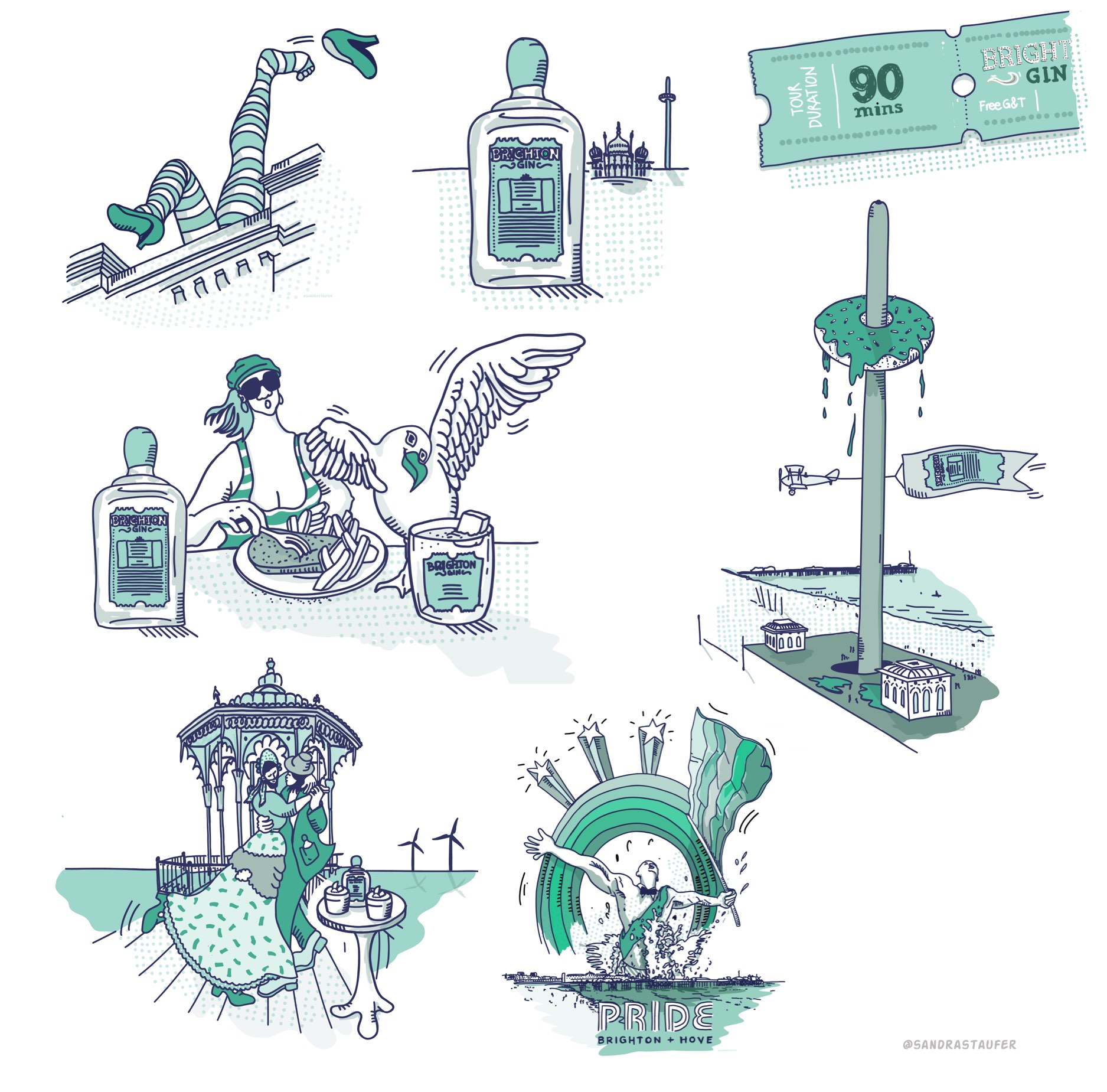
Kathy of Brighton Gin said, she "loves my cheeky seagulls and general Brighton illustrations" and asked me if I would be able to do a bundle of illustrations for use on newsletters, their website, and possibly some postcards.
My solution
I created a suite of illustrations of bottles, tickets and avatars for their team's page and general landmarks of Brighton such as the pier, the beach, events like the 'Brighton Naked Bike Ride'. I definitely wanted to capture Kathy's spirit of life and her sense of humour for this project.
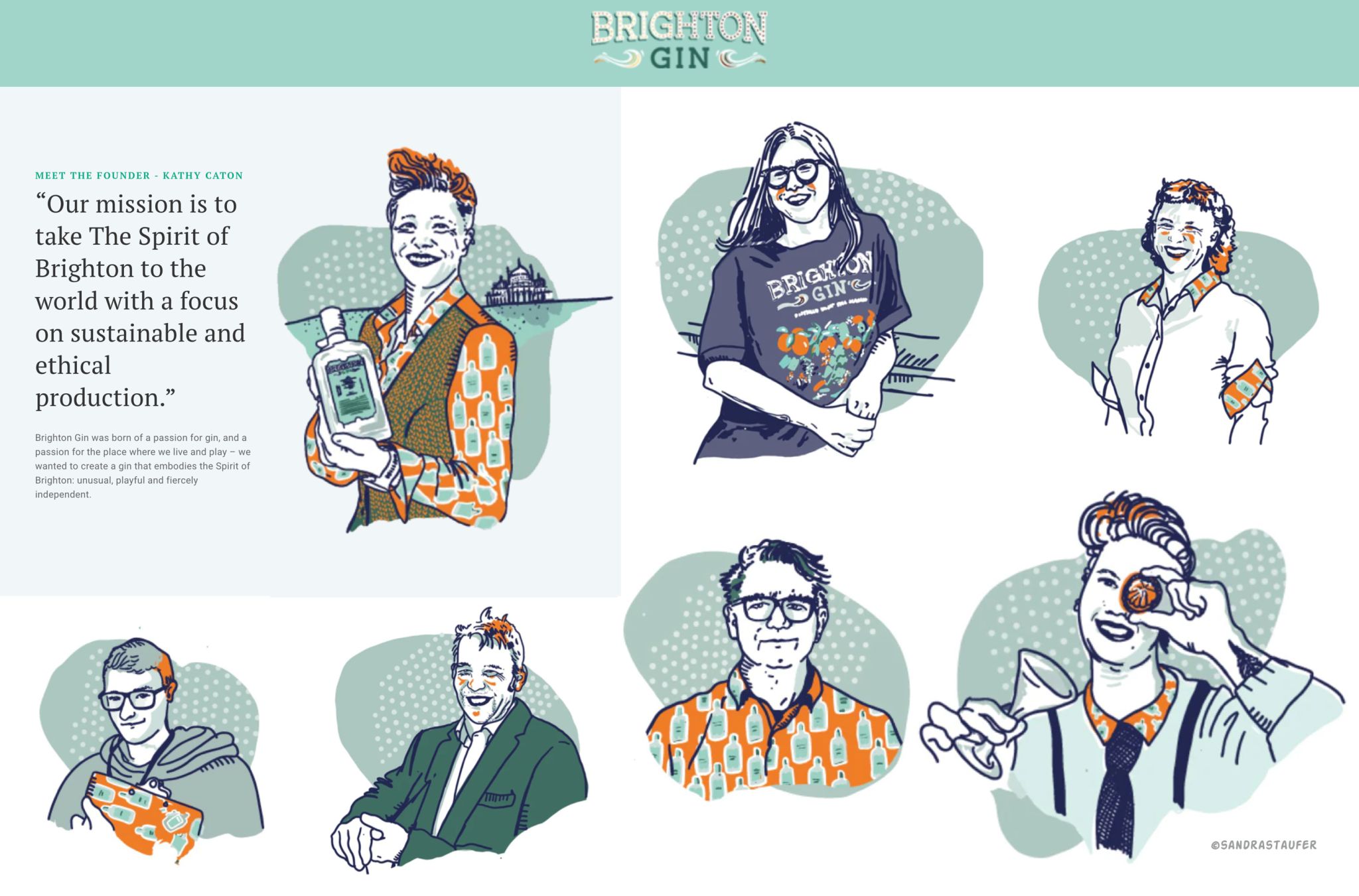
Personalised avatars for the Brighton Gin team's page
Adding that personal touch to the team's page - to speak to the audience directly
The 'About us' page or 'Teams' page helps evaluate things like the size of your company, mission and vision, core values of the company, how your business came to be where it is today, but most and for all who runs the company. How you come across on that page is important for your brand.
Brighton Gin took the plunge to make this page especially personal and playful, following their own brand values. This is fun and certainly quite different from many other 'Teams' pages. It also helps the site to be memorable.


