Case study: Brighton Fringe Branding 2021 Tender

Tender: Brighton Fringe: time to celebrate again

A hero graphic full of hope to provide core branding for the 2021 Brighton Fringe marketing campaign

Background

After 2020’s cancellation of the Brighton Festival and Fringe because of Covid-19, England’s most vibrant seaside city is again ready to celebrate the arts, the creativity of artists and the always-unpredictable nature of its world-famous Fringe Festival.

The challenge

Stepping away from its usual brochure-led branding, Brighton Fringe was on the hunt for an artist, designer or illustrator with a strong understanding of producing work for digital platforms for its 2021 event. (Callout here)

My solution

The winning Brighton Fringe hero graphic would provide the core branding for the 2021 marketing campaign, and be translated across all other marketing materials including print and outdoor advertising, social media, online, app and email marketing.

Artwork callout: "Brighton Fringe is currently looking for an artist to work with us on the design for the 2021 festival."

The brief

The Brighton Fringe 2021 hero graphic needs to entertain, engage and excite potential audiences around the world in these ‘new normal times’. It also needs to raise awareness of the artistic range of Brighton Fringe, reflect the high energy, inclusive nature of the Brighton Fringe brand, and build a strong digital brand.

Working as a UI (user interface) designer for Nvisage, I had undertaken designs for several earlier Brighton Fringe events and I felt I had a genuine insight into its working processes, evolving audience and brand intentions. And while not successful this time, I enjoyed the creative tender process of the project.

Collaboration

Had their bid been successful, I would have worked on this project with mylong-time collaborator graphic designer Lee Suttey, with whom I have worked closely on numerous branding, web and print projects over the past 15 years. Together Lee and I created the visual identity and branding for the Brighton Chamber of Commerce Basecamp 2020 and we will be doing so again this year.

The outcome

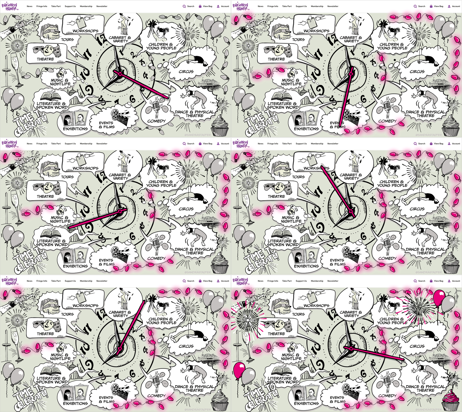
Inspired by comic's style, I chose to embrace the Fringe 2021 motto ‘Time to Celebrate’ quite literally: with a dynamic clock design, in which each of the 12 hour-associated illustrations represents a Fringe category.

‘The clock represents past, present and future, with the hand moving into the future; towards the time where we can celebrate again. With the spiralling of the clock hands, we show that the future is open; that we’re no longer in lock-down, but moving forward positively - hopeful!’

A dark year - now let's turn the lights back on

ILLUSTARTION BY SANDRA STAUFER FOR BRIGHTON FRINGE TENDER 2021 BRANDING

With the second, black and white graphic, I'm illustrating the idea that after a dark year, the lights will again shine. The intermittent flickering of the fairylights evokes the imagery of someone switching on the lights after a long period of darkness. Looking at past Brighton Fringe front covers our proposed artwork may be a little outside of the usual framework, yet as we are leaving 2020 behind, it feels that a slightly different approach is warranted.

Key benefits of a successful branding exercise

  • Builds a strong digital brand
  • Entertains, excites and engages people from all backgrounds and age group
  • Reflects well, sits comfortably with, and boosts main event branding
  • Improves an event’s online presence and raises awareness of its artistic range
  • Provides a successful shop window for an invent, boosting ticket sales