Stefan Sagmeister – ‘The Happy Show’ and my little piece of happiness
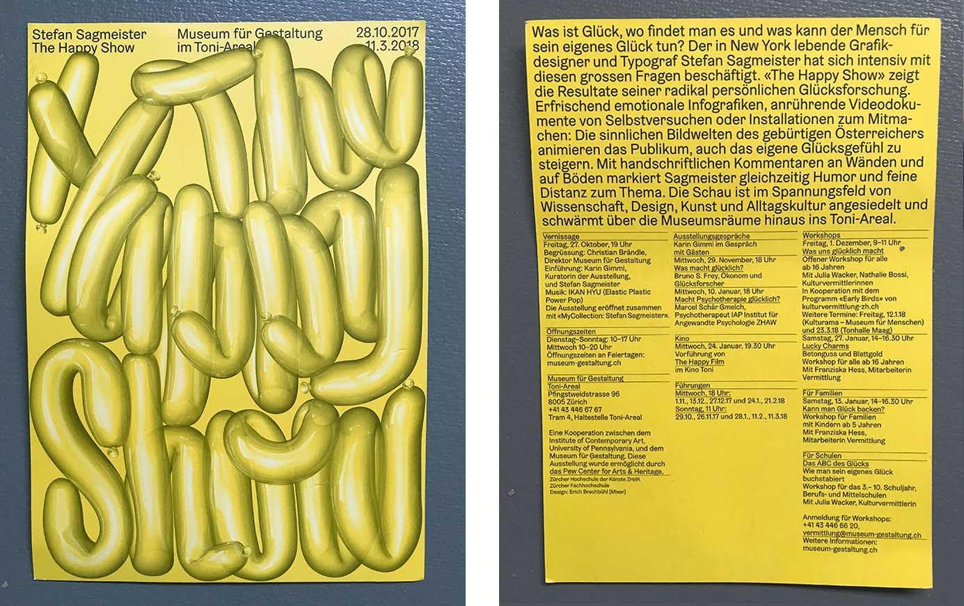
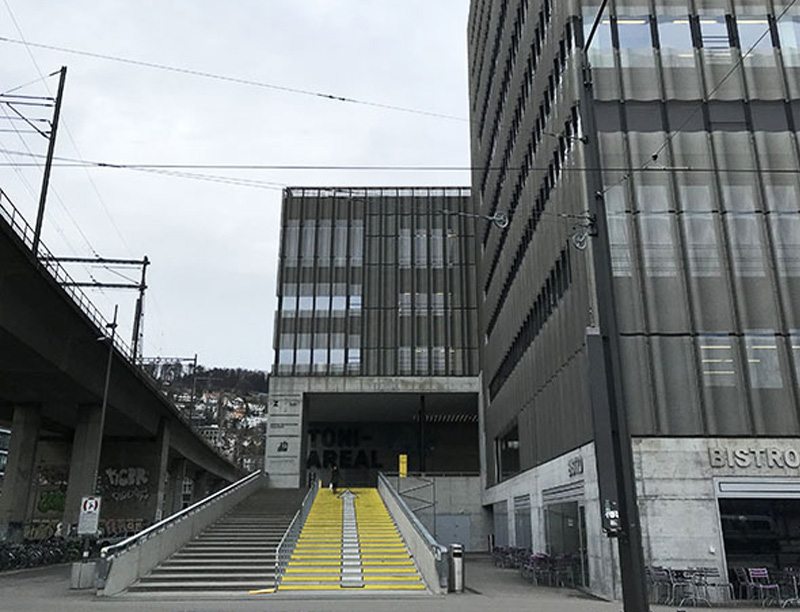
Stefan Sagmeister - The Happy Show - Museum für Gestaltung im Toni-Areal - and a ‘Fasnachtschüechli’
- "What is happiness, where can one find it and what can man woman do for his/her own happiness? The New York-based graphic designer and typographer Stefan Sagmeister has been working intensively on these big questions. 'The Happy Show' shows the results of his radically personal happiness research. Refreshingly emotional infographics, moving video documents of self-experiments or installations to join in: the sensuous imagery of the native Austrian animates the audience to increase their own happiness. With handwritten comments on walls and on floors, Sagmeister simultaneously marks humour and subtle distance to the subject…’ 1)
So I went along and took advantage of the ‘power of time-off’. In the long run, we all want to find happiness, don’t we? At this point, I was quite sure that I had quite a good steak in the happiness pie, and I took this as a chance to test my assumptions.
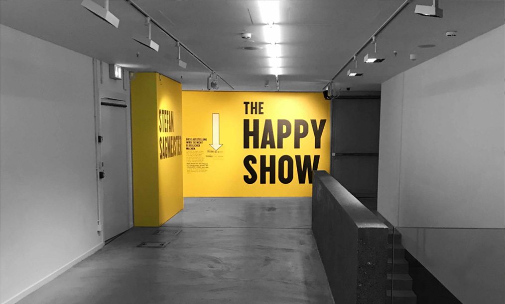
I always enjoy a visit to the ‘Museum für Gestaltung’ and the Toni Areal, as I myself once attended the ‘Vorkurs’ (Foundation) in Zurich, and I have extremely fond memories of drawing alphabets, studying typography, experimenting with form and challenging my skills. So if in this case, I was to find a new approach to how I perceive design, then that would suffice for the day. But a challenge is always good and I am merely grateful that someone asks questions, especially about 'happiness', to challenge my belief systems.
I liked the brochure accompanying the exhibition which is now sitting in my office: "1.2 This exhibition will not make you happier." (This managed my expectations), "2.1 Now is better", "2.11 Happiness breakdown" etc. Then a list of self-help tips which are useful to keep for the future.
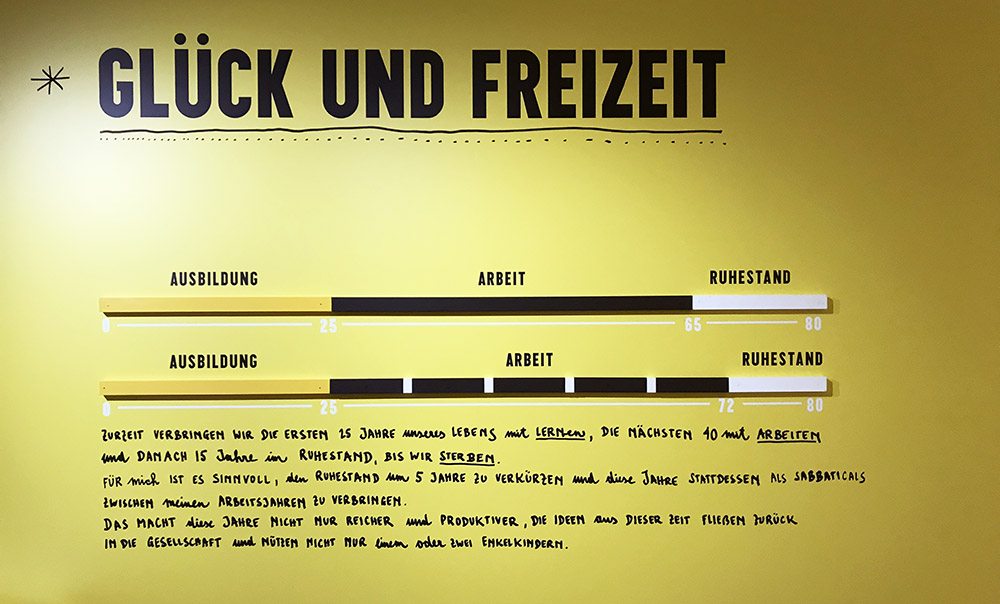
"2.5 Happiness and time off - Learning, working, retiring“. Sagmeister: ...Ich ahnte, dass ich mit dem Medium Design mehr als nur Werbung und Promotion machen könnte. “ (Approx. translation: “I sensed that with the medium of design I could do more than just advertising and promotion.”)
This is where I am currently at in my life as a designer: The sensing that more can be done with design than selling products. That, in fact, more must be done. What that ‘other’ was, I still had to define.
So I engaged and participated in some of the exhibition’s surveys and let myself be immersed in some of the questions Stefan Sagmeister asked in this ‘happiness research’. Some insights were challenging, such as the observation, that we learn for 15 years, work for 10 and then spend 15 years in retirement until we die; and therefore it may be a good idea to shorten the retirement period by 5 years and use this time as sabbaticals during our working lives.
It reminded me of the times I spoke to my teenagers about finding a hobby and how they could and should make that to their profession, as this would/ or could be a path to happiness, or a path to a happier work life.
In the sabbaticals, Stefan Sagmeister has been taking time off to explore projects with content that don't have to earn money. This seemed a great idea, and to experience what he discovered filled me with excitement. I appreciated the invitation to be active and interact with the exhibition. ‘"Find a reflection of yourself and tell it what you really think." I liked the question, if there may be any tools to achieve happiness and how we could train the brain to draw from achieved happiness at a later stage like a source of power. But it only touched me on the surface. Some of his tips were useful and I carried them away with enthusiasm to implement.
Personally, I feel that timeout could be taken in much smaller junks, letting everyday life leap into the creative process. As a working mother, I experience that taking time off to pick up the kids from school offered perspective on what I had been working on; coming back to it gives me the valued distance to make better judgement calls, and I often feel empowered to make more concise decisions. Was I fortunate enough to have a close transition between work life and ‘time out’? Or is my design work compromised because of the interspersing interruptions of family life?
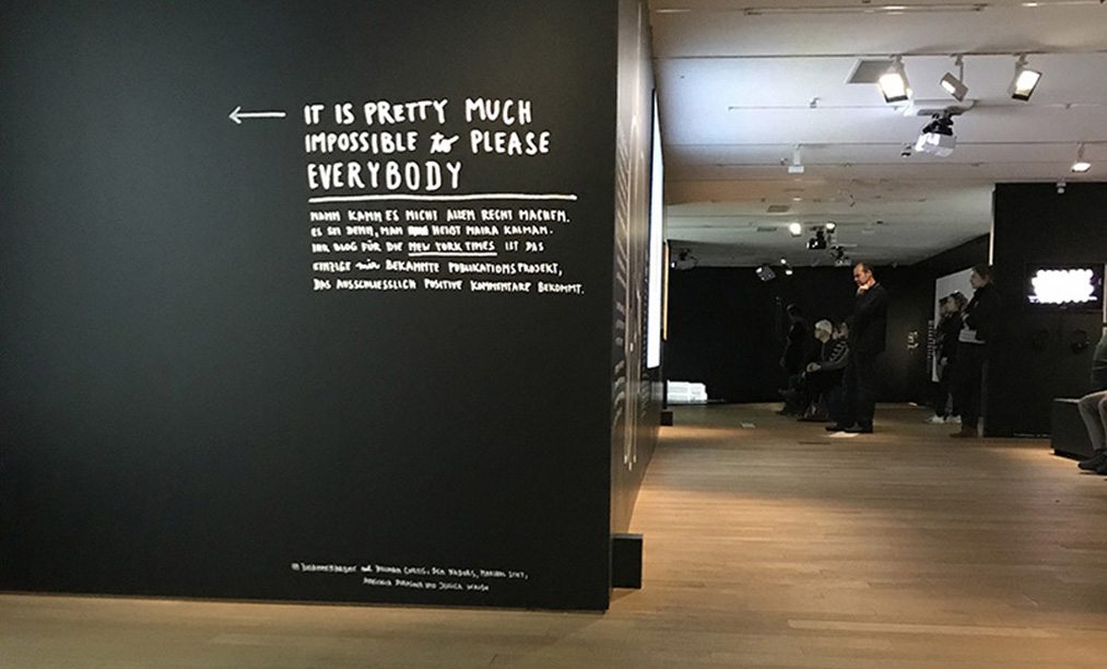
"This exhibition will not make you happier", the small print says at the entrance. "I mention this here to manage your expectations" – because to lower expectations is a good strategy on the path to find happiness.”
Analysing the exhibition closer, I feel it was more of a journey of self-discovery for Stefan Sagmeister and I applaud him for putting the exhibition together to illustrate a collection of findings. The exhibition certainly made me think about what I consider ‘happiness’ and realised that this required context: happiness in a ‘design’ context/happiness in a personal life context. I learnt that my design work could be a great source of happiness if time was allowed to produce content which did not necessarily pay my bills. So here my January resolution: To produce design work that is ‘other’, to produce stuff that makes people smile. And I am grateful for that inspiration.
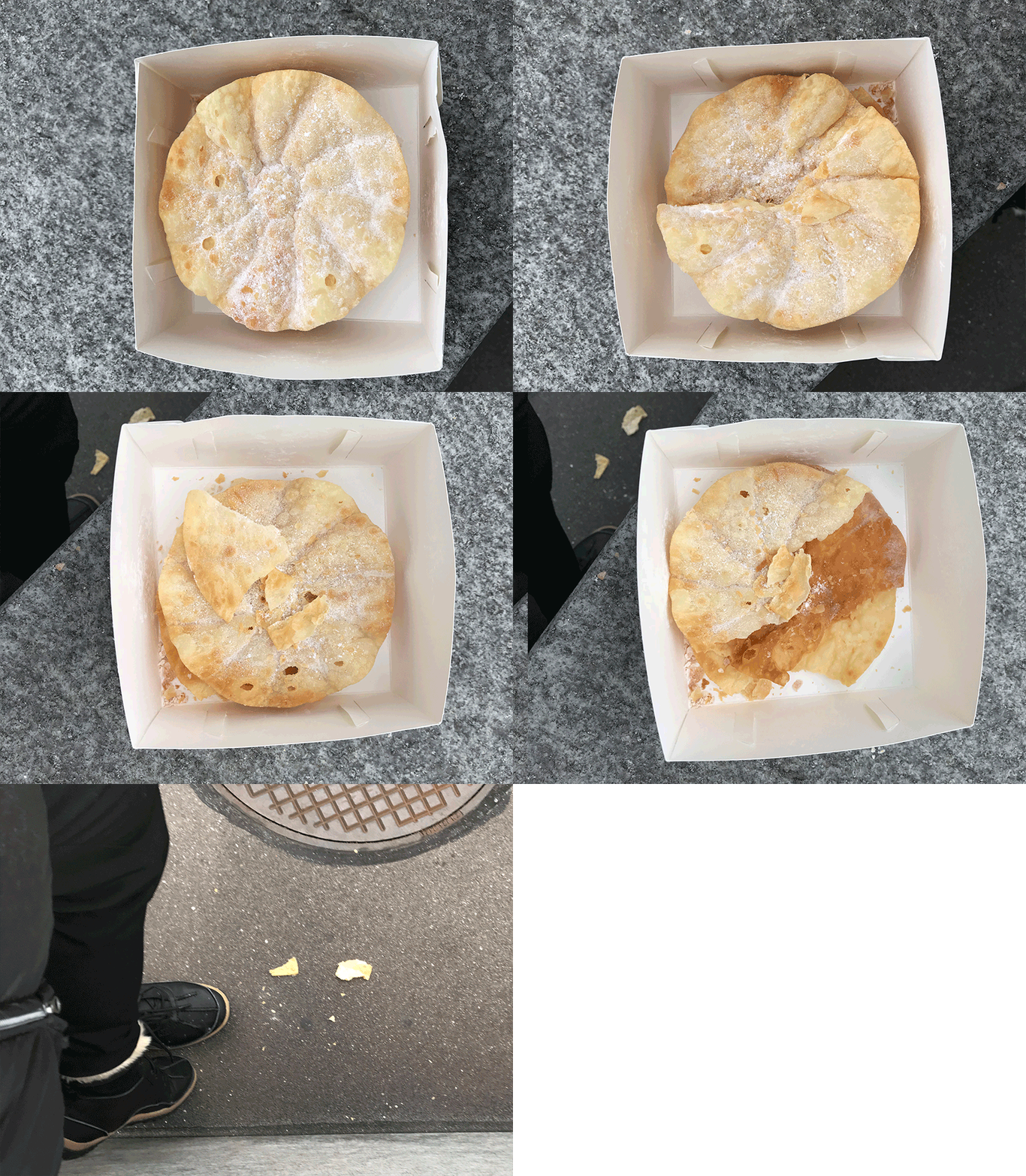
Once outside, I suddenly remember that earlier in the day I had purchased a timely ‘Fasnachtschuecheli’. As as a ‘Swiss abroad’, I realised that this little pack filled with nostalgia and loaded with childhood memories was my real happiness for this moment in time. And so I embarked on creating a little installation myself, by eating a little piece of happiness on a tram stop outside a design museum. If only it were that simple.
References:
- Veranstaltungen www.kulturzueri.ch
- blog.wohlgeraten.de Blog: Museum für Gestaltung in Zürich – „Happy Show“ für Design-Fans.
- www.badische-zeitung.de/ausstellungen: Sagmeisters "The Happy Show": Eine Geschichte des Glücks
Lessons from a design failure
The recent (false!) nuclear missile warning thrust upon Hawaii was a salutary lesson in user interface design failure. A warning system operator made an innocent mistake and selected the wrong menu item from a way too long list of alternatives. Instead of testing the system, they managed to send out a public warning of an impending nuclear missile strike.
Whilst we can all hope that such an important task might require or expect some judicious care be applied, the outcome throws into stark contrast how poor design made this person’s job that much more prone to risky failure. This process failed in a relatively clam test and the outcome was horrible for a lot of people. There were likely also some terror-filled moments for the poor operative when they realised their mistake as well.
But it could have been worse. Hard to believe but true.
Stress makes choices harder. Design should help not hinder
Now imagine if a genuine inbound missile was detected. For exactly the same reasons - too many conflicting options in close proximity – a similar mistake could have been made. The operative could have selected the test, depriving the good people of Hawaii time to 'duck and cover' or whatever else one needs to do when the thought of impending vaporisation is imminent. Now imagine the stress of a real missile detection. This would be a time of intense stress which would by nature, place upon the user a massive mental workload.
The stressed operative would be much more likely to make mistakes. There would be an exponentially higher burden on the design to help them make the right choice. They would really need this process to be truly designed to help not hinder them.
Placement and priorities greatly affect outcomes
This is an extreme example, but it's incredibly indicative of many examples that we see. We see information being simply thrown at users with no attempt to prioritise or group information. Especially choices.
- Hugely complicated User Interfaces laid out by the software engineers who built the system – not by user experience experts who research user’s needs.
- The number of features prioritised over the quality of those choices.
- An old favourite: why is the exit button to a building the same colour and location as the fire alarm button?
Strong foundations built on first principals
At Chie Consulting we work closely across disciplines. We never think of design as operating in its own Silo. Although we are grounded on incredibly strong foundations of graphic design and typography degree’s, we have always worked together with User Experience colleagues. This ensures the needs of users and the business are at the core of our thinking:
- What do the user’s need?
- What does the business want?
This means that we have to build out the design on top of great insight from users. How else can we prioritise the design of the most important tasks? We have to know what is truly important and focus on that. We can then reinforce these priority tasks by how we group related items together.
Lessons learned
Separating out the ‘Live!’ and Test!’ systems here was the first step. These are completely discreet tasks. This can be helped by grouping related tasks which then reinforce the core tasks. This way users can feel comfortable that everything they are doing is within one, related realm. The core task stands out and becomes more obvious because of the company it keeps. If we can always think of how the choices relate to each other we can build a more effective product that helps, not hinders our users. Not all of us work on nuclear warning systems but we can take the lessons and make our users worlds better even if we aren’t saving the whole world.