Is graphic design still relevant?
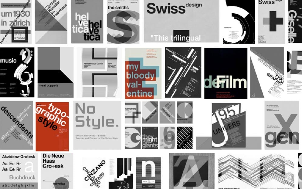
Current trends in comparison with the 'Swiss International style'
Just recently I thought to revisit the great and good typographers of the 'Swiss Style'. As trends focus on reducing the number of tasks - but executing them as flawlessly and frictionlessly as possible - it’s never been more important to get the foundations right.
Those guys really knew what they were doing with the simple ascetic! Swiss graphic design enjoys a worldwide reputation for legibility, cleanliness quality, strong concept, formality, objectivity and precision.
Often referred to as the 'International Typographic Style or the International Style', the style of design that originated in Switzerland in the 1940s and 50s was the basis of much of the development of graphic design during the mid 20th century. Led by designers Josef Müller-Brockmann at the Zurich School of Arts and Krafts and Armin Hofmann at the Basel School of Design, the style favoured simplicity, legibility and objectivity.
Emil Ruder played a key role in the development of graphic design in the 1940s and 50s. His style has been emulated by many designers, and his use of grids in design has influenced the development of web design on many levels.
So why did I feel this reconnection was necessary to advance my design work? As Maslow’s Pyramid identified, creativity and purpose are at the top of the hierarchy of needs. In daily design works, designing for clients, creativity and purpose can sometimes take lesser of a place over profitability and business success, speed of throughput etc. I needed a bit of creative injection and remind myself why these fantastic typographyers and graphic designers in the 'Swiss style' period found it necessary to simplify, to create art with typography and graphic design, to create works that achieved longevity.
As a web designer, I often feel squeezed and made to use UI patterns and templates to save time, and this can be frustrating; a good creative long concept phase is invaluable, where I can get my creative juices to flow, where I can ask the client for the real purpose of a redesign (Good video: Why Some Designers Are More Valuable Than Others,). Often there simply isn't the budget, or the client doesn't see the added value which is a shame (Good video: How to Respond To Price Buyers or Low Budget Clients - Roleplay).
‘Mobile first’ has shown the desires of users to do their thing and get out. The app like attributes of laser focus on the key task free from distractions. This has pushed a focus on being concise and clear and making sure that clarity is consistent across platforms and channels. The hyper-competitive market dictates the simplifying of the interface to serve up the best user experience.
Hence it is critical that individual design elements have been crafted with precision and utter simplicity to be able to carry the messages and journeys without distraction. I welcome the trends where we simplify fonts, use much more white space and allow the design to breathe which then best communicates the message. I love it.
The great 'Swiss Style' designers created visual communication which in their simplicity achieved attention and unchallenged presence. The design principles of the international style are still relevant in today's web design, and I am happy to recognise that most of the trends for graphic design in 2018 reflect these principles:
- clear organisation of the elements on a grid
- hierarchy to achieve a good composition
- figure ground (the visual separation of design’s parts, the relationship between dominant and less dominant design assets, or between foreground and background, negative space / positive space etc.
- symmetrically or asymmetrically balance to establish harmony and to create a more dynamic composition
- contrast to create visual tension, colour type weight, or scale, tonal values etc
- scale
- proportions
- cropping
- pattern
Philip VanDusen (Verhall Brand design) analysis of graphic design trends for 2018 showed a very close parallel to the 'Swiss International Style' design and typography masters - and how relevant graphic design still is. I clearly see that the trends are taking forward the international style designs principle, whilst reflecting on the Swiss Style masters. Even if some of these trends do not necessarily reflect simplicity, they are based on good organisation and contrast, good hierarchy, symmetry & asymmetry as well as considered proportions.
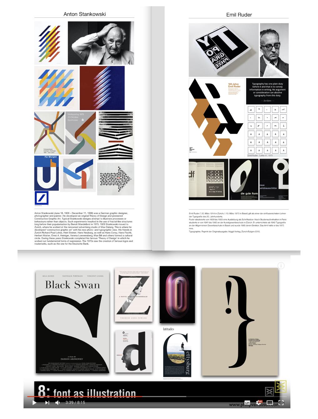
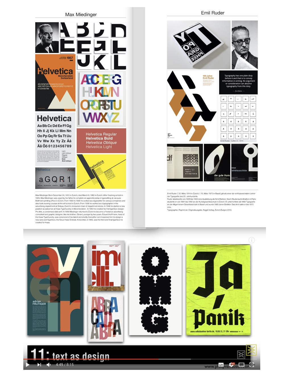
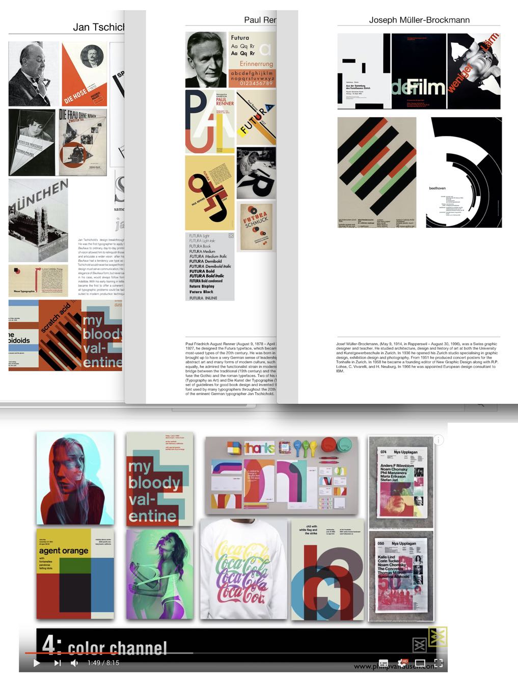
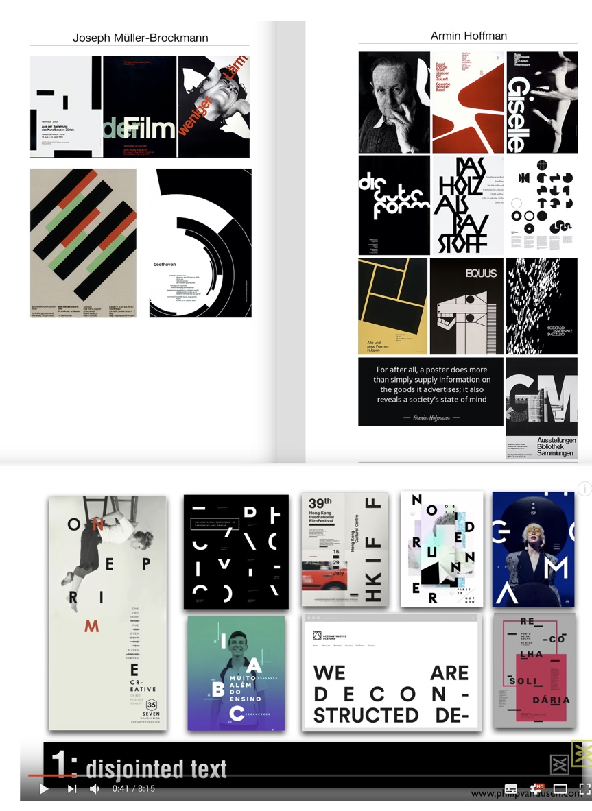
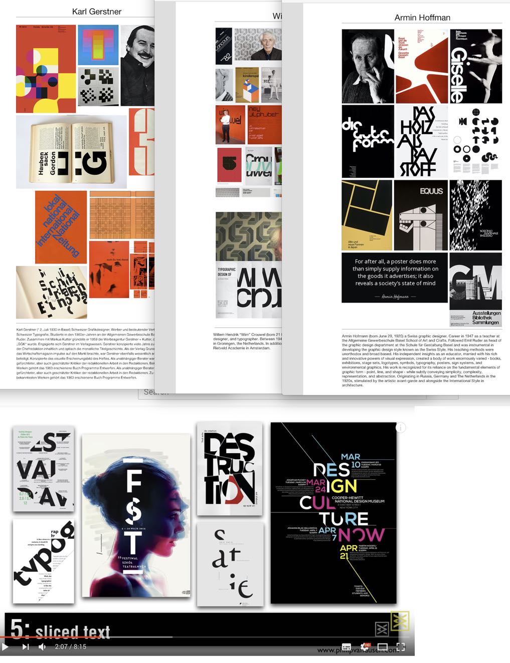
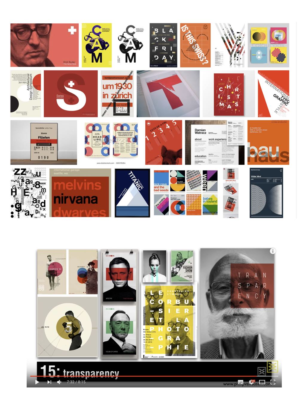
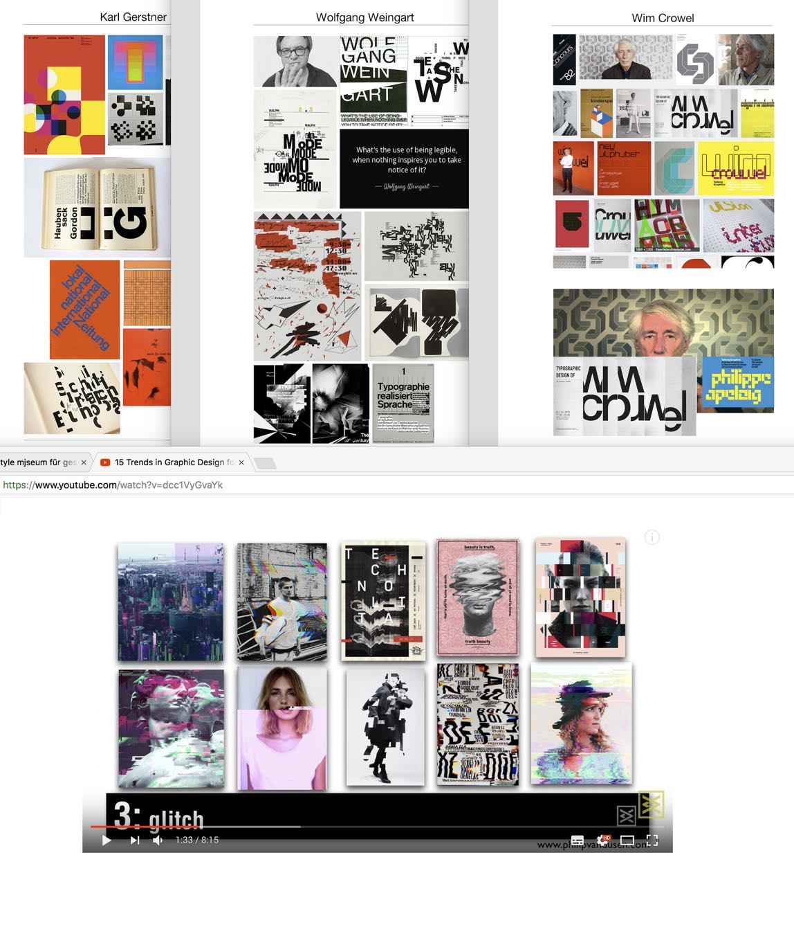
I hope you liked this little comparison exercise, and as we know other trends for 2018 suggested bigger and bolder creative typography in general, use of fonts in different compositions, double exposure effect of images, vivid colours, (examples Youtube mark, spotify logo) for dimension, geometric shapes and patterns.
Conclusion
After years of visual opulence, the ‘Swiss International Style’ and its simplicity is again in demand, especially for infographics and typography used in the digital and printed media. What I really like though is in the trend of making our designs more concise, simple and usable, we are looking back at designers from simpler times for inspiration. Ironically it is they who are bringing sense, meaning and most of all impact, to these incredibly complex and challenging times.
So now more than ever graphic design is utterly relevant and essential and we can truly learn so much from these masters of their craft.
___
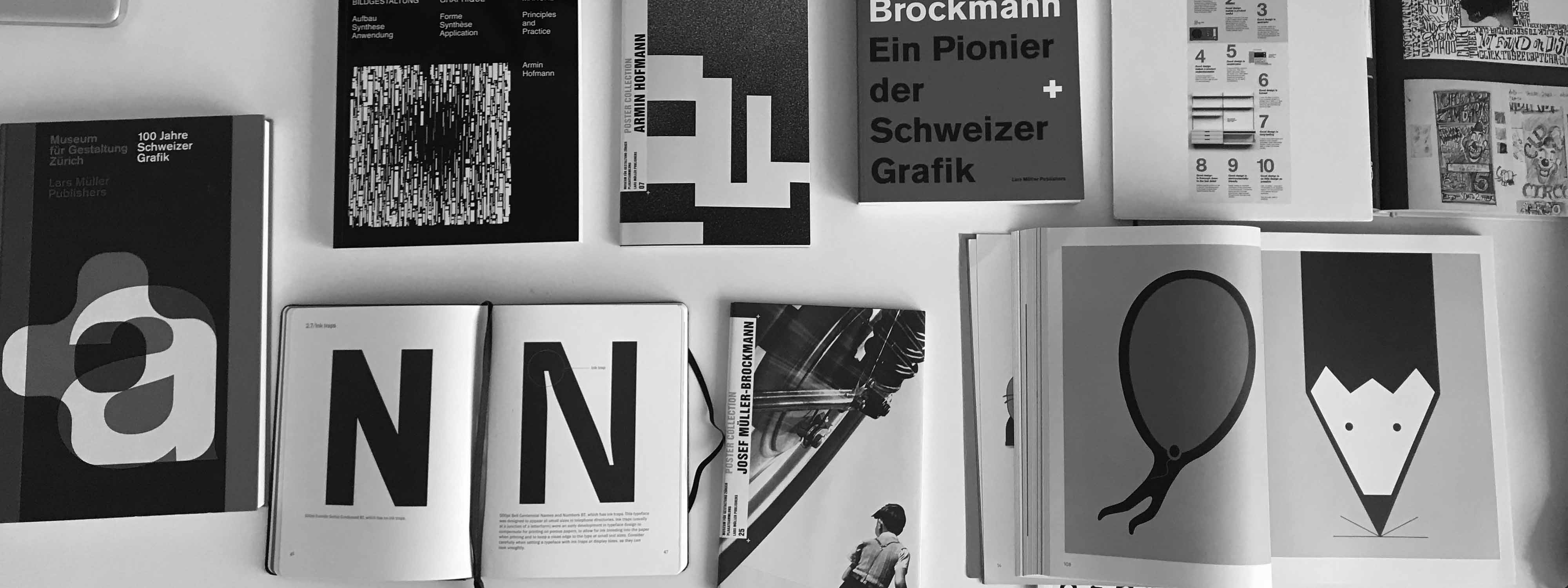
Books I am currently reading:
- Graphic Design Manual: Principles and Practice by Armin Hofmann
- Josef Müller-Brockmann: Pioneer of Swiss Graphic Design
- Poster Collections: Armin Hoffman
- 100 Jahre Schweizer Grafik
- Type Matters by Jim Williams
___
Timeline:
___
Resources:
- Design is History / Swiss Design
- Famous graphic designers / Emil Ruder
- Design principles & the international style
- 15 Trends in Graphic Design for 2018
- Graphic Design Trends of 2018 | Are They Important?
- 5 HUGE Graphic Design Trends in 2018
“When you have once touched quality, you’ll never forget it.”
Armin Hofmann
