Prioritise wisely, it could be the end of the world if you don’t!

Lessons from a design failure
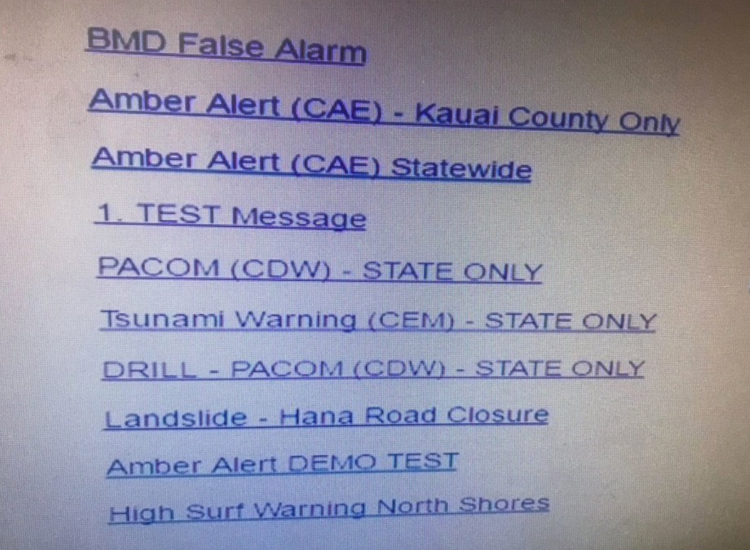
The recent (false!) nuclear missile warning thrust upon Hawaii was a salutary lesson in user interface design failure. A warning system operator made an innocent mistake and selected the wrong menu item from a way too long list of alternatives. Instead of testing the system, they managed to send out a public warning of an impending nuclear missile strike.
Whilst we can all hope that such an important task might require or expect some judicious care be applied, the outcome throws into stark contrast how poor design made this person’s job that much more prone to risky failure. This process failed in a relatively clam test and the outcome was horrible for a lot of people. There were likely also some terror-filled moments for the poor operative when they realised their mistake as well.
But it could have been worse. Hard to believe but true.
Stress makes choices harder. Design should help not hinder
Now imagine if a genuine inbound missile was detected. For exactly the same reasons - too many conflicting options in close proximity – a similar mistake could have been made. The operative could have selected the test, depriving the good people of Hawaii time to 'duck and cover' or whatever else one needs to do when the thought of impending vaporisation is imminent. Now imagine the stress of a real missile detection. This would be a time of intense stress which would by nature, place upon the user a massive mental workload.
The stressed operative would be much more likely to make mistakes. There would be an exponentially higher burden on the design to help them make the right choice. They would really need this process to be truly designed to help not hinder them.
Placement and priorities greatly affect outcomes
This is an extreme example, but it's incredibly indicative of many examples that we see. We see information being simply thrown at users with no attempt to prioritise or group information. Especially choices.
- Hugely complicated User Interfaces laid out by the software engineers who built the system – not by user experience experts who research user’s needs.
- The number of features prioritised over the quality of those choices.
- An old favourite: why is the exit button to a building the same colour and location as the fire alarm button?
Strong foundations built on first principals
At Chie Consulting we work closely across disciplines. We never think of design as operating in its own Silo. Although we are grounded on incredibly strong foundations of graphic design and typography degree’s, we have always worked together with User Experience colleagues. This ensures the needs of users and the business are at the core of our thinking:
- What do the user’s need?
- What does the business want?
This means that we have to build out the design on top of great insight from users. How else can we prioritise the design of the most important tasks? We have to know what is truly important and focus on that. We can then reinforce these priority tasks by how we group related items together.
Lessons learned
Separating out the ‘Live!’ and Test!’ systems here was the first step. These are completely discreet tasks. This can be helped by grouping related tasks which then reinforce the core tasks. This way users can feel comfortable that everything they are doing is within one, related realm. The core task stands out and becomes more obvious because of the company it keeps. If we can always think of how the choices relate to each other we can build a more effective product that helps, not hinders our users. Not all of us work on nuclear warning systems but we can take the lessons and make our users worlds better even if we aren’t saving the whole world.

